Cell Visualization
In this tutorial, we will make 2D and 3D visualizations of the graph components that constitute cells in PNA data.
After completing this tutorial, you will be able to:
- Select components of interest based on proximity scores or other metrics.
- Load cell graphs of the selected component IDs from a PXL file.
- Visualize individual cell graphs in 2D and color nodes based on selected proteins.
- Visualize multiple cell graphs and proteins in 2D.
- Visualize cell graphs in 3D.
Setup
library(pixelatorR)
library(SeuratObject)
library(dplyr)
library(tidyr)
library(stringr)
library(ggplot2)
library(here)
library(patchwork)
Load data
In this tutorial we will continue with the PHA-stimulated and resting PBMC dataset that we used in previous tutorials. There is no need to load the object again if you still have it in your workspace after running the previous tutorial.
DATA_DIR <- "path/to/local/folder"
Sys.setenv("DATA_DIR" = DATA_DIR)
pg_data_combined <- readRDS(file.path(DATA_DIR, "combined_data_annotated.rds"))
pg_data_combined
An object of class Seurat
158 features across 1970 samples within 1 assay
Active assay: PNA (158 features, 158 variable features)
 3 layers present: counts, data, scale.data
 4 dimensional reductions calculated: pca, umap, harmony, harmony_umap
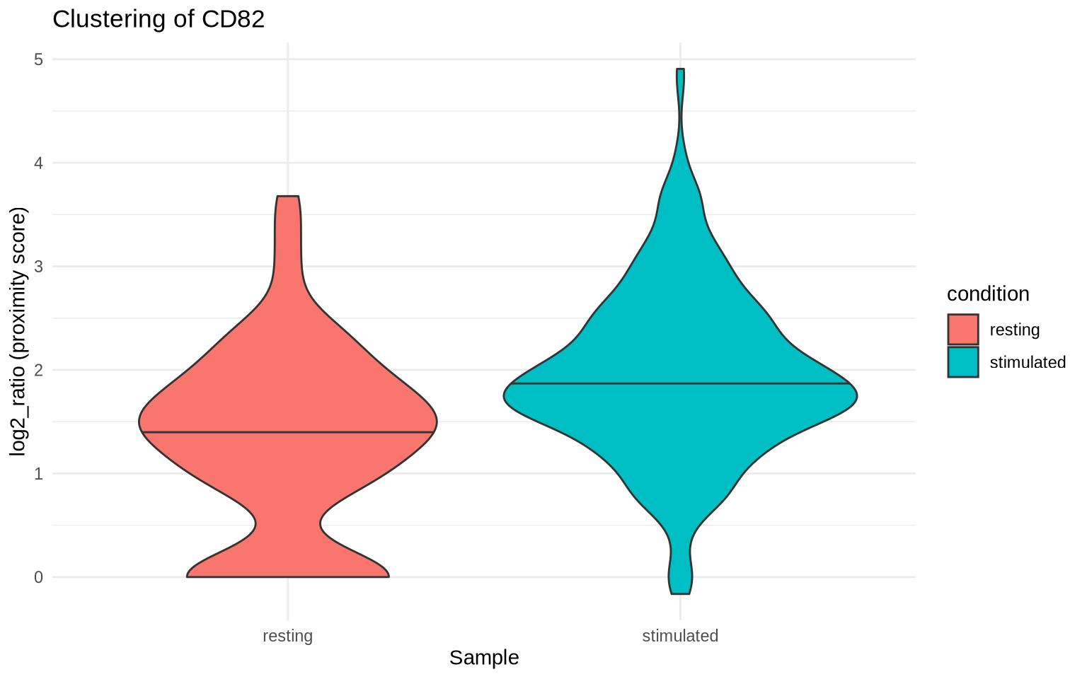
In the previous tutorial, we saw that CD82 was clustered on CD8 T cells
both in PHA-stimulated and resting CD8 T cells and that the degree of
clustering was higher in the PHA-stimulated condition. Let’s start by
visualizing the log2_ratio scores for CD82 in the CD8 T cell
populations in our two conditions.
Note that a log2_ratio of 1 indicates that there are twice (2^1) as
many CD82/CD82 pairs as expected by chance, a log2_ratio of 2
indicates that there four times (2^2) as many CD82/CD82 pairs as
expected by chance, and so on.
# Fetch colocalization scores from Seurat object
clustering_scores <- ProximityScores(
  pg_data_combined,
  meta_data_columns = c("condition", "cell_type"),
  add_marker_counts = TRUE
) %>%
  filter(cell_type == "CD8 T cells") %>%
  # Remove colocalization pairs
  filter(marker_1 == marker_2)

clustering_scores %>%
  filter(marker_1 == "CD82") %>%
  ggplot(aes(condition, log2_ratio, fill = condition)) +
  geom_violin(draw_quantiles = 0.5) +
  theme_minimal() +
  labs(x = "Sample",
       y = "log2_ratio (proximity score)",
       title = "Clustering of CD82")
Component selection
Now we will select graph components (cells) with a high degree of CD82
clustering and visualize these. The plot below shows the relationship
between the number of CD82 molecules in a cell and the log2_ratio
score. Cells with high abundance and log2_ratio scores are typically
good candidates for visualization.
clustering_scores %>%
  filter(marker_1 == "CD82") %>%
  ggplot(aes(count_1, log2_ratio, color = condition)) +
  geom_density_2d() +
  geom_point() +
  scale_x_log10() +
  theme_minimal() +
  labs(x = "CD82 count",
       y = "log2_ratio (proximity score)",
       title = "Proximity score vs abundance levels for CD82 in CD8 T cells")
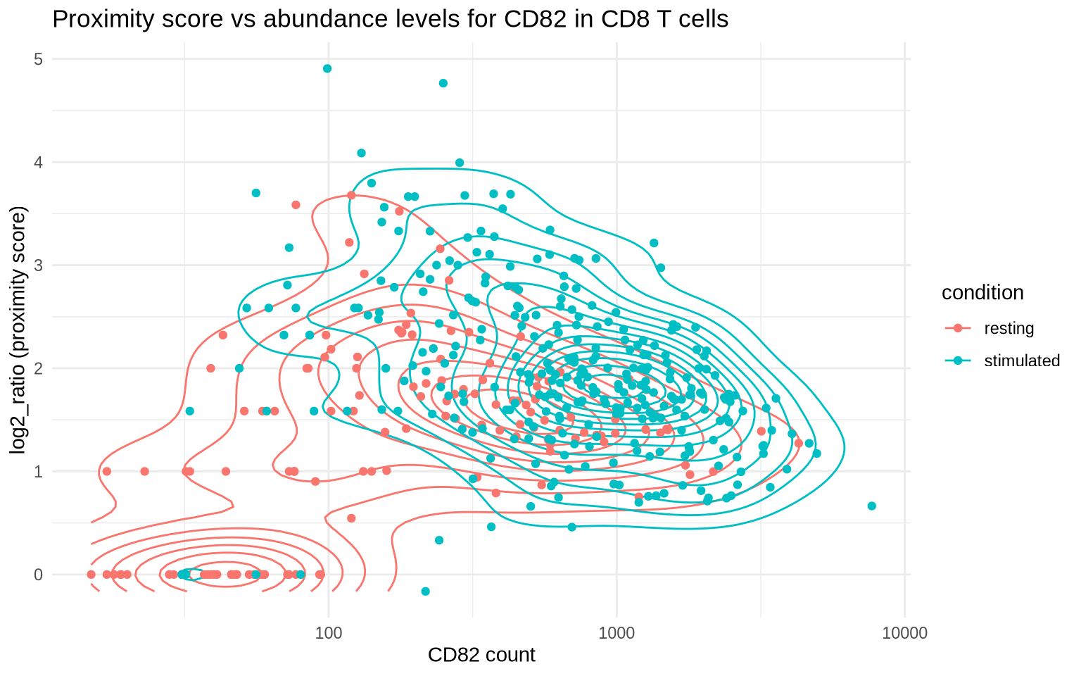
Let’s select cells with more than 500 CD82 molecules to ensure that
there’s a large number of molecules to show in our visualizations. Cells
with a low abundance of CD82 molecules are probably poor candidates for
visualization since the distribution of CD82 will be very sparse. After
filtering, we pick the two cells with the highest log2_ratio and the
two cells with the lowest log2_ratio for reference.
plot_components <-
  clustering_scores %>%
  filter(marker_1 == "CD82") %>%
  group_by(condition) %>%
  arrange(-log2_ratio) %>%
  filter(between(count_1, 500, Inf)) %>%
  group_by(condition) %>%
  # Keep the 2 with highest and lowest scores per sample
  filter(row_number() %in% 1:2 | rev(row_number()) %in% 1:2) %>%
  select(condition, component, marker_1, marker_2, log2_ratio)

plot_components
# A tibble: 8 × 5
# Groups:   condition [2]
  condition  component                   marker_1 marker_2 log2_ratio
  <chr>      <chr>                       <chr>    <chr>         <dbl>
1 stimulated stimulated_3dd9036bf397f790 CD82     CD82          3.10
2 stimulated stimulated_49f7c5a625f08100 CD82     CD82          3.07
3 resting    resting_7ed4f66abd4d1048    CD82     CD82          2.43
4 resting    resting_c1764be92d311044    CD82     CD82          2.10
5 resting    resting_07f696ce95cc9fe4    CD82     CD82          0.753
6 resting    resting_617840edd58dd8b3    CD82     CD82          0.747
7 stimulated stimulated_a8ddcd10a548f075 CD82     CD82          0.459
8 stimulated stimulated_236aea79019891ab CD82     CD82          0.264
2D cell visualization
Now that we have selected some cells of interest, we can proceed with the single-cell visualization.
Load graphs
Before we can visualize the
layouts for our
cells, we need to load their graphs into our Seurat object with the
LoadCellGraphs method.
Note that
LoadCellGraphscreates the component (cell) graphs from the edgelist stored in the PXL file(s). Thus, it is crucial that the paths to the PXL files are correct and that the PXL files contain the correct data. If you have loaded the Seurat object from an RDS file, now is the time to ensure that the PXL files are in the right location. We can use theFSMapgetter function to check the paths to the PXL files:
FSMap(pg_data_combined)
If the paths are incorrect, we can use the
FSMap<-setter method to update them.
# Example of how to update the PXL file paths if the
# files have been moved
corrected_pxl_paths <- c(
  "path/to/file1.pxl",
  "path/to/file1.pxl"
)
FSMap(pg_data_combined) <- FSMap(pg_data_combined) %>%
  mutate(pxl_file = corrected_pxl_paths)
When we call LoadCellGraphs, we can decide exactly what components to
load (cells = ...). Here, we will load the component graph fro the
cell with the highest CD82 log2_ratio and set add_layouts = TRUE.
Since our PXL files contain pre-computed layouts, we can load these
along with the cell graphs. Otherwise, we would need to compute these
with the ComputeLayout method which is significantly slower.
pg_data_combined <- pg_data_combined %>%
  LoadCellGraphs(cells = "stimulated_0781d5b4dfa3b62a", add_layouts = TRUE)
Once our component graph has been loaded, we can access the graph data
using the CellGraphs method. CellGraphs returns a list with one
element per cell. Component graphs that have not been loaded yet will
have a NULL value in the list. Each loaded component graph is stored
in a CellGraph object that contains a graph, a node count matrix and
an optional slot with layouts:
CellGraphs(pg_data_combined)[[plot_components$component[1]]]
NULL
Our selected component graph has 87243 nodes, 162079 edges and the
associated node count matrix contains values for 158 proteins. The
CellGraph object also contains a pre-computed 3D layout called
wpmds_3d. In this tutorial, we will focus on 2D visualizations and
even though this layout is 3D, we can still visualize it in 2D by
selecting x and y coordinates. This will be equivalent to visualizing
the 3D layout from a fixed point of view while ignoring the depth (third
coordinate axis).
As mentioned before, LoadCellGraphs fetches the graph data from the
edgelist(s) in the PXL file(s) stored on disk, and returns a graph
representation of our selected component stored in memory in the Seurat
object. If we were to export this Seurat object to an RDS file, the
component graph that we just loaded would also be saved and we no longer
need the PXL file to access it. We can of course load all component
graphs in the Seurat object, but they are quite large and we rarely need
to load more than a few for visualization. For this reason, we recommend
carefully selecting components of interest to load.
If you want to remove the loaded component graph from the Seurat object,
you can use the RemoveCellGraphs method. This can be useful if you
want to free up memory or if you just need to reload the graph with
different parameters.
Compute layouts
If we do not have access to pre-computed layouts, we can generate them
using the ComputeLayout method. ComputeLayout will check what
components have been loaded and compute a layout for each of these
components. All we need to do is to specify the layout method we want to
use.
pg_data_combined <- pg_data_combined %>%
  ComputeLayout(layout_method = "wpmds")
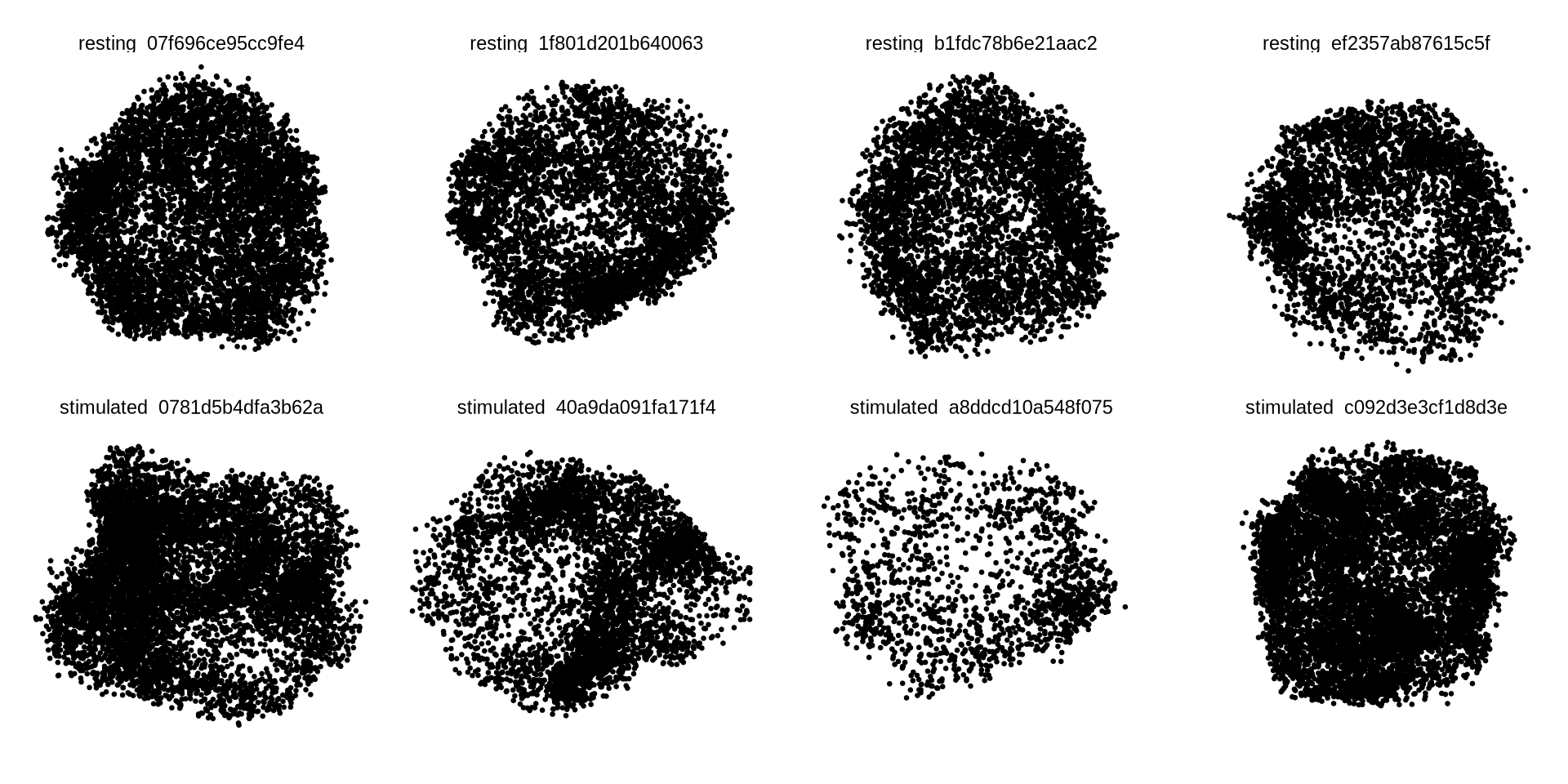
Now, let’s load the graph components for the cells that we picked out
earlier (plot_components). To get a quick 2D visualization of the
layouts, we will fetch the layouts, normalize the layout coordinates to
have roughly the same radius and plot them in a grid. Graph components
typically have tens of thousands of nodes, so we will only sample 10% of
the nodes for this visualization.
pg_data_combined <- pg_data_combined %>%
  LoadCellGraphs(cells = plot_components$component, add_layouts = TRUE, verbose = FALSE)

cg_list <- CellGraphs(pg_data_combined)[plot_components$component]

# Combine layout data from all components into a single dataframe
xyz_all <- lapply(names(cg_list), function(name) {
  CellGraphData(cg_list[[name]], "layout")$wpmds_3d %>%
    normalize_layout_coordinates() %>%
    mutate(component = name) %>% # Add component name as a column
    # Sample 10% of rows randomly for each component
    slice_sample(prop = 0.1)
}) %>%
  bind_rows()

ggplot(xyz_all, aes(x, y)) +
  geom_point(size = 0.5) +
  coord_fixed() +
  theme_void() +
  facet_wrap( ~component, ncol = 4)
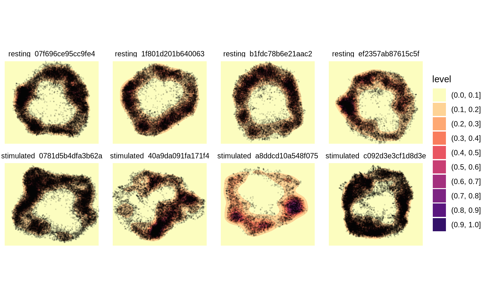
In 2D, it’s quite difficult to see if layouts correspond to a cell surface or just a random distribution of points. Let’s cut a slice from each 3D layout to demonstrate that the layouts are indeed empty in the middle. The code below will select points located within the 35th and 65th percentile of the z coordinate. In other words we cut off the front and back parts of the layout to select a “donut” shape.
xyz_all_slices <- lapply(names(cg_list), function(name) {
  CellGraphData(cg_list[[name]], "layout")$wpmds_3d %>%
    normalize_layout_coordinates() %>%
    mutate(component = name) %>%
    filter(between(z, quantile(z, 0.35), quantile(z, 0.65)))
}) %>%
  bind_rows()

ggplot(xyz_all_slices, aes(x, y)) +
  geom_point(size = 0.5) +
  coord_fixed() +
  theme_void() +
  facet_wrap( ~component, ncol = 4)
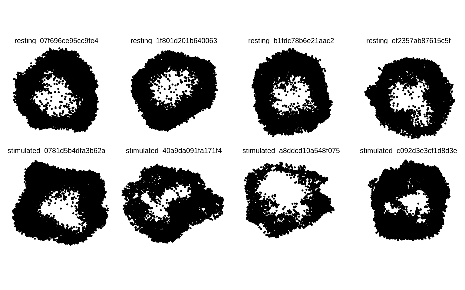
A component graph is a complex data structure which contains noise. Graph drawing is a challenging problem and some amount of distortion is expected, especially if the component graphs have low connectivity. The layouts should be thought of as abstract representations of cells and not exact reconstructions. That being said, for high quality component graphs, most of the nodes are typically aggregated in 3D space to form a continuous surface.
ggplot(xyz_all_slices, aes(x, y)) +
  geom_density_2d_filled() +
  geom_point(size = 0.2, alpha = 0.1) +
  coord_fixed() +
  theme_void() +
  facet_wrap( ~component, ncol = 4) +
  scale_fill_manual(values = viridis::magma(n = 12, direction = -1))
Now, let’s visualize the abundance of some selected proteins on a component graph layout. Our selected cells are CD8 T cells and should therefore be positive for CD2 and CD8. If we pick a cell with a strong CD82 clustering, we will hopefully see a polarization pattern in the layout. We have also seen that CD82 often colocalize with CD81, so let’s add this protein to the mix to see if we can also observe a CD81/CD82 colocalization pattern.
Note that clustering does not indicate polarization. Many proteins are clustered locally in many different locations on the cell membrane.
p1 <- Plot2DGraph(pg_data_combined, cells = plot_components$component[1], marker = "CD2")
p2 <- Plot2DGraph(pg_data_combined, cells = plot_components$component[1], marker = "CD8")
p3 <- Plot2DGraph(pg_data_combined, cells = plot_components$component[1], marker = "CD82")
p4 <- Plot2DGraph(pg_data_combined, cells = plot_components$component[1], marker = "CD81")
wrap_plots(p1, p2, p3, p4)
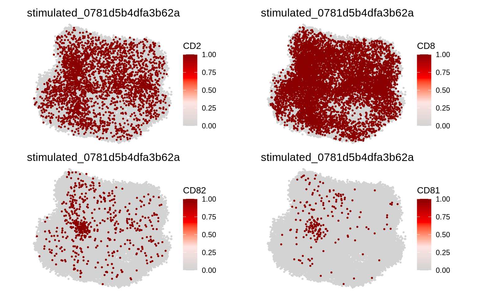
Indeed, CD3e and CD8 are expressed all over the cell surface whereas CD82 and CD81 are clustered on the middle left part of the layout.
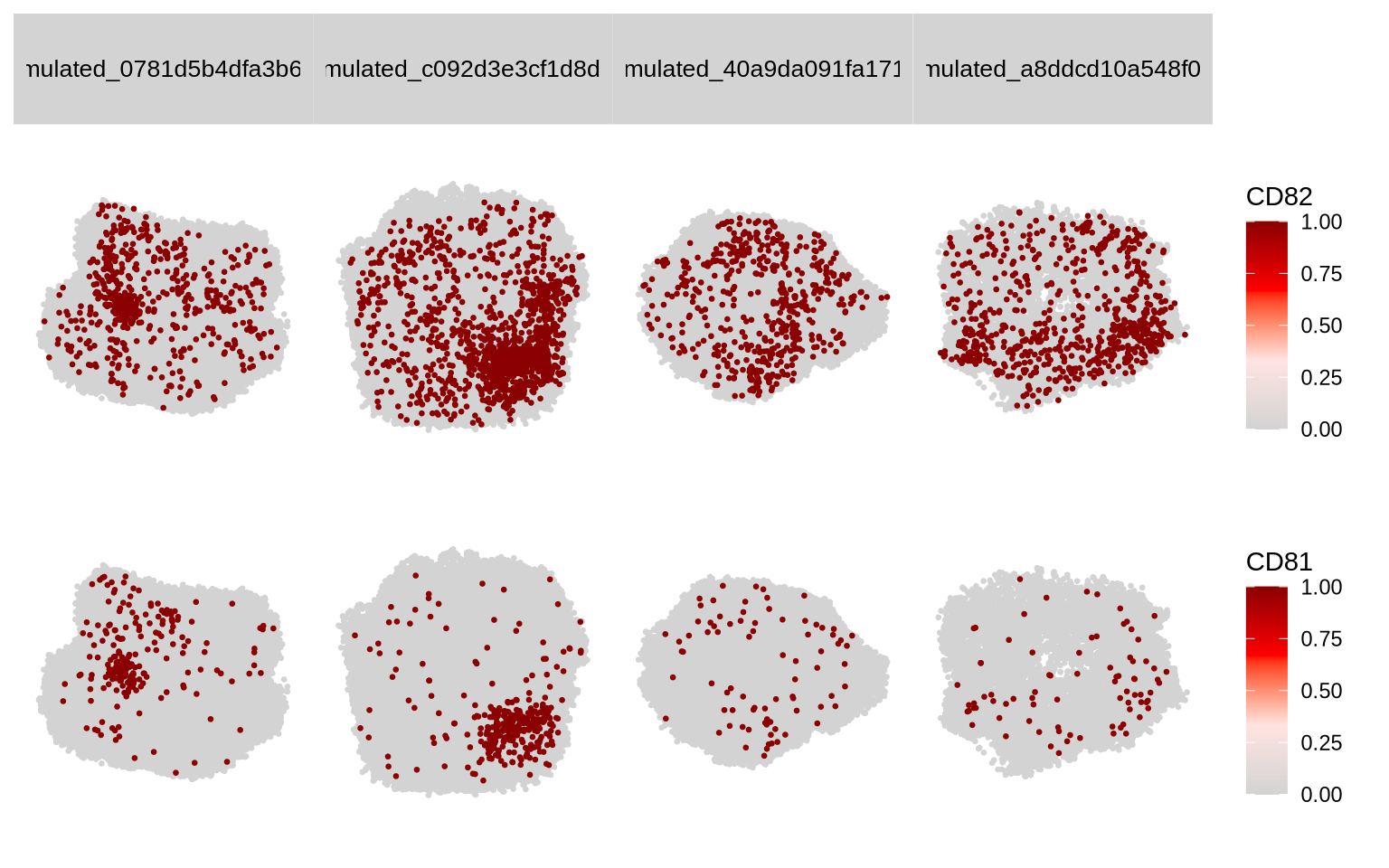
We can also plot multiple proteins and cells at once with Plot2DGraphM
(M for multiple). In our selected cells with a high degree of CD82
clustering (row 1, 2, 7 and 8 in plot_components), we can see that
CD82 and CD81 are colocalized in a single region in the PHA-stimulated
condition but less so in the resting condition. These few selected cells
are of course not representative of the entire CD8 T cell population,
but these visualizations can be useful to exemplify findings from global
(population-level) analyses.
Plot2DGraphM(pg_data_combined, cells = plot_components$component[c(1, 2, 7, 8)], markers = c("CD82", "CD81"))
3D cell visualization
We can also visualize component graphs as 3D scatter plots where each point corresponds to a protein. Just as in the 2D plots, we can color the points based on protein identity to see how it is distributed on the cell surface. However, now that we have a 3D layout, we get an interactive plot that we can rotate, pan and zoom.
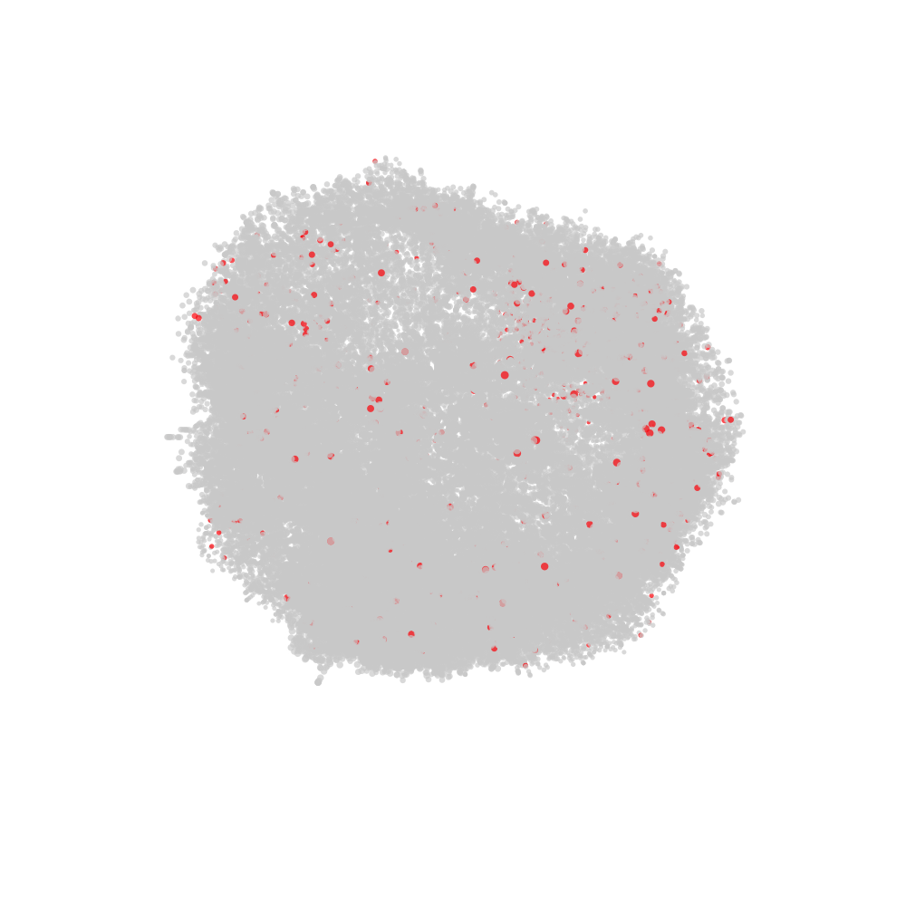
Let’s use the Plot3DGraph function to visualize CD2 on one of our CD8
T cells with a high degree of CD82 clustering. Note that Plot3DGraph
can only visualize one cell and one protein at the time. The resulting
plot is a plotly object that we can manipulate further.
Plot3DGraph(pg_data_combined, cell_id = plot_components$component[2], marker = "CD2", layout_method = "wpmds_3d") %>%
  plotly::layout(scene = list(xaxis = list(title = "", showgrid = F, nticks = 0, showticklabels = F),
                      yaxis = list(title = "", showgrid = F, nticks = 0, showticklabels = F),
                      zaxis = list(title = "", showgrid = F, nticks = 0, showticklabels = F)))
As we saw in the 2D visualizations, CD2 is present all over the membrane as expected.
Let’s continue with CD82 which was clearly clustered in the 2D visualization.
Plot3DGraph(pg_data_combined, cell_id = plot_components$component[2], marker = "CD82", layout_method = "wpmds_3d") %>%
  plotly::layout(scene = list(xaxis = list(title = "", showgrid = F, nticks = 0, showticklabels = F),
                      yaxis = list(title = "", showgrid = F, nticks = 0, showticklabels = F),
                      zaxis = list(title = "", showgrid = F, nticks = 0, showticklabels = F)))
The CD82 polarization is clear when we spin the layout, but the 3D visualization tells a quite different story than the 2D visualization. Naturally, depending on the chosen viewing angle, the CD82 distribution is very different.
Visualizing protein colocalization
We recall from the previous tutorial that we saw CD81 and CD82 colocalizing in PHA stimulated CD8 T cells. If we plot CD81 on the same component layout, we can see that it’s clustered in the same region as CD82.
Plot3DGraph(pg_data_combined, cell_id = plot_components$component[2], marker = "CD81", layout_method = "wpmds_3d") %>%
  plotly::layout(scene = list(xaxis = list(title = "", showgrid = F, nticks = 0, showticklabels = F),
                      yaxis = list(title = "", showgrid = F, nticks = 0, showticklabels = F),
                      zaxis = list(title = "", showgrid = F, nticks = 0, showticklabels = F)))
Export animation
pixelatorR also offers an experimental function to animate and export
3D layouts. For this to work, we need to construct a tibble with the x,
y, z coordinates and a “node_val” column that will be used for coloring
the nodes in the animation.
Below are some useful tips for creating good animations:
-
The file extension determines the video format. The default, “.gif”, requires the
gifskiR package to be installed. GIFs are generally good for low resolution content and are supported by most presentation software. For higher resolution content, consider using “.mp4” or “.webm” formats. All other video formats except for GIF require theavR package to be installed. -
GIF is not optimal for high resolution content as the resulting videos tend to become very large.
-
The
max_degreeparameter controls how much the layout is rotated around the z axis. A value of 360 corresponds to a full rotation. You can set this to a lower value to create a partial rotation and significantly reduce the file size. -
The
framesparameter controls how many frames are rendered in the animation. More frames will result in a smoother animation, but will also increase the file size. -
The
delayparameter controls the delay between frames in milliseconds. A lower value will result in a faster rotation. -
The
widthandheightparameters control the size of the output video. The default is 500x500 pixels, which is suitable for low resolution videos. If you increase the size, you might want to increase the resolution as well using theresparameter. -
Rendering can take quite some time. The
show_first_frameparameter (TRUE by default) shows the first frame and lets the user decide whether to continue rendering the full animation. This is useful when defining the graphical parameters. -
Install the
raggR package for faster rendering.
Here, we will only plot a single cell layout, but it is possible to
include multiple cell layouts and multiple markers in the same
animation. Please see the function documentation for more details
(?render_rotating_layout). In the animation below, we will color nodes
labelled with CD82 in red and all other nodes in grey.
# Fetch CellGraph object for selected cell
cg <- CellGraphs(pg_data_combined)[[plot_components$component[2]]]

# Create a tibble with x, y, z coordinates and a "node_val" column
# for plotting
xyz <- cg@layout$wpmds_3d %>%
  mutate(node_val = cg@counts[, "CD82"])

# Output file path for the animation
output_file <- "cd82_3d_animation.gif"

# Render the rotating layout and save as a GIF
render_rotating_layout(
  data = xyz,
  file = output_file,
  max_degree = 180,
  frames = 200,
  show_first_frame = FALSE,
  colors = c("lightgrey", "red"),
  width = 1e3,
  height = 1e3
)
Now we can open the file in a web browser or any other video player.
Summary
In this tutorial, we learned how to select cells based on a high degree of clustering of CD82 and visualized these using pre-computed layouts. While these 2D visualizations can be useful, they are greatly over-simplified projections of 3D structures.
Those who are familiar with dimensionality reduction techniques such as UMAP and t-SNE have probably noticed that adding a third dimension can reveal patterns and relationships that are hidden in 2D. Still, 3D plots are rarely suitable to include in printed material such as publications and presentation slides since they can be much more difficult to interpret and requires a fixed perspective. Cells are clearly 3D structures, so we need to be mindful about the fact that these plots are simplified representations.
With that being said, if we want to show the full complexity of the intricate patterns of proteins on the cell membrane, we need to visualize the component graphs in 3D.