Cell Visualization
In this tutorial, we will make visualization of the graph components that constitute cells in MPX data.
After completing this tutorial, you will be able to:
- Select components of interest: Based on colocalization scores or other metrics, choose cells with potential uropods or other features of interest.
- Visualize individual cell graphs: Convert the bipartite graph of a component to a layout using networkx or igraph. Color nodes based on pixel type (A or B) or other attributes.
- Visualize multiple components and markers: Calculate layouts, visualize marker abundance on each node (UPIA) using color scales.
- Visualize marker detection: Color nodes based on whether specific markers were detected or not.
Setup
import matplotlib.pyplot as plt
import numpy as np
from pathlib import Path
import pandas as pd
from pixelator import read, simple_aggregate
from pixelator.plot import plot_2d_graph
import seaborn as sns
import networkx as nx
DATA_DIR = Path("<path to the directory to save datasets to>")
Load data
In this tutorial we will continue with the stimulated T cell data that we analyzed in the previous tutorial Spatial Analysis (Karlsson et al., Nature Methods 2024). There is no need to load the object again if you still have it in your workspace after running the previous tutorial.
pg_data_combined = read(DATA_DIR/ "uropod_spatial.pxl")

polarity_scores = pg_data_combined.polarization
colocalization_scores = pg_data_combined.colocalization
edgelist = pg_data_combined.edgelist
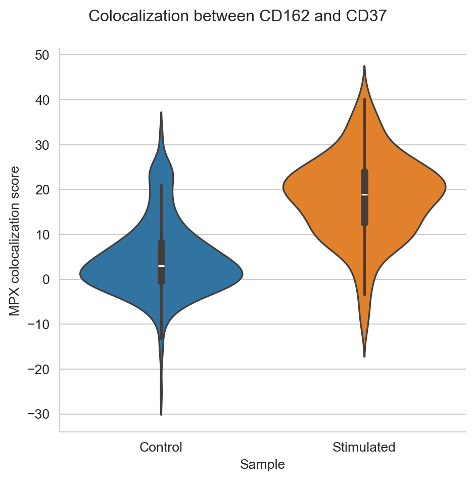
The data we are using constists of two samples; one control sample of unstimulated T cells, and one sample of T cells stimulated by CD54 immobilization and a chemokine to encourage cells to attain a migratory phenotype. In the previous tutorial, we found that many of the stimulated cells formed uropods, a bulge that helps the cell to migrate, through the increased colocalization of CD37, CD50, and CD162, along with the polarization of these and several other proteins.
colocalization_df = colocalization_scores[
    (colocalization_scores["marker_1"] == "CD162")
    & (colocalization_scores["marker_2"] == "CD37")
]


colocalization_plot = (
    sns.catplot(colocalization_df, kind="violin", x="sample", y="pearson_z", hue="sample")
    .set_xlabels("Sample")
    .set_ylabels("MPX colocalization score")
)


colocalization_plot.fig.subplots_adjust(top=0.9)
colocalization_plot.fig.suptitle("Colocalization between CD162 and CD37")
plt.show()

In this tutorial, we will try to select some components that have formed the uropod, as well as some that haven’t, and visualize these. Although many more cells seem to have formed uropods in the stimulated samples, it seems like there are also a few in the control sample. To get some examples, let’s select the cells with the highest colocalization of CD37 and CD162 from both the control and stimulated samples. Let’s also pick some cells with low colocalization between CD37 and CD162 to compare with. We will call the cells with high colocalization of CD37 and CD162 “Uropod”, while the ones with low colocalization score “No uropod”.
plot_components = colocalization_df.groupby(["sample"]).apply(
    lambda df: df.sort_values("pearson_z").pipe(
        lambda df: df.iloc[[0, 1, len(df) - 2, len(df) - 1]]
    )
)
plot_components["component_type"] = plot_components["pearson_z"].transform(
    lambda x: "Uropod" if x > 10 else "No uropod"
)

plot_components["component_number"] = np.int64(
    plot_components["component"].str.replace(r"RCVCMP(.*)_.*", r"\1", regex=True)
)
Visualize single cell graph components in 2D
To start with, let’s visualize single component. Each graph component corresponds to a cell, and is represented by a bipartite graph where nodes are UPIAs and UPIBs. The edges linking a UPIA node and a UPIB node correspond to antibody molecules that have been detected in the intersection of a specific pair of one A pixel (UPIA) and one B pixel (UPIB). MPX graph data is well represented by layouts such as the Fruchterman Reingold (fr), Kamada Kawai (kk) and pivot multi-dimensional scaling (pmds) as demonstrated here.
example_graph = pg_data_combined.graph(
    "RCVCMP0000318_Control", simplify=True, use_full_bipartite=True
)
fig, ax = plot_2d_graph(pg_data_combined, "RCVCMP0000318_Control", layout_algorithm="pmds", cmap= 'viridis')
plt.show()

These graph visualizations showcase the structure of the graph of a cell. If we now add the nodes (UPIA and UPIB), we see how the edges in the bipartite graph always connects one UPIA to one UPIB.
fig, ax = plot_2d_graph(pg_data_combined, "RCVCMP0000318_Control", layout_algorithm="pmds", show_b_nodes=True, show_edges=True, cmap= 'viridis')
plt.show()

Now, let’s calculate layouts in parallel for all components we picked. Here we only display the UPIA nodes.
from joblib import Parallel, delayed

def generate_2d_layout(component):
    graph = pg_data_combined.graph(component,
                       add_node_marker_counts=True,
                       simplify=True,
                       use_full_bipartite=True)
    data = graph.layout_coordinates("pmds",
                           only_keep_a_pixels=True,
                           get_node_marker_matrix=True)
    data["component"] = component
    return data

unique_components = plot_components["component"].unique()
res = Parallel()(delayed(generate_2d_layout)(component) for component in unique_components)

component_2d_layouts = pd.concat(res)
component_2d_layouts = component_2d_layouts.merge(
    plot_components[["component", "sample", "component_type", "component_number"]],
    on="component",
)
plot_component_names = plot_components["component"].unique()
fig, ax = plot_2d_graph(pg_data_combined, component=plot_component_names[:4], layout_algorithm="pmds", cmap= 'viridis')
fig.set_size_inches(15,4)

fig, ax = plot_2d_graph(pg_data_combined, component=plot_component_names[4:], layout_algorithm="pmds", cmap= 'viridis')
fig.set_size_inches(15,4)
plt.show()


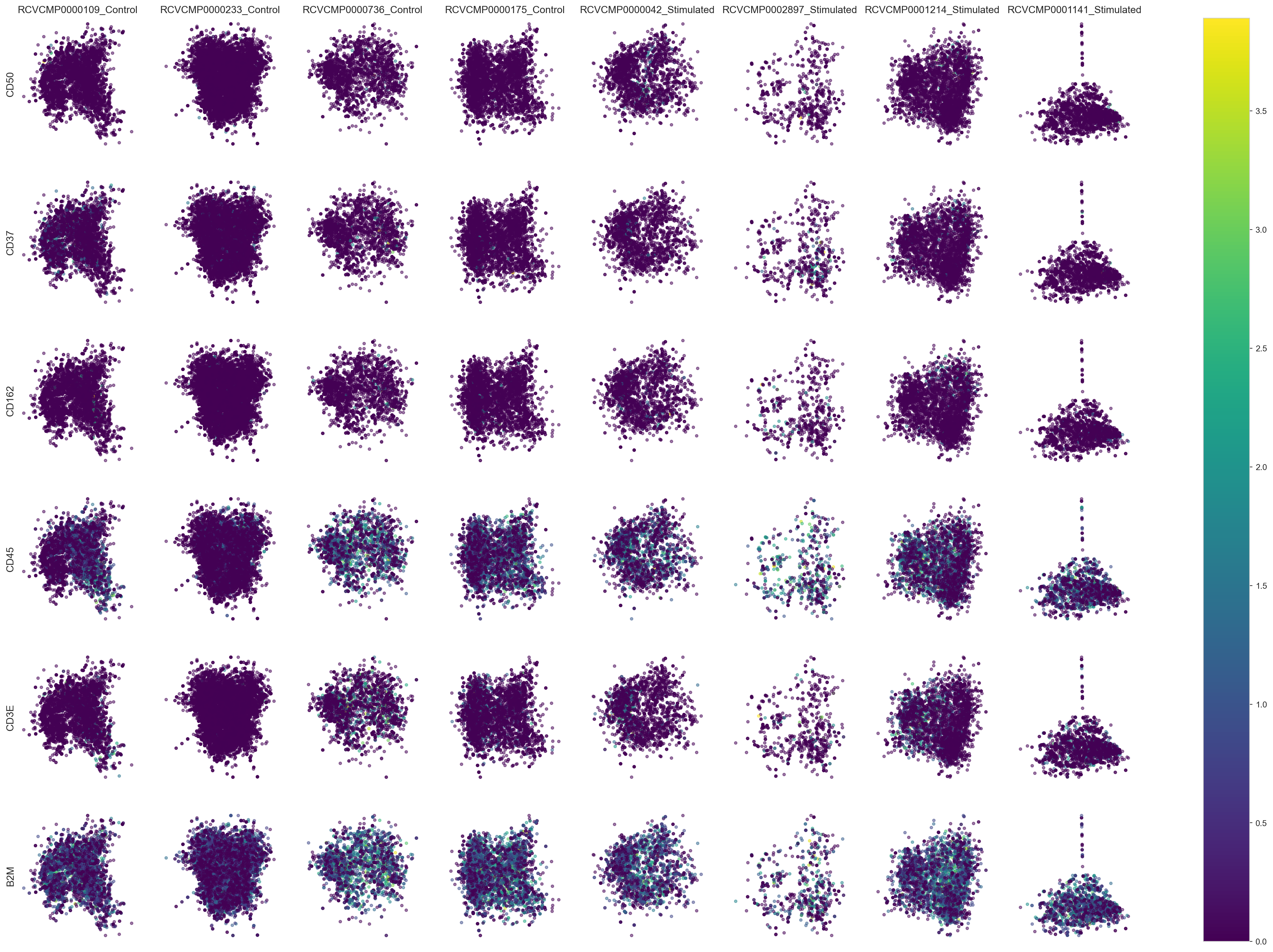
Now, let’s visualize the abundance of some markers within the
components. We will visualize the uropod markers CD37, CD50, and CD162,
as well as some background markers CD45, CD3E, and B2M. Here we simply
visualize the antibody count (log10(n + 1)) by coloring each UPIA by
the number of antibody molecules detected, scaled from minimum to
maximum per marker.
# We select the markers we are interested in plotting
plot_markers = ["CD50", "CD37", "CD162", "CD45", "CD3E", "B2M"]
fig, ax = plot_2d_graph(pg_data_combined, component=plot_component_names, marker=plot_markers, layout_algorithm="pmds", cmap="viridis")
fig.set_size_inches(30,20)
plt.show()

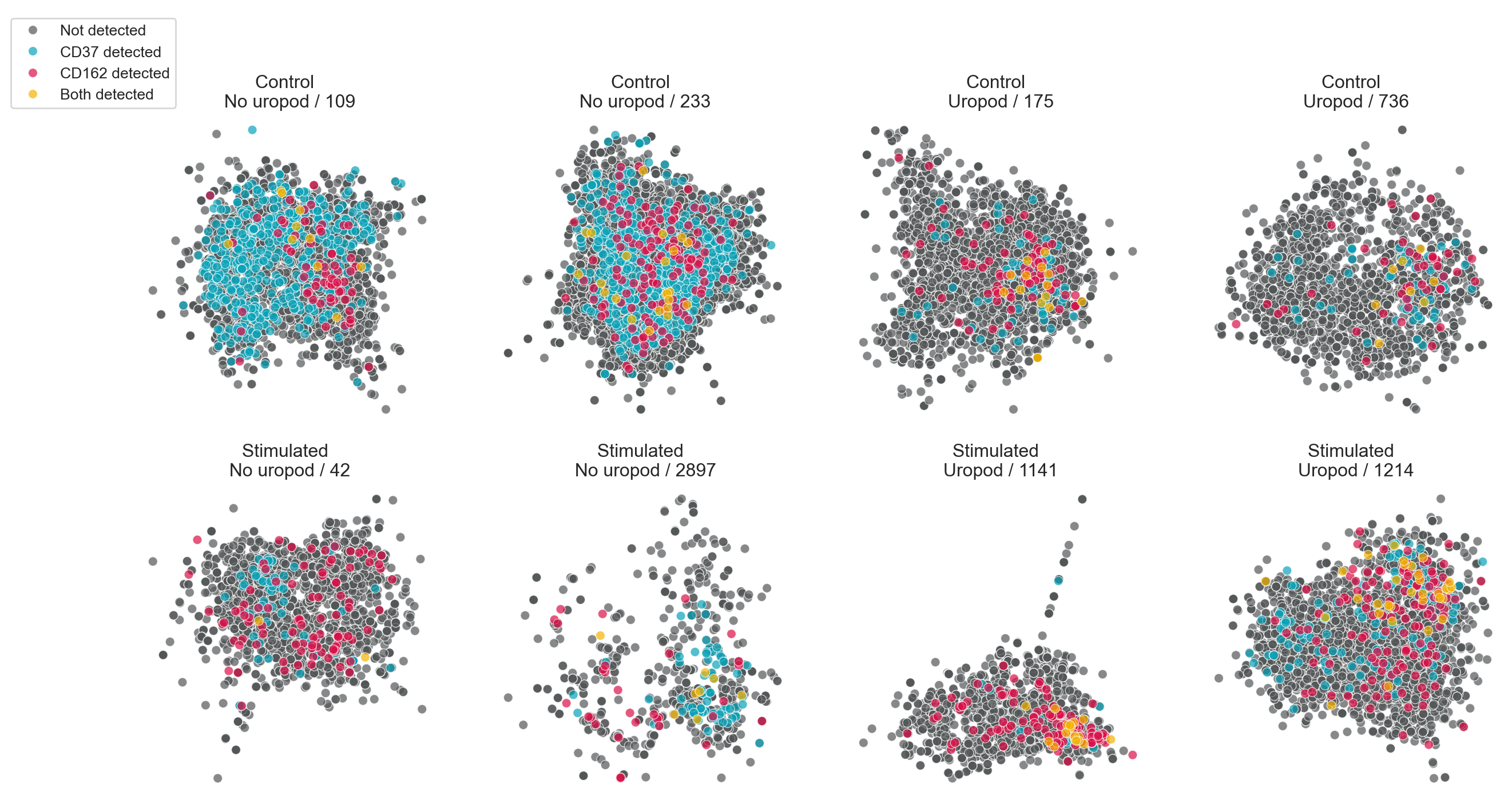
We can also visualize the distribution of a combination of markers. Here, we simply color UPIAs by whether CD50 and/or CD162 are detected.
# Build up a vector with information about which of CD50 and CD162 were detected
component_2d_layouts["detected"] = "Not detected"
component_2d_layouts["detected"][
    component_2d_layouts["CD37"].astype(bool)
] = "CD37 detected"
component_2d_layouts["detected"][
    component_2d_layouts["CD162"].astype(bool)
] = "CD162 detected"
component_2d_layouts["detected"][
    component_2d_layouts["CD37"].astype(bool)
    & component_2d_layouts["CD162"].astype(bool)
] = "Both detected"

# Sort the values to make sure that the high values end up on-top when overplottning
component_2d_layouts["detected"] = pd.Categorical(
    component_2d_layouts["detected"],
    categories=["Not detected", "CD37 detected", "CD162 detected", "Both detected"],
    ordered=True,
)
component_2d_layouts = component_2d_layouts.sort_values(
    ["sample", "component_number", "detected"]
)
# We use a custom palette here to make the detection status
# easier to see
palette = sns.color_palette(["#535657", "#0AA3B8", "#DB1048", "#F4B301"])
unique_sample_names = component_2d_layouts["sample"].unique()
unique_sample_names = component_2d_layouts["sample"].unique()
number_of_unique_components = component_2d_layouts.groupby(["sample"])[
    "component_number"
].nunique()[0]

fig, axes = plt.subplots(
    len(unique_sample_names),
    number_of_unique_components,
    sharex=False,
    sharey=False,
    figsize=(16, 8),
)
for row, sample_name in enumerate(unique_sample_names):
    for col, (col_name, df) in enumerate(
        component_2d_layouts[component_2d_layouts["sample"] == sample_name].groupby(
            ["component_type", "component_number"]
        )
    ):
        plot = sns.scatterplot(
            df,
            x="x",
            y="y",
            hue="detected",
            ax=axes[row, col],
            alpha=0.7,
            palette=palette,
            legend=True,
        ).set(
            yticks=[],
            xticks=[],
            xlabel="",
            ylabel="",
            title=f"{sample_name} \n {col_name[0]} / {col_name[1]}",
        )

# This a trick to give us a single legend for all the plots
# We pick one of the legends, save it and then remove all
# the individual legends.
# Finally we create an empty axes to place it in on the side.
handles, labels = fig.axes[0].get_legend_handles_labels()
for ax in fig.axes:
    ax.get_legend().remove()

cax = fig.add_axes([0.15, 0.1, 0, 0.9])
axis_off = cax.axis("off")
cax.legend(
    handles,
    labels,
)
sns.despine(fig=fig, top=True, right=True, left=True, bottom=True)

fig


In this tutorial we chose interesting cell components from our MPX data and created layouts depicting their spatial structure and marker abundance in 2D. While 2D visualizations give us valuable insights into the structure and composition of individual cell graphs, they lack the depth to represent the full complexity of the intricate patterns of proteins on the cell membrane.
If you are looking for that, jump to the 3d cell visualization tutorial to learn how to explore cell graphs in 3D in your favourite programming language.