Spatial Analyses
In this tutorial we will show you how you can analyze the spatial configuration of proteins on the cell surface of single cells, using PNA data.
Pixelator will generate a number of metrics from the graph structure inherent to the PNA data. In this tutorial we will show you how you can approach spatial analysis using the PNA proximity scores to get a deeper understanding of how proteins are organized on the cell surface.
After completing this tutorial, you will be able to:
-
Interact with PNA proximity scores to analyze protein clustering and colocalization on the cell surfaces.
-
Quantify changes in protein clustering: Utilize PNA proximity scores and differential tests to measure and compare protein clustering between conditions, revealing spatial rearrangements upon cellular stimulation.
-
Identify changes in protein colocalization: Conduct differential proximity analysis to pinpoint protein pairs with significant changes in co-occurrence across different samples, uncovering potential protein interactions under specific conditions.
-
Visualize and interpret data: Effectively communicate your findings through volcano plots and heatmaps for differential analyses.
Setup
library(pixelatorR)
library(dplyr)
library(tibble)
library(stringr)
library(ggrepel)
library(Seurat)
library(here)
library(pheatmap)
library(ggplot2)
library(tidygraph)
library(ggraph)
library(tidyr)
library(patchwork)
Load data
We begin by loading our resting PBMC and PHA-stimulated PBMC dataset from previous tutorials.
DATA_DIR <- "path/to/local/folder"
Sys.setenv("DATA_DIR" = DATA_DIR)
# Load the object that you saved in the previous tutorial. This is not needed if it is still in your workspace.
pg_data_combined <- readRDS(file.path(DATA_DIR, "combined_data_annotated.rds"))
pg_data_combined
An object of class Seurat
158 features across 1970 samples within 1 assay
Active assay: PNA (158 features, 158 variable features)
 3 layers present: counts, data, scale.data
 4 dimensional reductions calculated: pca, umap, harmony, harmony_umap
Obtaining proximity scores for target cells
Since T cells are the primary target of PHA, let us limit our analysis of spatial metrics to CD8 T cells. We use the cell types from the cell annotation tutorial.
pg_data_cd8 <- pg_data_combined %>%
  subset(cell_type == "CD8 T cells")
ProximityScores(pg_data_cd8) %>%
  head() %>%
  knitr::kable()
| marker_1 | marker_2 | join_count | join_count_expected_mean | join_count_expected_sd | join_count_z | join_count_p | log2_ratio | component |
|---|---|---|---|---|---|---|---|---|
| CD159a | CD159a | 7 | 6.36 | 2.4100798 | 0.2655514 | 0.3952924 | 0.1383282 | resting_d90fe9075bfcbf1a |
| CD159a | TCRab | 6 | 3.24 | 1.7298333 | 1.5955295 | 0.0552969 | 0.8889687 | resting_d90fe9075bfcbf1a |
| CD159a | CD28 | 1 | 0.37 | 0.6301355 | 0.6300000 | 0.2643473 | 0.0000000 | resting_d90fe9075bfcbf1a |
| CD159a | CD59 | 66 | 69.55 | 8.2943025 | -0.4280046 | 0.3343239 | -0.0755845 | resting_d90fe9075bfcbf1a |
| CD159a | CD45RB | 42 | 28.61 | 5.5284297 | 2.4220259 | 0.0077171 | 0.5538698 | resting_d90fe9075bfcbf1a |
| CD159a | KLRG1 | 2 | 3.74 | 2.1159328 | -0.8223323 | 0.2054439 | -0.9030383 | resting_d90fe9075bfcbf1a |
The measures in each row of the proximity scores’ table correspond to a protein pair (marker_1 and marker_2) in a given component. When marker_1 and marker_2 are the same, the measure indicates the clustering degree of that protein in the component; when they are different, the measure indicates the colocalization degree of those two proteins.
Proximity measures
When analyzing spatial proximity, we primarily examine two key values. First, “join_count_z” is a z-score indicating the statistical significance of the observed number of links between marker_1 and marker_2 antibodies compared to random expectation. A higher absolute z-score suggests a more significant deviation from chance, but it reflects significance, not the degree of proximity itself. Higher total counts can lead to higher z-scores even for similar proximity degrees. Second, “log2_ratio” represents the log2 of the ratio between observed and expected (by chance) edges between marker_1 and marker_2. This metric provides a more direct measure of the degree of proximity. Therefore, to answer questions like “Are these two proteins colocalized?” or “Is this protein significantly clustered?”, focus on the “join_count_z” value. For questions such as “Has this marker’s clustering increased after stimulation?”, the log2_ratio metric is more informative.
Filtering the low-abundance markers
Not all proteins will be expressed by every cell, i.e. some proteins might have very low abundance in some cells. For such proteins, the proximity scores should be excluded in the corresponding cells. Typically, filtration should be performed before spatial proximity analysis to reduce the potential noise from low abundance markers.
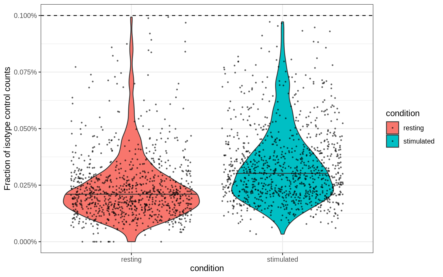
One strategy is to define the filter threshold based on the isotype control fraction. The isotype control fraction is the fraction of counts that are attributed to the isotype control antibody, which should not bind to any specific target. Any value lower than this threshold is considered noise and should be filtered out.
We can use the median isotype control fraction plus two median absolute deviations (MAD) as a cutoff. If the value is smaller than 0.001, we fall back to a threshold of 0.001 to make sure that the threshold is conservative.
isotype_control_fraction_cutoff <- median(pg_data_combined$isotype_fraction) + 2*mad(pg_data_combined$isotype_fraction)
isotype_control_fraction_cutoff <- max(isotype_control_fraction_cutoff, 0.001)

pg_data_combined[[]] %>%
  select(condition, isotype_fraction) %>%
  ggplot(aes(condition, isotype_fraction, fill = condition)) +
  geom_violin(draw_quantiles = 0.5) +
  geom_jitter(size = 0.4, alpha = 0.5) +
  theme_bw() +
  labs(y = "Fraction of isotype control counts") +
  scale_y_continuous(labels = scales::percent) +
  geom_hline(yintercept = isotype_control_fraction_cutoff, linetype = "dashed")
pixelatorR provides a method FilterProximityScores() to filter out
protein pairs based on a predefined isotype control fraction threshold.
To use this method, we need to set add_marker_proportions = TRUE when
fetching the proximity scores. This will create two new columns p1 and
p2 that represent the proportion of counts for marker_1 and marker_2
in the component. When we apply FilterProximityScores() with a
predefined isotype control fraction threshold, it will filter out any
protein pair where the minimum proportion is lower than the threshold.
As an example, if our isotype control fraction threshold is 0.001 and the component (cell) has 20,000 nodes, any protein pair where the minimum count is less than 0.001 * 20,000 = 20 will be filtered out.
filtered_cd8_proximity_scores <- ProximityScores(
  pg_data_cd8,
  meta_data_columns = "condition",
  add_marker_counts = TRUE,
  add_marker_proportions = TRUE
) %>%
  FilterProximityScores(background_threshold_pct = isotype_control_fraction_cutoff)
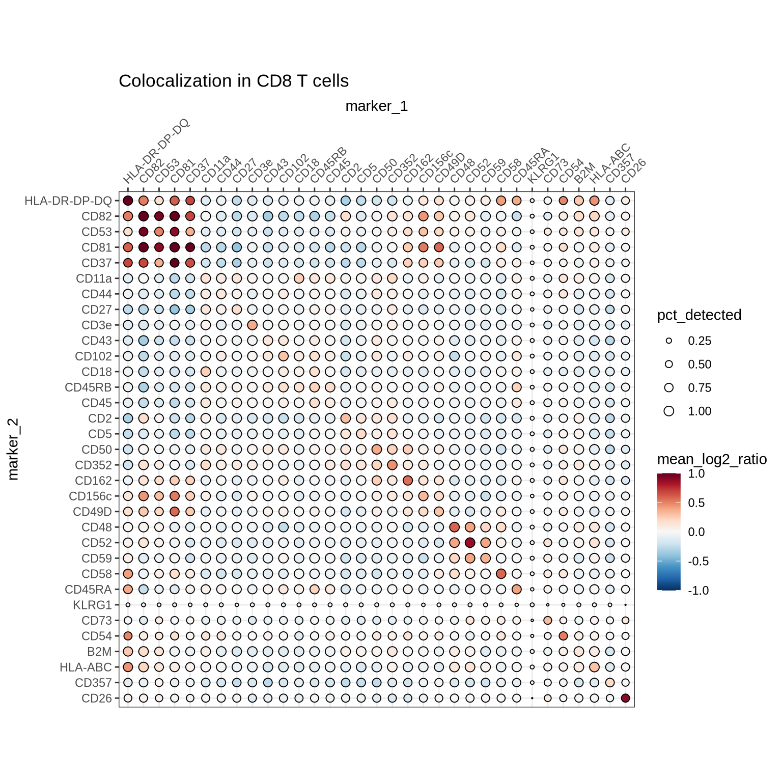
Proximity score profiling
We can now analyze the proximity profiles of the CD8 T cells. The
SummarizeProximityScores method can be used to compute various summary
statistics from a proximity score table. By default, it calculates the
mean log2 ratio while setting missing observations to 0. It also reports
the fraction of cells where the protein pair is detected, which is
useful for filtering and visualization.
Below we summarize the proximity scores for the CD8 T cells in each condition and visualize the results for the stimulated cells in a heatmap. Note that area of the dots are scaled by the fraction of cells where the pair is detected, which is useful for understanding if the pair is detected in the whole population or a fraction of it.
summarized_cd8_proximity_scores <- filtered_cd8_proximity_scores %>%
  SummarizeProximityScores(group_vars = "condition")

selected_markers <- summarized_cd8_proximity_scores %>%
  filter(pct_detected > 0.5) %>%
  arrange(desc(abs(mean_log2_ratio))) %>%
  slice_head(n = 60) %>%
  select(marker_1, marker_2) %>%
  unlist() %>%
  unique()

summarized_cd8_proximity_scores %>%
  filter(condition == "stimulated") %>%
  filter(marker_1 %in% selected_markers & marker_2 %in% selected_markers) %>%
  ColocalizationHeatmap(
    marker1_col = "marker_1",
    marker2_col = "marker_2",
    value_col = "mean_log2_ratio",
    size_col = "pct_detected",
    type = "dots",
    clustering_method = "ward.D2",
    legend_range = c(-1, 1)
  ) +
  ggtitle("Colocalization in CD8 T cells")
Clustering analysis
Let’s look at the significantly clustered proteins in each sample. We can get the protein clustering scores by filtering our summary table on rows where marker_1 = marker_2. We can also filter the table to include proteins with high average log2 ratio that are detected in a large fraction of cells. This will help us identify the most clustered proteins.
summarized_cd8_proximity_scores %>%
  filter(marker_1 == marker_2) %>%
  arrange(desc(mean_log2_ratio)) %>%
  filter(mean_log2_ratio > 0.3) %>%
  select(condition, marker_1, marker_2, pct_detected, mean_log2_ratio) %>%
  pivot_wider(
    names_from = condition,
    values_from = c(pct_detected, mean_log2_ratio)
  ) %>%
  filter(pmin(pct_detected_stimulated, pct_detected_resting) > 0.5) %>%
  head(n = 20) %>%
  knitr::kable()
| marker_1 | marker_2 | pct_detected_stimulated | pct_detected_resting | mean_log2_ratio_stimulated | mean_log2_ratio_resting |
|---|---|---|---|---|---|
| CD81 | CD81 | 0.9433333 | 0.9548872 | 2.1871674 | 1.3434804 |
| CD82 | CD82 | 0.9966667 | 0.9022556 | 1.9478403 | 1.2589974 |
| CD58 | CD58 | 0.9733333 | 0.6766917 | 0.5842796 | 0.9539350 |
| CD26 | CD26 | 0.6866667 | 0.6917293 | 0.9008568 | 0.6510591 |
| CD52 | CD52 | 1.0000000 | 1.0000000 | 0.8734878 | 0.5581848 |
| CD73 | CD73 | 0.6366667 | 0.6015038 | 0.3101712 | 0.5955602 |
| CD48 | CD48 | 1.0000000 | 1.0000000 | 0.5879279 | 0.3868075 |
| CD162 | CD162 | 0.9366667 | 1.0000000 | 0.5574287 | 0.3742704 |
| CD352 | CD352 | 0.9966667 | 1.0000000 | 0.4569454 | 0.3153525 |
| CD59 | CD59 | 1.0000000 | 1.0000000 | 0.3496422 | 0.4175179 |
| CD45RA | CD45RA | 0.9033333 | 0.8571429 | 0.4067486 | 0.3234783 |
| CD8 | CD8 | 0.9700000 | 0.9022556 | 0.3789417 | 0.3118179 |
| CD50 | CD50 | 1.0000000 | 1.0000000 | 0.3724110 | 0.3397555 |
| CD156c | CD156c | 0.9500000 | 0.9924812 | 0.3313496 | 0.3588284 |
Here, we can for example see that CD81 and CD82 clustering goes up after PHA stimulation.
Differential clustering analysis
Another question is whether we can observe an increase in clustering of any proteins upon stimulation. We already expect CD82 to be one of those but we recall that join_count_z is an indication of significance, so this time, we compare degrees of clustering using the log2_ratio.
test_results <- DifferentialProximityAnalysis(
  filtered_cd8_proximity_scores,
  metric_type = "self",
  target = "stimulated",
  reference = "resting",
  contrast_column = "condition",
  proximity_metric = "log2_ratio",
  min_n_obs = 25
)
# Visualize this in a volcano plot
test_results %>%
  left_join(
    summarized_cd8_proximity_scores,
    by = c("marker_1", "marker_2", "target" = "condition")
  ) %>%
  ggplot(aes(diff_median, -log10(p_adj), label = marker_1, color = mean_log2_ratio)) +
  geom_point() +
  geom_text_repel(max.overlaps = 5) +
  theme_minimal() +
  guides(color = guide_colorbar(title.position = "top")) +
  labs(x = "Difference in medians",
      y = expression(-log[10] ~ (adj. ~ p - value)),
      color = "Mean clustering\nafter stimulation") +
  geom_vline(xintercept = 0, linetype = "dashed")
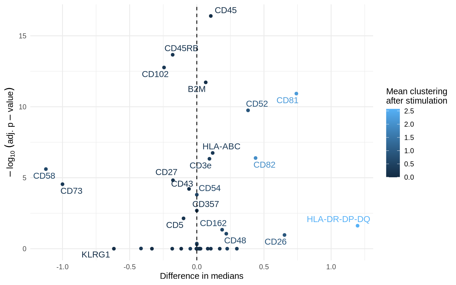
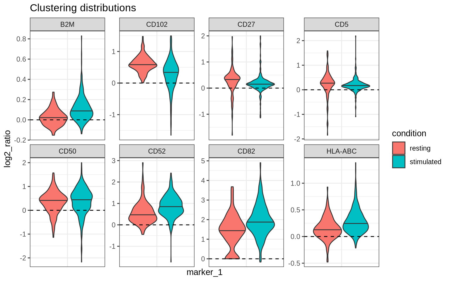
We see that CD82 and CD52 have indeed increased in clustering after PHA-stimulation as well as other markers including CD50, CD44, CD45, HLA-ABC, and B2M. We also see that CD5 and CD27 have decreased in clustering. Let us now look at the clustering distributions for these markers.
filtered_cd8_proximity_scores %>%
  filter(marker_1 == marker_2) %>%
  filter(marker_1 %in% c("CD50", "CD5", "CD27", "CD52", "CD82", "CD102", "HLA-ABC", "B2M")) %>%
  ggplot(aes(marker_1, log2_ratio, fill = condition)) +
  geom_violin(draw_quantiles = 0.5) +
  facet_wrap(~marker_1, scales = "free", ncol = 4) +
  theme_bw() +
  theme(axis.text.x = element_blank(), axis.ticks.x = element_blank()) +
  labs(title = "Clustering distributions") +
  geom_hline(yintercept = 0, linetype = "dashed", color = "black")
Colocalization analysis
Another aspect of spatial organization is whether pairs of proteins colocalize. So now, we focus on protein-pairs and their proximity scores. Here, we consider a protein pair to be significantly colocalized if it’s mean log2_ratio is above 0.3 and is detected in at least 80% of cells in both conditions.
summarized_cd8_proximity_scores %>%
  filter(marker_1 != marker_2) %>%
  arrange(desc(mean_log2_ratio)) %>%
  filter(mean_log2_ratio > 0.3) %>%
  select(condition, marker_1, marker_2, pct_detected, mean_log2_ratio) %>%
  pivot_wider(
    names_from = condition,
    values_from = c(pct_detected, mean_log2_ratio)
  ) %>%
  filter(pmin(pct_detected_stimulated, pct_detected_resting) > 0.8) %>%
  knitr::kable()
| marker_1 | marker_2 | pct_detected_stimulated | pct_detected_resting | mean_log2_ratio_stimulated | mean_log2_ratio_resting |
|---|---|---|---|---|---|
| CD81 | CD82 | 0.9400000 | 0.8646617 | 1.4792828 | 0.8732882 |
| CD49D | CD81 | 0.8600000 | 0.8947368 | 0.5777415 | 0.4261950 |
| CD156c | CD81 | 0.9033333 | 0.9473684 | 0.5251510 | 0.4516671 |
| CD156c | CD82 | 0.9466667 | 0.8947368 | 0.4439449 | 0.3406580 |
| CD52 | CD59 | 1.0000000 | 1.0000000 | 0.3937154 | 0.4334148 |
Here, we can for example see that CD52/CD59 have roughly the same colocalization strength in both unstimulated and PHA-stimulated CD8 T cells whereas CD81/D82 has a much higher colocalization score in PHA-stimulated CD8 T cells.
Given that there can be several colocalizing protein-pairs, a protein-pair graph illustration is one alternative for getting an overview of colocalization patterns in a sample. Below we use the same filtering procedure as above to filter for significant colocalization pairs.
markers_to_plot <- c("CD52", "CD59", "CD81", "CD82", "CD43", "CD44", "CD45", "CD45RA", "CD45RB", "CD8")

df_net <- summarized_cd8_proximity_scores %>%
  filter(marker_1 %in% markers_to_plot & marker_2 %in% markers_to_plot) %>%
  filter(abs(mean_log2_ratio) > 0.1 & pct_detected > 0.5) %>%
  mutate(from = marker_1, to = marker_2) %>%
  select(from, to, mean_log2_ratio, condition)

tidygraph::as_tbl_graph(df_net)  %>%
  ggraph(layout = "kk") +
  geom_edge_link(aes(color = mean_log2_ratio, width = abs(mean_log2_ratio))) +
  geom_node_label(aes(label = name), size = 2.5) +
  scale_edge_color_gradientn(
      colours = c("#1F395F", "#647DA3", "#BBC8DA",
                  "#FFFFFF", "#F0BCCD", "#BE5F7D",
                  "#781534"),
      limits = c(-abs(max(df_net$mean_log2_ratio)), abs(max(df_net$mean_log2_ratio)))
  ) +
  scale_x_continuous(expand = c(0.2, 0.2)) +
  scale_y_continuous(expand = c(0.2, 0.2)) +
  facet_edges(~condition, nrow = 1) +
  theme(aspect.ratio = 1,
      panel.background = element_rect(fill = "white", color = "black"),
      panel.spacing = unit(1, "lines")) +
  labs(edge_color = "Mean\nlog2 ratio") +
  guides(edge_width = "none")
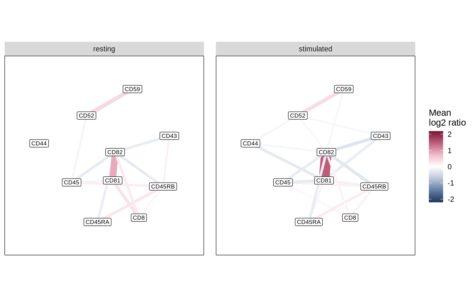
Keep in mind that the decision to remove protein pairs present in fewer cells should be guided by your experimental goals. If you aim to identify colocalization changes in rare cell subpopulations, retaining these pairs for downstream analysis might be crucial.
Differential colocalization analysis
Let’s run a differential colocalization test to find protein-pairs that differ significantly in proximity scores between conditions.
coloc_test_results <- DifferentialProximityAnalysis(
  filtered_cd8_proximity_scores,
  metric_type = "co",
  target = "stimulated",
  reference = "resting",
  contrast_column = "condition",
  proximity_metric = "log2_ratio",
  min_n_obs = 50
)
# Visualize this in a volcano plot
coloc_test_results %>%
  mutate(pair = paste0(marker_1, "/", marker_2)) %>%
  arrange(-diff_median) %>%
  mutate(label = case_when(
    row_number() %in% 1:5 ~ pair,
    row_number() %in% (n() - 4):n() ~ pair,
    TRUE ~ NA_character_
  )) %>%
  ggplot(aes(diff_median, -log10(p_adj), label = label)) +
  geom_point() +
  geom_text_repel(max.overlaps = 10) +
  theme_minimal() +
  guides(color = guide_colorbar(title.position = "top")) +
  labs(
      x = "Difference in medians",
      y = expression(-log[10] ~ (adj. ~ p - value))
  )
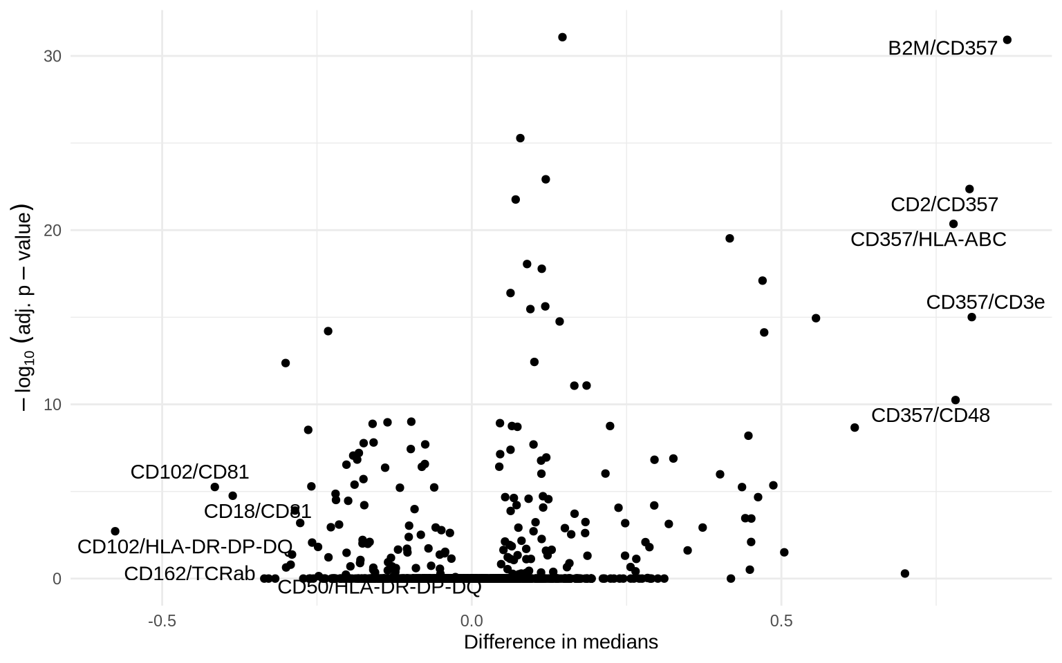
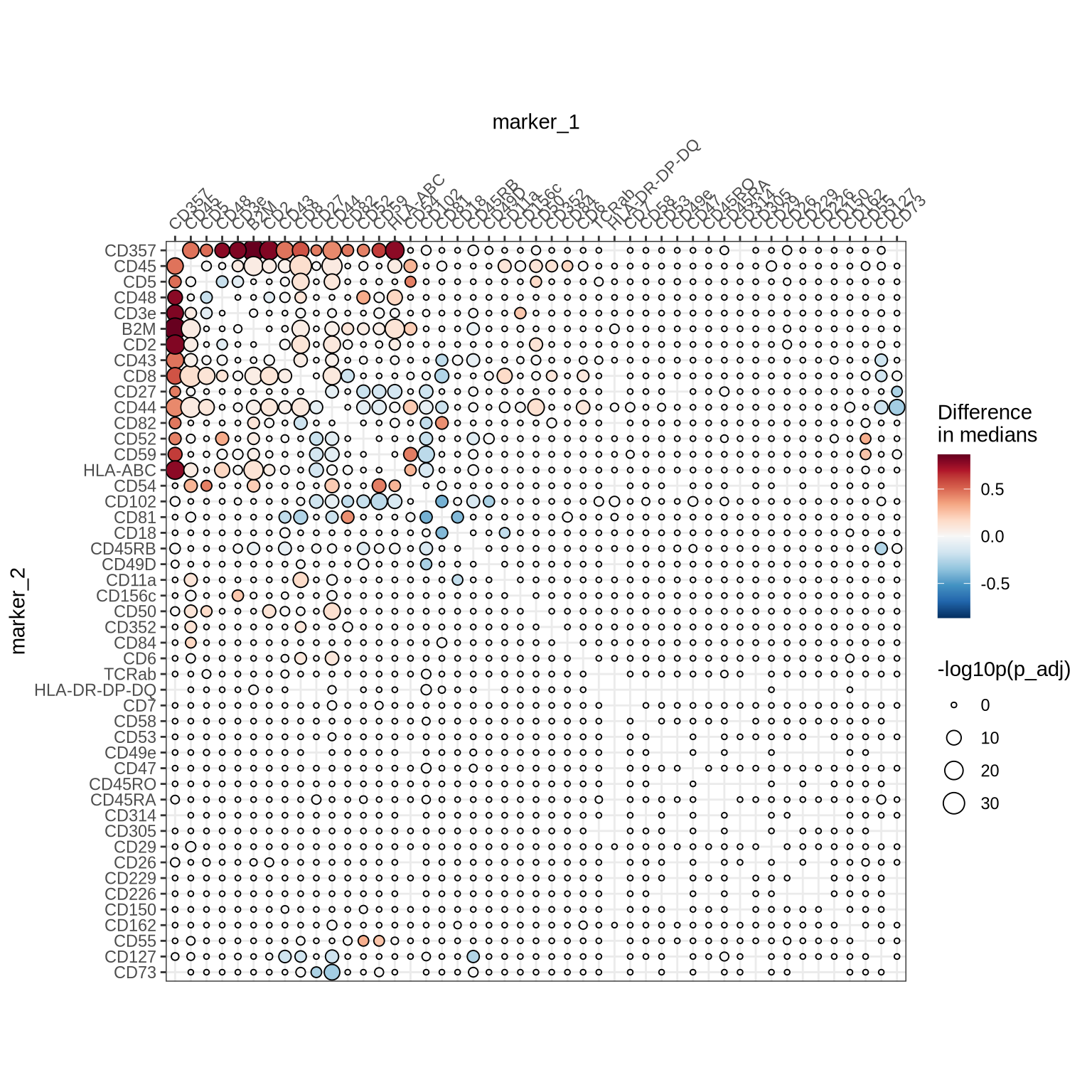
We observe several differentially colocalized protein pairs. Let us look at a clustered heatmap to get a better grasp of these protein pair colocalization patterns.
ColocalizationHeatmap(
  coloc_test_results %>%
    mutate(diff_median = case_when(
      p_adj < 0.001 ~ diff_median,
      TRUE ~ 0
    )),
  marker1_col = "marker_1",
  marker2_col = "marker_2",
  value_col = "diff_median",
  type = "dots",
  size_col_transform = \(x) {-log10(x)}
) &
  labs(size = "-log10p(p_adj)") &
  scale_size(range = c(1, 5), limits = c(0, max(-log10(coloc_test_results$p_adj)))) &
  labs(fill = "Difference\nin medians")
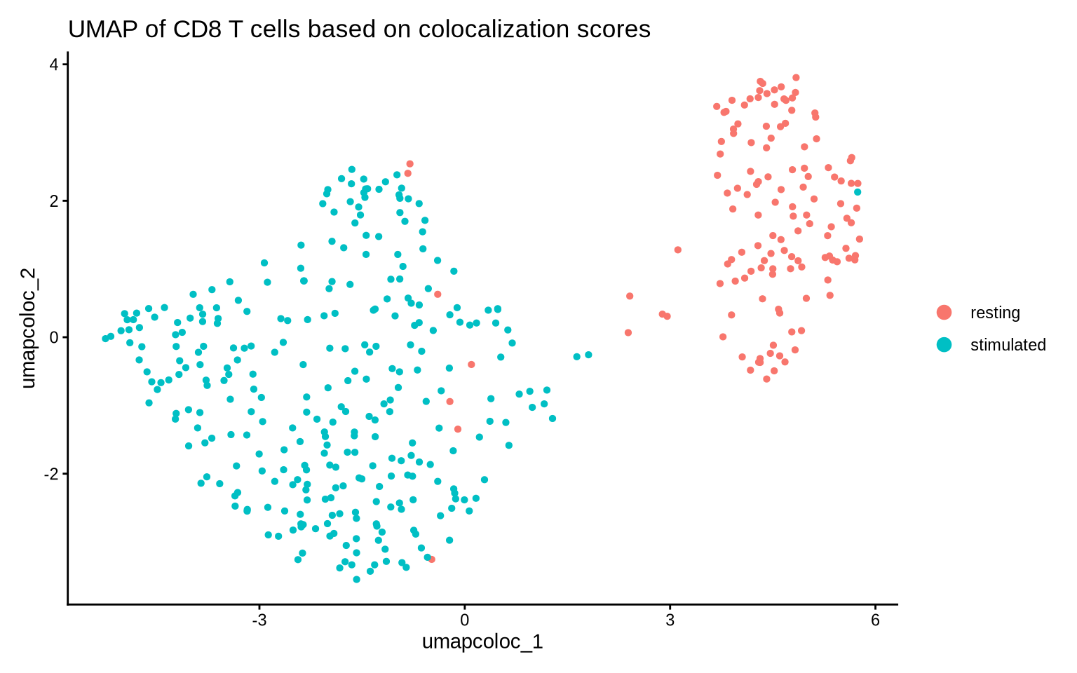
Now let’s take a holistic view of colocalization scores and make a UMAP. We will only include protein pairs that display a large difference in colocalization score between our two conditions.
# Make sure that we are using the correct assay
DefaultAssay(pg_data_cd8) <- "PNA"
# Convert colocalization table to a new assay
pg_data_cd8 <- ProximityScoresToAssay(pg_data_cd8, values_from = "log2_ratio", missing_obs = 0)
DefaultAssay(pg_data_cd8) <- "proximity"

# Filter test results to define pairs of interest
proteins_of_interest <- coloc_test_results %>%
  filter(p_adj < 0.01) %>%
  arrange(-diff_median) %>%
  select(marker_1, marker_2) %>%
  unlist() %>%
  unique()

# Find pairs of interest
pairs_of_interest <- coloc_test_results %>%
  select(marker_1, marker_2) %>%
  filter(
      marker_1 %in% proteins_of_interest &
      marker_2 %in% proteins_of_interest
  ) %>%
  tidyr::unite(marker_1, marker_2, col = "pairs", sep = "/") %>%
  pull(pairs)

# Set variable features
VariableFeatures(pg_data_cd8) <- pairs_of_interest

# Create UMAP
pg_data_cd8 <- pg_data_cd8 %>%
  ScaleData() %>%
  RunPCA(reduction.name = "pca_coloc") %>%
  RunUMAP(dims = 1:10, reduction = "pca_coloc", reduction.name = "umap_coloc")

# Plot
DimPlot(pg_data_cd8, group.by = "condition", reduction = "umap_coloc") +
    theme_classic() +
  labs(title = "UMAP of CD8 T cells based on colocalization scores")
Building upon the insights gained from Proximity Network Assay data analysis, we now turn our attention to the spatial organization of proteins on the cell surface and how their clustering and interactions vary across conditions. The next tutorial in this series introduces cell graph visualizations, an exciting method that allows us to visualize and intuitively understand the dynamic clustering of proteins, providing deeper insights into their roles in cellular function.