Differential Abundance
Having merged, normalized, integrated, and annotated the cell types in our dataset, we can now delve into more insightful analyses focused on the differences between our two conditions. While PNA data offers rich spatial information (to be explored in subsequent tutorials), here we will concentrate on the differential abundance of markers across these conditions.
After completing this tutorial, you should be able to:
- Identify changes in protein abundance levels across conditions within a specific cell type population.
- Visualize these changes effectively.
Setup
library(pixelatorR)
library(dplyr)
library(tibble)
library(stringr)
library(tidyr)
library(SeuratObject)
library(Seurat)
library(ggplot2)
library(here)
library(pheatmap)
Load data
To illustrate the differential abundance testing we continue with the annotated object that we created in the previous tutorial. As described before, this object contains two samples: resting PBMCs and PHA-stimulated PBMCs.
DATA_DIR <- "path/to/local/folder"
Sys.setenv("DATA_DIR" = DATA_DIR)
# Load the object that you saved in the previous tutorial. This is not needed if it is still in your workspace.
pg_data_combined <- readRDS(file.path(DATA_DIR, "combined_data_annotated.rds"))
pg_data_combined
An object of class Seurat
158 features across 1970 samples within 1 assay
Active assay: PNA (158 features, 158 variable features)
 3 layers present: counts, data, scale.data
 4 dimensional reductions calculated: pca, umap, harmony, harmony_umap
Differential Abundance in CD8 T cells
Given that PHA is a T cell mitogen, we will focus on its impact on protein abundance within T cells. Therefore, this tutorial will guide you through subsetting the data to isolate CD8 T cells and then performing a differential abundance test to compare protein levels between PHA-treated and resting cells.
Here we use the RunDAA function from the pixelatorR package to
perform differential abundance analysis. This function requires a
contrast_column that specifies the column in the metadata to be used
for the comparison, a targets character vector that indicates the
condition(s) of interest, and a reference column that indicates the
baseline condition.
# Caculate the difference in CLR value between stimulated and resting CD8 T cells
DAA <- pg_data_combined %>%
  subset(cell_type == "CD8 T cells") %>%
  RunDAA(
    contrast_column = "condition",
    targets = "stimulated",
    reference = "resting",
    mean_fxn = Matrix::rowMeans
  ) %>%
   arrange(-difference)

DAA %>% head() %>% knitr::kable()
| marker | p | p_adj | difference | pct_1 | pct_2 | target | reference |
|---|---|---|---|---|---|---|---|
| CD38 | 0 | 0 | 2.0831968 | 1.000 | 0.970 | stimulated | resting |
| CD366 | 0 | 0 | 1.2140906 | 0.997 | 0.925 | stimulated | resting |
| CD39 | 0 | 0 | 1.0913953 | 1.000 | 0.872 | stimulated | resting |
| CD25 | 0 | 0 | 1.0529318 | 1.000 | 0.850 | stimulated | resting |
| CD103 | 0 | 0 | 0.9334087 | 0.977 | 0.647 | stimulated | resting |
| CD37 | 0 | 0 | 0.8361905 | 0.997 | 1.000 | stimulated | resting |
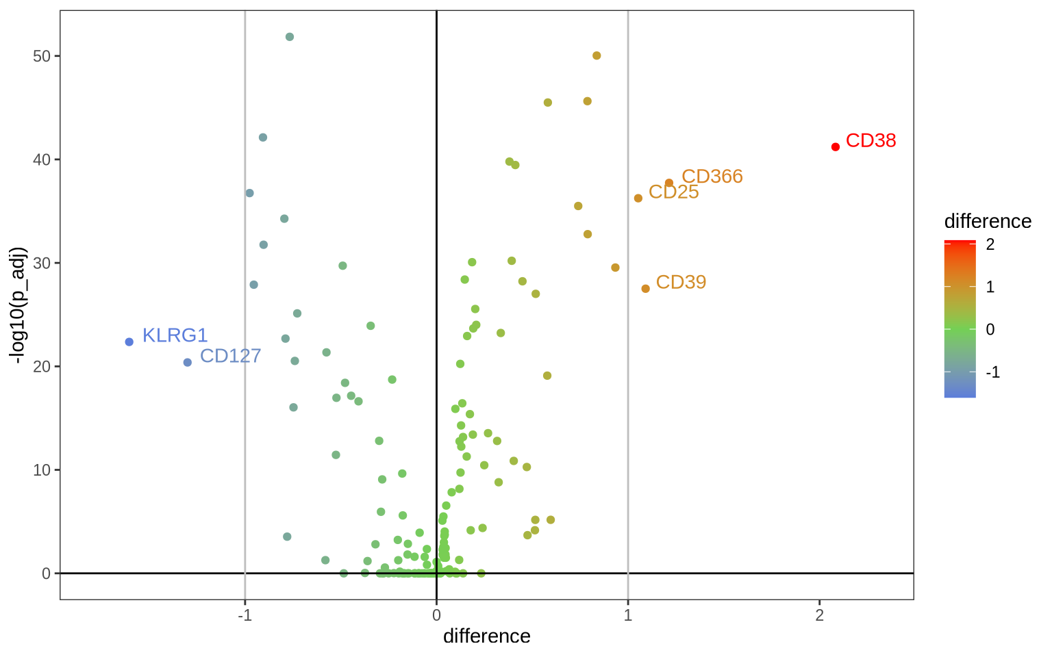
Let’s visualize these results as a volcano plot and label the most differentially abundant proteins.
ggplot(DAA, aes(x = difference, y = -log10(p_adj), color = difference)) +
    geom_point() +
    scale_color_gradient2(low = "#0066FFFF", mid = "#74D055FF", high = "#FF0000FF", midpoint = 0) +
    geom_hline(yintercept = 0) +
    geom_vline(xintercept = 0) +
    geom_vline(xintercept = c(-1, 1), col = "grey") +
    coord_cartesian(xlim = c(1.1 * min(DAA$difference), 1.1 * max(DAA$difference))) +
    theme_bw() +
    geom_text(aes(label = ifelse(abs(difference) > 1, as.character(marker), '')), hjust = -0.2, vjust = 0) +
    theme(panel.grid.minor = element_blank(),
            panel.grid.major = element_blank())
Alternatively, in a heatmap we can visualize the average normalized values in each of the four samples for the 10 most up-regulated and the 10 most down-regulated markers in PHA versus resting conditions.
# Select 20 most different markers
DA_markers <- DAA %>%
  arrange(-difference) %>%
  {
    rbind(head(., 10), tail(., 10))
  } %>%
  pull(marker)

# Visualize them in a heatmap of CLR values for the two conditions
FetchData(pg_data_combined, vars = c("condition", DA_markers), layer = "scale.data") %>%
    group_by(condition) %>%
    summarise_all(mean) %>%
    column_to_rownames("condition") %>%
    t() %>%
    pheatmap(cellwidth = 10, cellheight = 10, angle_col = 90)
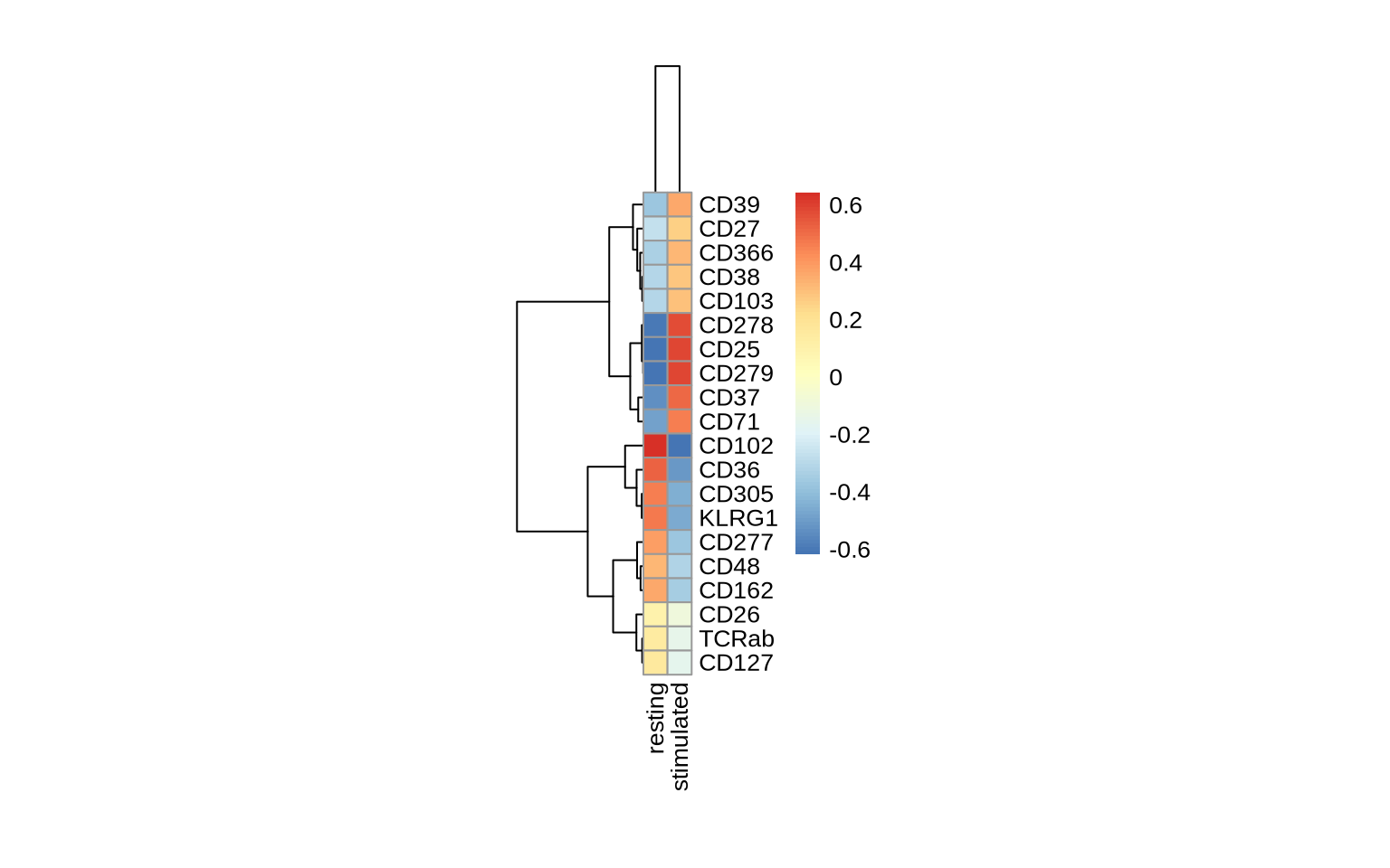
This example reveals a significant increase in the abundance of CD37, CD25, CD278, and CD279 upon PHA stimulation, while KLRG1 and CD305 show a significant decrease.
However, protein abundance is just one dimension of the rich data from PNA experiments. We are now poised to explore the spatial organization and interactions of proteins on the cell surface. The following tutorials will leverage the graph structure and spatial metrics inherent in PNA data to uncover the spatial biology of cells, examining protein clustering and colocalization patterns and their contributions to cell identity, signaling, and function.