Cell Annotation
This tutorial demonstrates key steps in analyzing cell populations within PNA data. We will cover normalization, scaling, dimensionality reduction, clustering, and differential abundance testing to identify cell annotations for each cluster.
After completing this tutorial, you should be able to:
- Cluster cells with a graph-based community-detection algorithm (Louvain) to identify groups of cells with similar abundance profiles.
- Identify cluster marker proteins through differential abundance analysis.
- Visually explore marker differences across clusters using heatmaps.
- Manually annotate cell type identities based on known marker expression patterns.
- Summarize cell type frequencies across experimental groups.
Setup
library(pixelatorR)
library(dplyr)
library(tibble)
library(stringr)
library(tidyr)
library(SeuratObject)
library(Seurat)
library(ggplot2)
library(here)
library(pheatmap)
Load data
To illustrate the annotation workflow we continue with the integrated object we created in the previous tutorial. As described before, this merged and harmonized object contains four samples: a resting and PHA stimulated PBMC sample, both in duplicate.
DATA_DIR <- "path/to/local/folder"
Sys.setenv("DATA_DIR" = DATA_DIR)
# Load the object that you saved in the previous tutorial. This is not needed if it is still in your workspace.
pg_data_combined <- readRDS(file.path(DATA_DIR, "combined_data_integrated.rds"))
pg_data_combined
An object of class Seurat
158 features across 1970 samples within 1 assay
Active assay: PNA (158 features, 158 variable features)
 3 layers present: counts, data, scale.data
 4 dimensional reductions calculated: pca, umap, harmony, harmony_umap
Clustering
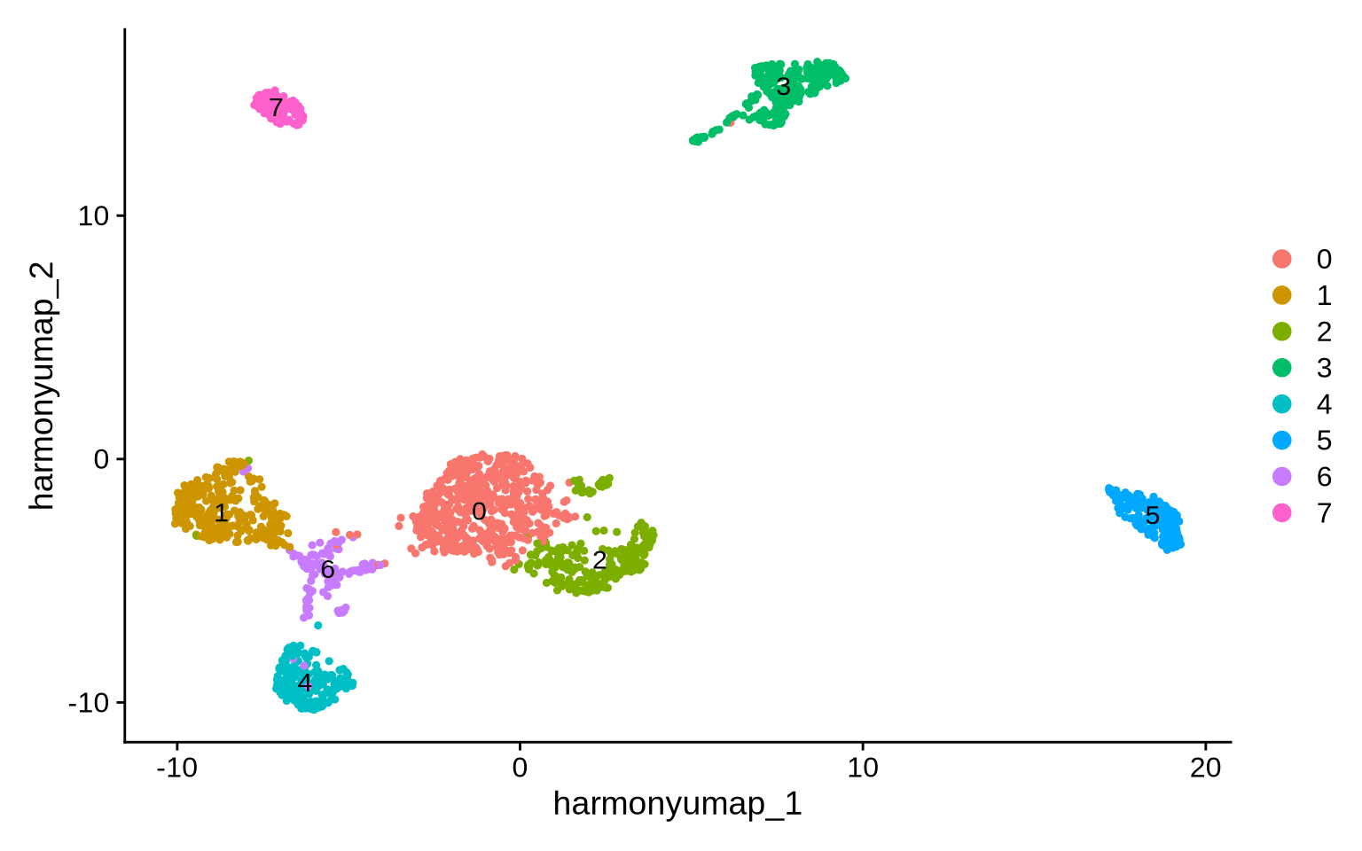
To identify cell types in the PNA data we perform data-driven clustering. First, we build a Shared Nearest Neighbor (SNN) graph from the harmony embedding which we then pass to the clustering algorithm (Louvain).
pg_data_combined <- pg_data_combined %>%
  # Create SNN graph
  FindNeighbors(dims = 1:10, reduction = "harmony") %>%
  # Find communities (clusters) of cells in SNN graph
  FindClusters(random.seed = 1, resolution = 0.2)
Modularity Optimizer version 1.3.0 by Ludo Waltman and Nees Jan van Eck

Number of nodes: 1970
Number of edges: 67712

Running Louvain algorithm...
Maximum modularity in 10 random starts: 0.9482
Number of communities: 8
Elapsed time: 0 seconds
# Visualize the clusters
DimPlot(pg_data_combined, reduction = "harmony_umap", label = TRUE)
Cell type marker detection
To annotate the resulting clusters, we use a Wilcoxon Rank sum test to
gauge which markers are specific for each cluster using the Seurat
method FindAllMarkers. This function also calculates the difference in
CLR value of each cluster with all other cells.
DE_cluster <- FindAllMarkers(
  pg_data_combined,
  test.use = "wilcox",
  assay = "PNA",
  slot = "data",
  logfc.threshold = 0,
  return.thresh = 1,
  mean.fxn = rowMeans,
  fc.name = "difference"
) %>%
  as_tibble()

DE_cluster %>%
  group_by(cluster) %>%
  arrange(-difference) %>%
  slice_head(n = 5) %>%
  knitr::kable()
| p_val | difference | pct.1 | pct.2 | p_val_adj | cluster | gene |
|---|---|---|---|---|---|---|
| 0 | 2.423554 | 1.000 | 0.997 | 0e+00 | 0 | CD45RO |
| 0 | 2.061716 | 1.000 | 0.985 | 0e+00 | 0 | CD5 |
| 0 | 2.003257 | 0.998 | 0.934 | 0e+00 | 0 | CD4 |
| 0 | 1.702644 | 1.000 | 0.988 | 0e+00 | 0 | CD3e |
| 0 | 1.577757 | 1.000 | 0.967 | 0e+00 | 0 | CD6 |
| 0 | 3.622724 | 1.000 | 0.983 | 0e+00 | 1 | CD8 |
| 0 | 2.085087 | 1.000 | 0.989 | 0e+00 | 1 | CD27 |
| 0 | 1.818016 | 1.000 | 0.983 | 0e+00 | 1 | CD45RB |
| 0 | 1.650366 | 1.000 | 0.990 | 0e+00 | 1 | CD3e |
| 0 | 1.577040 | 1.000 | 0.987 | 0e+00 | 1 | CD5 |
| 0 | 1.943671 | 1.000 | 0.944 | 0e+00 | 2 | CD4 |
| 0 | 1.915521 | 1.000 | 0.990 | 0e+00 | 2 | CD3e |
| 0 | 1.864491 | 1.000 | 0.987 | 0e+00 | 2 | CD5 |
| 0 | 1.838098 | 1.000 | 0.983 | 0e+00 | 2 | CD45RB |
| 0 | 1.763139 | 1.000 | 0.989 | 0e+00 | 2 | CD27 |
| 0 | 2.840725 | 1.000 | 1.000 | 0e+00 | 3 | HLA-DR-DP-DQ |
| 0 | 2.535272 | 1.000 | 0.990 | 0e+00 | 3 | CD36 |
| 0 | 2.424214 | 1.000 | 0.955 | 0e+00 | 3 | Siglec-9 |
| 0 | 2.406431 | 1.000 | 0.982 | 0e+00 | 3 | HLA-DR |
| 0 | 2.345008 | 0.996 | 0.950 | 0e+00 | 3 | CD11c |
| 0 | 3.038495 | 1.000 | 0.958 | 0e+00 | 4 | CD328 |
| 0 | 2.596679 | 1.000 | 0.905 | 0e+00 | 4 | CD94 |
| 0 | 2.537840 | 1.000 | 0.926 | 0e+00 | 4 | CD244 |
| 0 | 2.422730 | 1.000 | 0.995 | 0e+00 | 4 | CD45RA |
| 0 | 2.321489 | 0.995 | 0.923 | 0e+00 | 4 | CD16 |
| 0 | 3.468128 | 1.000 | 1.000 | 0e+00 | 5 | HLA-DR-DP-DQ |
| 0 | 3.253083 | 1.000 | 0.983 | 0e+00 | 5 | HLA-DR |
| 0 | 3.193665 | 1.000 | 0.916 | 0e+00 | 5 | CD20 |
| 0 | 2.912425 | 1.000 | 0.915 | 0e+00 | 5 | CD22 |
| 0 | 2.683572 | 1.000 | 0.976 | 0e+00 | 5 | CD40 |
| 0 | 2.699117 | 1.000 | 0.985 | 0e+00 | 6 | CD8 |
| 0 | 1.556863 | 1.000 | 0.982 | 0e+00 | 6 | KLRG1 |
| 0 | 1.339831 | 1.000 | 0.991 | 1e-06 | 6 | CD3e |
| 0 | 1.183929 | 1.000 | 1.000 | 0e+00 | 6 | CD43 |
| 0 | 1.085034 | 0.992 | 0.969 | 0e+00 | 6 | TIGIT |
| 0 | 6.601932 | 1.000 | 0.995 | 0e+00 | 7 | CD41 |
| 0 | 5.113647 | 1.000 | 0.991 | 0e+00 | 7 | CD36 |
| 0 | 4.600226 | 1.000 | 0.990 | 0e+00 | 7 | CD9 |
| 0 | 2.889785 | 1.000 | 0.989 | 0e+00 | 7 | CD226 |
| 0 | 2.881187 | 1.000 | 1.000 | 0e+00 | 7 | CD29 |
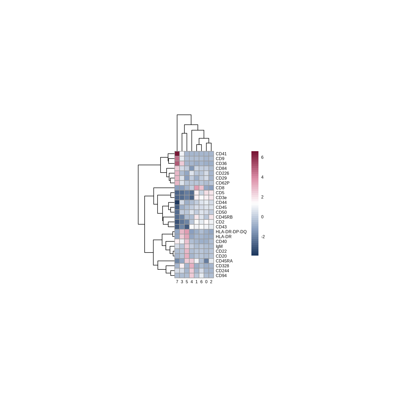
To help us compare the abundance levels of markers across clusters, we will visualize the difference in average CLR values for each cluster relative to all other cells in a heatmap.
heatmap_colors <- colorRampPalette(c("#1F395F", "#8DA2C1", "#FFFFFF", "#DB8CA6", "#781534"))(50)

DE_cluster %>%
  group_by(gene) %>%
  # Filter proteins that are statistically significant for at least one cluster
  filter(any(p_val_adj < 0.001 &
               abs(difference) > 2.5)) %>%
  group_by(cluster) %>%
  select(difference, cluster, gene) %>%
  pivot_wider(names_from = "cluster", values_from = "difference") %>%
  column_to_rownames("gene") %>%
  pheatmap(cellwidth = 7,
           cellheight = 7,
           fontsize = 6,
           angle_col = 0,
           color = heatmap_colors)
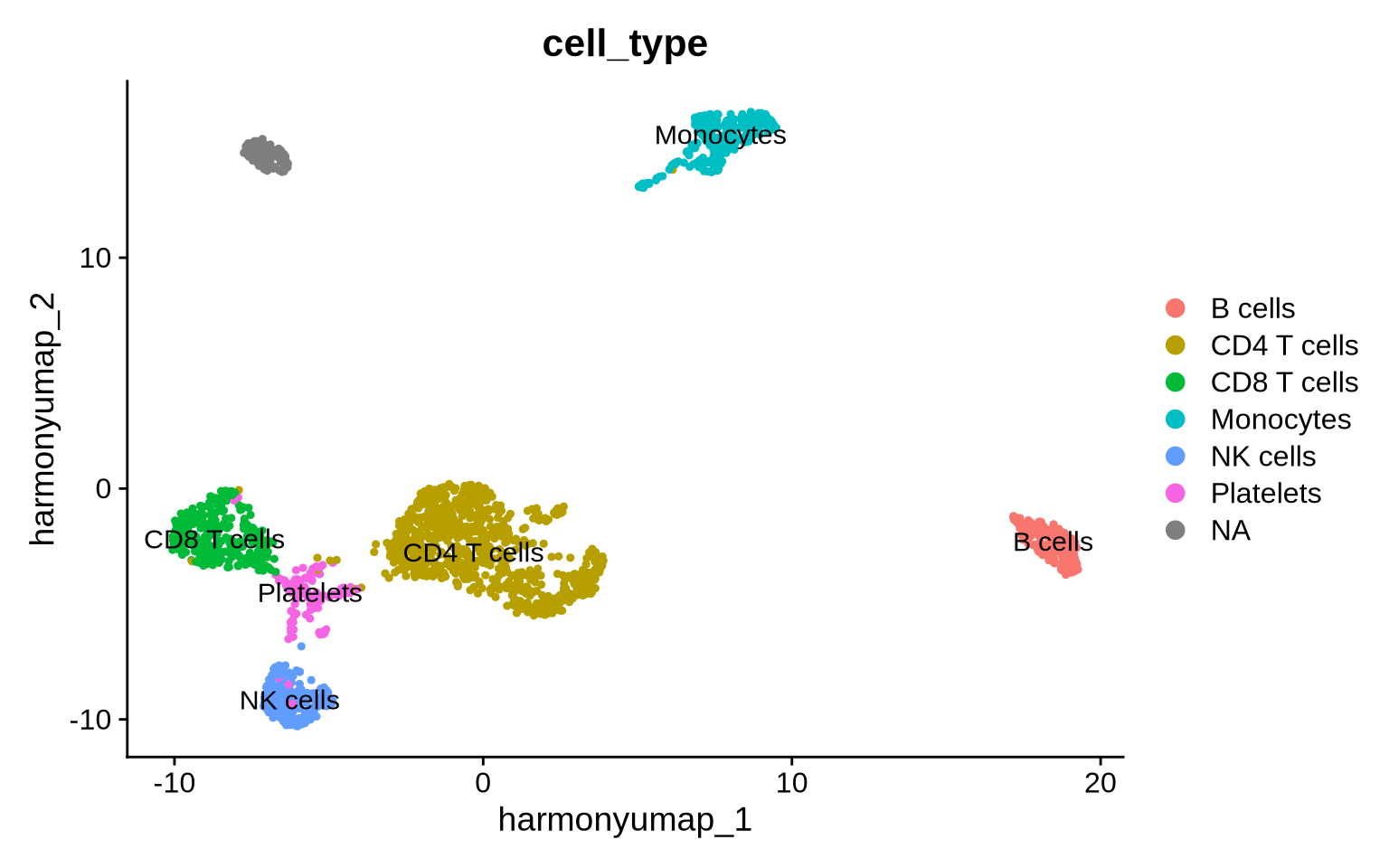
Now we can use the relative abundance levels of cells to manually assign cell identities to clusters.
# Cluster annotation as a named vector
cell_annotation <-
  c("0" = "CD4 T cells",
    "1" = "CD8 T cells",
    "2" = "CD4 T cells",
    "3" = "Monocytes",
    "4" = "NK cells",
    "5" = "B cells",
    "6" = "Platelets")

# Add the cluster annotation to the data
pg_data_combined <- pg_data_combined %>%
  AddMetaData(setNames(cell_annotation[pg_data_combined$seurat_clusters],
                       nm = colnames(pg_data_combined)), "cell_type")

# Plot UMAP colored by cell annotation
pg_data_combined %>%
  DimPlot(group.by = "cell_type", reduction = "harmony_umap", label = TRUE)
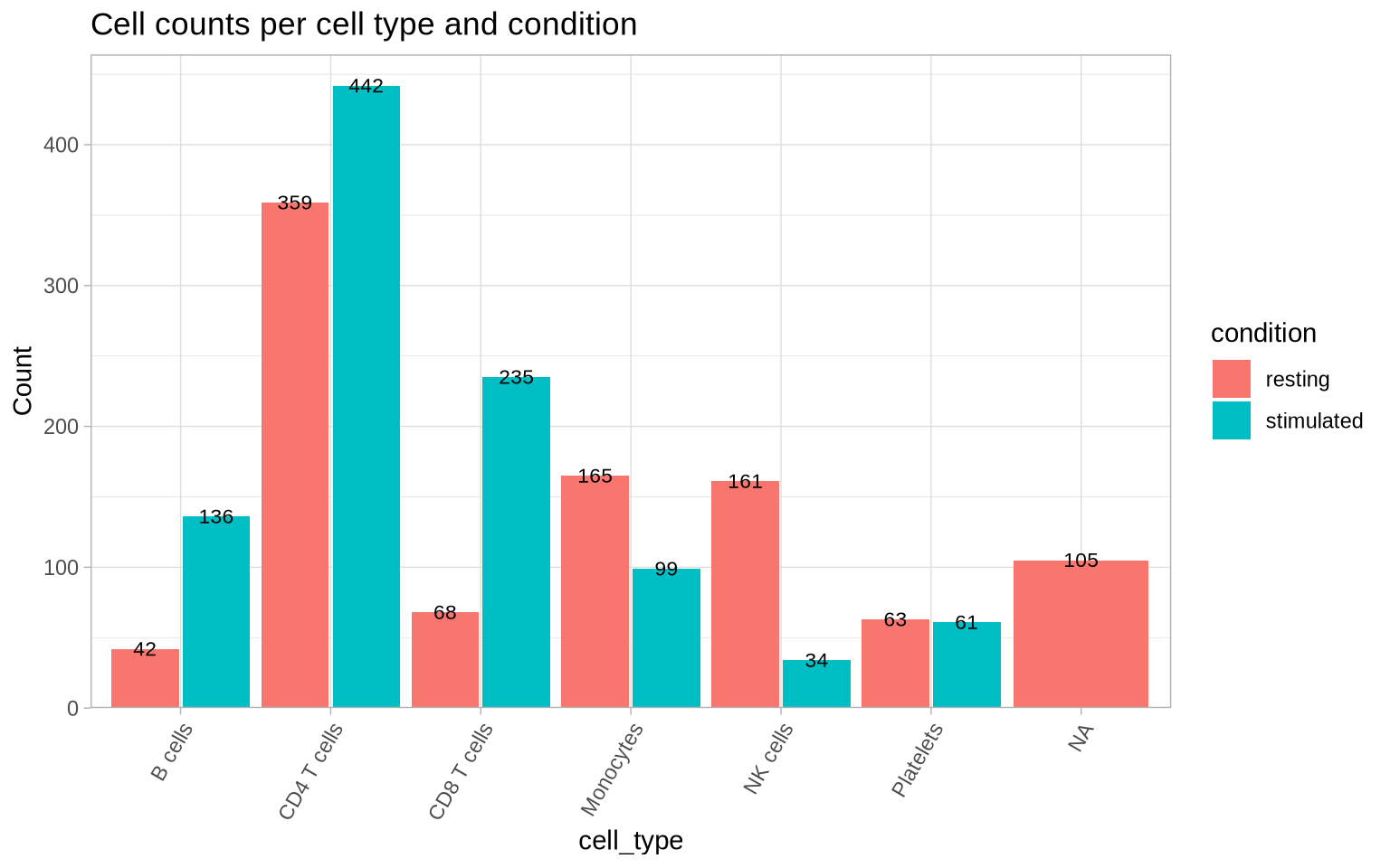
Now, let’s take a look at the frequency of each of the cell identities within each condition.
CellCountPlot(pg_data_combined, group_by = "cell_type", color_by = "condition") &
  ggtitle("Cell counts per cell type and condition")
Compact annotation alternative - Marker gating
Another cell annotation strategy involves “gating” cells based on dsb-normalized abundance. In this tutorial, we use a dsb value of 2 as the gate threshold, given that non-expressing populations are typically centered around 0 with a standard deviation near 1. Here we will be quite strict and only annotate a cell if it passes all defined positive and negative protein marker gates, but we can of course relax this condition if needed to allow for small deviations.
The code below assigns a cell to the cell type for which it passes the
highest proportion of gates and this highest proportion needs to be at
least required_gate_pass_ratio (set to 1 in the example below). Cells
that do not pass any gating strategy are annotated as NA.
# Renormalize the data to dsb
pg_data_combined <- Normalize(pg_data_combined, method = "dsb", isotype_controls = c("mIgG1", "mIgG2a", "mIgG2b"), assay = "PNA")

# Define a list of cell-type specific markers, a minus sign indicates the marker should not be expressed in this cell-type
celltype_marker_list <- list(
    "CD8 T cells"  = c("CD3e", "CD8", "-CD4", "-CD64", "-CD337"),
    "CD4 T cells"  = c("CD3e", "CD4", "-CD8", "-CD64", "-CD337"),
    "NK cells"  = c("CD335", "CD337", "-CD22", "-CD3e", "-CD64"),
    "B cells"     = c("CD22", "CD72", "-CD3e", "-CD64", "-CD337"),
    "Monocytes"  = c("Siglec-9", "CD64", "-CD22", "-CD3e", "-CD337"),
    "Platelets"  = c("CD41", "-CD3e", "-CD22", "-CD64", "-CD337")
)

# Define a function to calculate per cell the ratio of markers passing the gating strategy
calc_gates_passed <- function(expression_data, marker_sets, threshold){

  expression_data <- t(expression_data)
  gate_threshold <- threshold
  celltypes <- names(marker_sets)

  celltype_score <- matrix(0, nrow = nrow(expression_data), ncol = length(marker_sets))
  rownames(celltype_score) <- rownames(expression_data)
  colnames(celltype_score) <- celltypes

  for (ct in celltypes){
    for (marker in marker_sets[[ct]]){
      if (str_sub(marker, 1, 1) == "-"){
        celltype_score[,ct] <- celltype_score[,ct] + (expression_data[,str_sub(marker, 2)] < gate_threshold)
      } else {
        celltype_score[,ct] <- celltype_score[,ct] + (expression_data[,marker] > gate_threshold)
      }
    }
  celltype_score[,ct] <- celltype_score[,ct]/length(marker_sets[[ct]])
  }
  return(celltype_score)
}
cell_type_gate <- calc_gates_passed(LayerData(pg_data_combined), celltype_marker_list, threshold = 2)

# keep maximum celltype_score and set cell type to "other" if this value is < than the required_gate_pass_ratio
required_gate_pass_ratio <- 1
gated_cell_type <- cell_type_gate %>%
  as.data.frame() %>%
  rownames_to_column("component") %>%
  pivot_longer(-component, names_to = "gate_celltype", values_to = "ratio") %>%
  group_by(component) %>%
  arrange(-ratio) %>%
  slice(1) %>%
  mutate(gate_celltype = ifelse(ratio >= required_gate_pass_ratio, gate_celltype, NA_character_)) %>%
  data.frame(row.names = 1)

# Add the resulting cell type labels to the data
pg_data_combined <- AddMetaData(pg_data_combined, gated_cell_type, col.name = "gate_celltype")

# Plot UMAP colored by cell annotation
pg_data_combined %>%
  DimPlot(group.by = "gate_celltype", reduction = "harmony_umap")
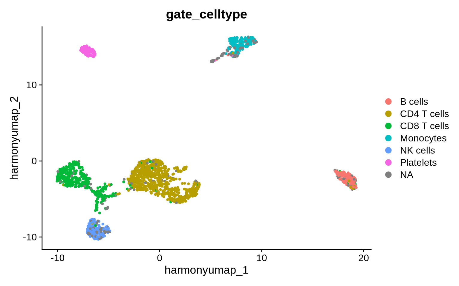
With this strict annotation strategy, only 191 cells did not pass our criteria.
sum(is.na(pg_data_combined$gate_celltype))
[1] 191
Annotation sanity check
To validate our annotations against expected marker expression, we now
visualize the abundance data for selected marker proteins. The
DensityScatterPlot function allows us to compare the abundance
distributions of two selected marker proteins. Let’s begin by looking at
the distribution of CD3e against its isotype control, mIgG1.
DensityScatterPlot(
  pg_data_combined,
  layer = "data",
  marker1 = "mIgG1",
  marker2 = "CD3e",
  margin_density = TRUE
)
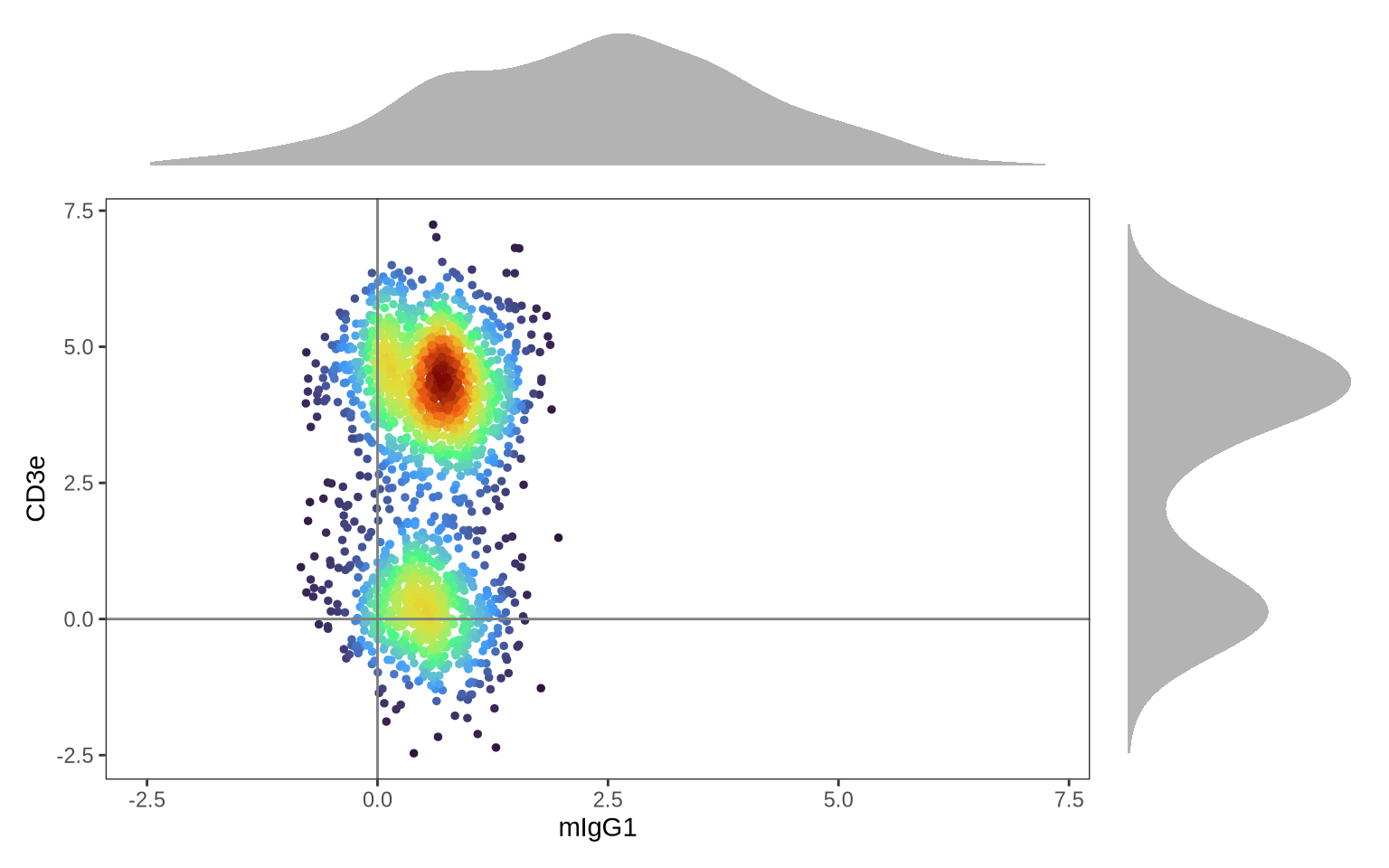
As anticipated, the isotype control (mIgG1) forms a single distribution, indicating background levels across all cells. However, since mIgG1 is negative in all cell types, dsb has not centered the values at 0. In contrast, CD3E shows two distinct distributions: one centered at 0, representing CD3E-negative cells (likely non-T cell PBMCs), and another centered around 3, representing CD3E-positive T cells.
Now, let’s examine whether our annotated cell types express the expected markers. For instance, we can look at the abundance of CD4 and CD8 proteins across the different identified cell types:
DensityScatterPlot(pg_data_combined, layer = "data", marker1 = "CD4", marker2 = "CD8", facet_vars = "gate_celltype")
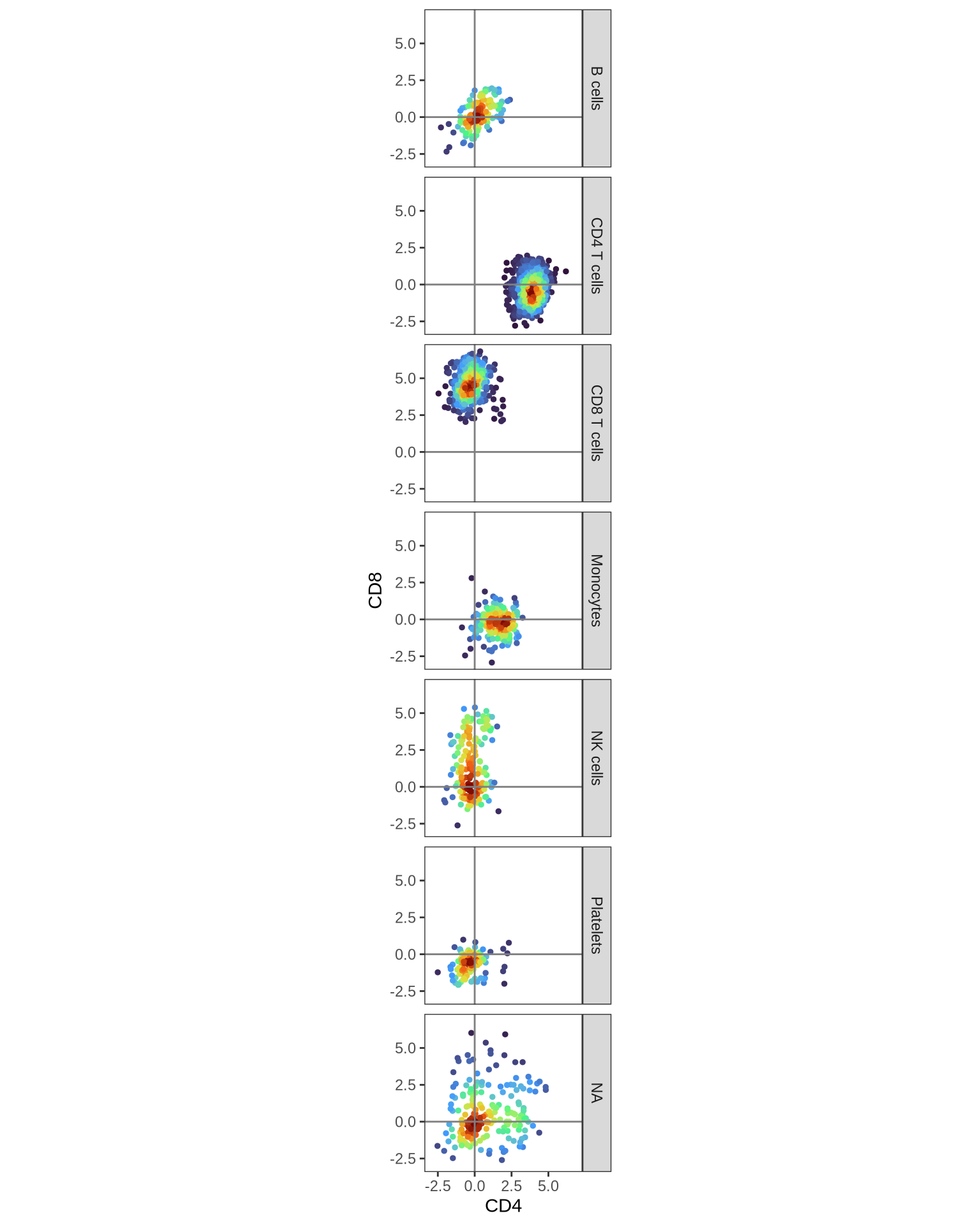
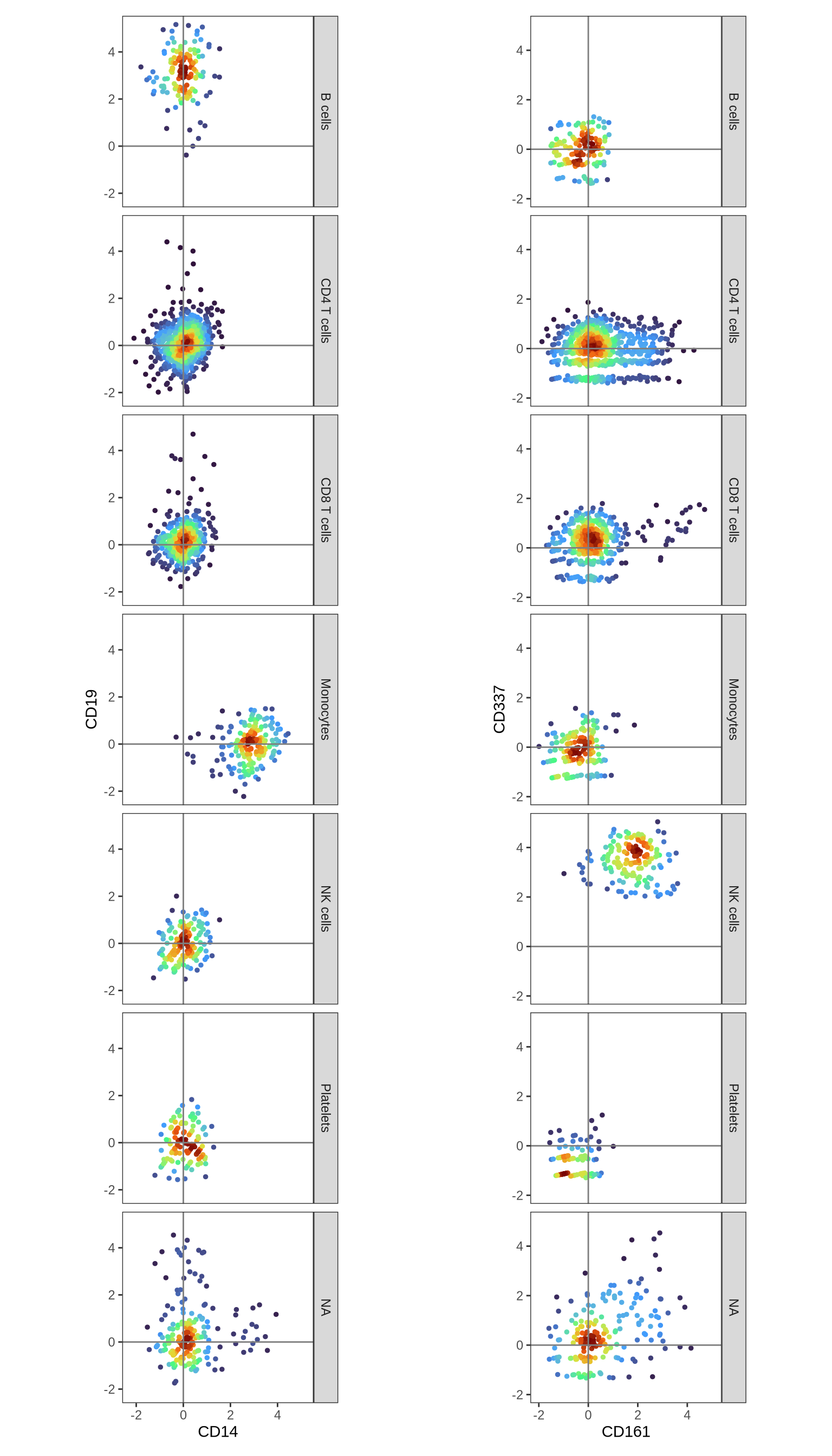
As predicted, we observe CD4 expression in CD4 T cells and CD8 expression in CD8 T cells. The presence of CD8 on some NK cells is also consistent with known biology. To further verify our cell type annotations, let’s examine the expression patterns of additional key markers: CD14 (expected in Monocytes), CD19 (B cells), CD161 (Innate T cells), and CD337 (NK cells).
p1 <- DensityScatterPlot(pg_data_combined, layer = "data", marker1 = "CD14", marker2 = "CD19", facet_vars = "gate_celltype")
p2 <- DensityScatterPlot(pg_data_combined, layer = "data", marker1 = "CD161", marker2 = "CD337", facet_vars = "gate_celltype")

p1 | p2
Compare annotations
Now, let’s assess the agreement between our clustering-based and gating-based cell type annotations:
table(pg_data_combined[[]]$cell_type, pg_data_combined[[]]$gate_celltype) %>%
  pheatmap(.,
  display_numbers = .,
  cluster_rows = TRUE,
  cluster_columns = TRUE,
  treeheight_row = 0,
  treeheight_col = 0,
  color = colorRampPalette(c("white", "red", "darkred"))(50), )
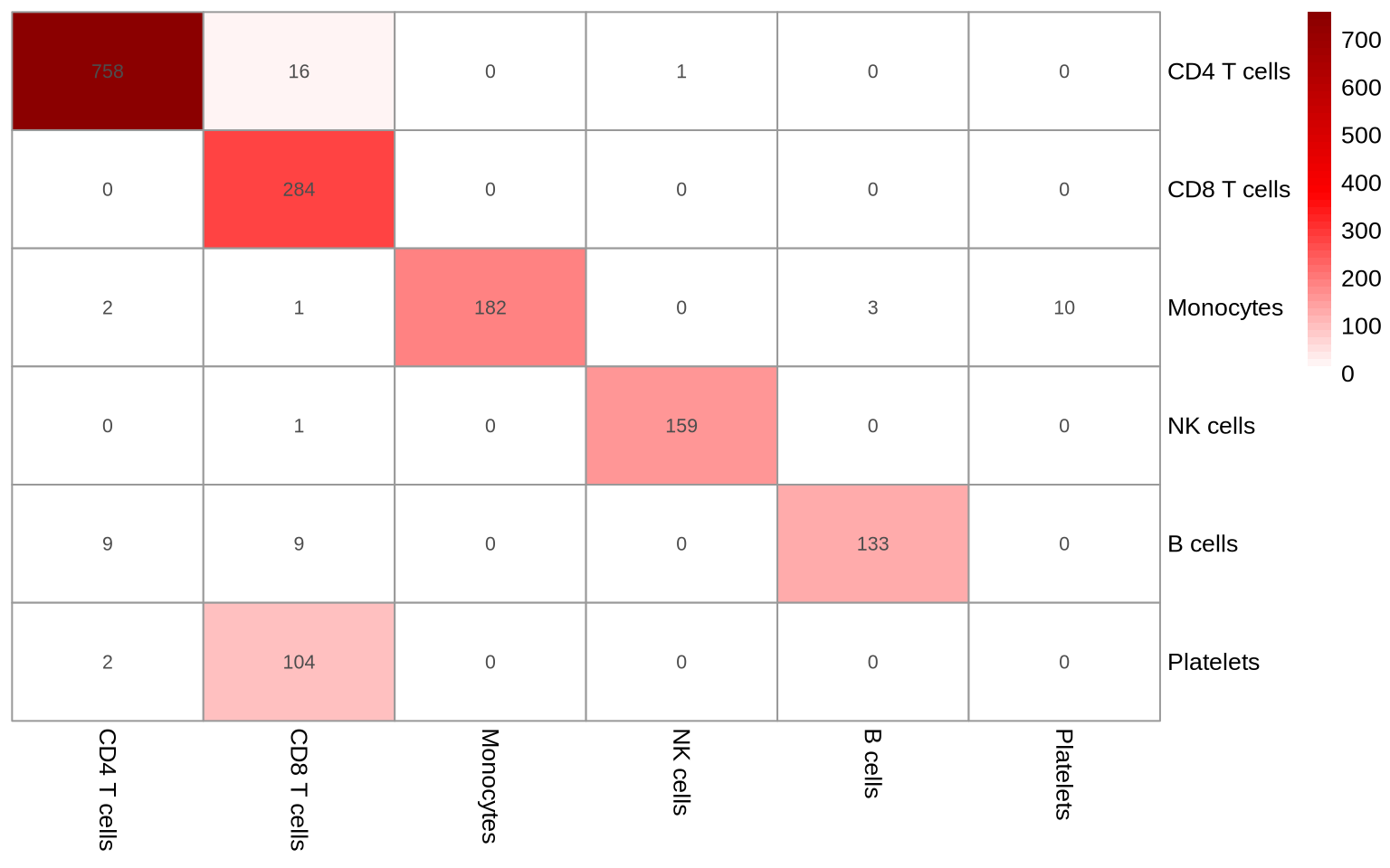
The annotations show substantial agreement. It’s important to note that gating, by its nature of focusing on a select few markers, can be susceptible to misclassifications. A data-driven approach can leverage abundance information from all proteins to find populations that are easily missed with a more rudimentary gating strategy. However, it offers a valuable complement to clustering-based annotation by refining inaccurate assignments. For instance, a B cell cluster should ideally be devoid of CD3E+/CD14+ cells, and a T cell cluster should not contain CD19+/CD14+ cells. Depending on the analysis goals, a strict gating strategy might be more suitable, for instance, when defining cell populations based on well-established protein markers from the literature.
In this tutorial we have learned how to annotate cell populations and to compare protein abundance levels between annotated cell types.
We will now save this annotated object to proceed to the next tutorial, where we will demonstrate how to perform differential abundance testing between experimental conditions within a specific cell type.
But first, normalize the data to CLR again to prepare for the next tutorial.
pg_data_combined <- NormalizeData(pg_data_combined, normalization.method = "CLR", margin = 2)
# Save filtered dataset for next step. This is an optional pause step; if you prefer to continue to the next tutorial without saving the object explicitly, that will also work.
saveRDS(pg_data_combined, file.path(DATA_DIR, "combined_data_annotated.rds"))