Spatial Analyses
In this tutorial we will show you how you can analyze the spatial configuration of proteins on the cell surface of single cells, using PNA data.
Pixelator will generate a number of metrics from the graph structure inherent to the PNA data. In this tutorial we will show you how you can approach spatial analysis using the PNA proximity scores to get a deeper understanding of how proteins are organized on the cell surface.
We will load two PBMC samples, one that has undergone PHA stimulation, and an unstimulated sample.
After completing this tutorial, you will be able to:
-
Extract key features from PNA data: Analyze the inherent graph structure of PNA data to understand protein clustering (polarity) and co-abundance (colocalization) on cell surfaces.
-
Quantify spatial changes in protein clustering: Utilize PNA proximity scores and Wilcoxon Rank Sum tests to measure and compare protein clustering between different conditions, revealing spatial rearrangements upon cellular stimulation.
-
Identify changes in protein colocalization: Conduct differential proximity analysis to pinpoint protein pairs with significant changes in co-occurrence across different samples, uncovering potential protein interactions under specific conditions.
-
Visualize and interpret data: Effectively communicate your findings through volcano plots and heatmaps for differential analyses, and leverage UMAPs to explore relationships between proximity scores, identifying distinct protein groups based on their spatial dynamics.
-
Connect spatial data to biological functions: Correlate observed changes in protein organization with cellular phenotypes or functions to gain deeper insights into protein interactions and their roles in biological processes like cellular migration.
Setup
import numpy as np
import pandas as pd
from pathlib import Path
from pixelator import read_pna as read
from pixelator.pna.analysis import calculate_differential_proximity
from pixelator.mpx.plot import plot_colocalization_diff_heatmap
import seaborn as sns
import matplotlib.pyplot as plt
import matplotlib.cm as cm
import matplotlib.colors as mcolors
import networkx as nx
from scipy.stats import mannwhitneyu, false_discovery_control, zscore
from statsmodels.stats.multitest import multipletests
import umap

sns.set_style("whitegrid")
DATA_DIR = Path("./pna-analysis")
Load data
We begin by loading and merging the two samples, so that they can easily be analyzed together.
from pixelator.pna.pixeldataset.download import DownloadableDatasets

DATA_DIR.mkdir(parents=True, exist_ok=True)

DownloadableDatasets.download_dataset(
  "pna062-unstim-pbmcs",
  output_path=DATA_DIR / "PNA062_unstim_PBMCs_1000cells_S02_S2.layout.pxl",
)
DownloadableDatasets.download_dataset(
  "pna062-pha-pbmcs",
  output_path=DATA_DIR / "PNA062_PHA_PBMCs_1000cells_S04_S4.layout.pxl",
)
pg_data_combined_pxl_object =  read([
    DATA_DIR/ "PNA062_unstim_PBMCs_1000cells_S02_S2.layout.pxl",
    DATA_DIR/ "PNA062_PHA_PBMCs_1000cells_S04_S4.layout.pxl",
])
filtered_cells = list(pd.read_csv(DATA_DIR / "qc_filtered_cells.csv")["component"])
pg_data_combined_pxl_object = pg_data_combined_pxl_object.filter(components=filtered_cells)
Obtaining proximity scores for target cells
Since T cells are the primary target of PHA, let us limit our analysis of spatial metrics to CD8 T cells. We use the cell types from the cell annotation tutorial.
annotations = pd.read_csv(DATA_DIR / "cell_type_annotations.csv").set_index("component")
cd8t_cells = list(annotations[annotations["cell_type"] == "CD8 T"].index)
proximity_scores = pg_data_combined_pxl_object.filter(components=cd8t_cells).proximity().to_df()
proximity_scores.head()
| marker_1 | marker_2 | join_count | join_count_expected_mean | join_count_expected_sd | join_count_z | join_count_p | component | sample | marker_1_count | marker_1_freq | marker_2_count | marker_2_freq | min_count | log2_ratio | |
|---|---|---|---|---|---|---|---|---|---|---|---|---|---|---|---|
| 0 | HLA-ABC | HLA-ABC | 203 | 180.08 | 13.673450 | 1.676241 | 0.046845 | a9b381039231f96e | PNA062_unstim_PBMCs_1000cells_S02_S2 | 1657 | 0.041803 | 1657 | 0.041803 | 1657 | 0.172842 |
| 1 | HLA-ABC | KLRG1 | 95 | 73.07 | 8.017979 | 2.735103 | 0.003118 | a9b381039231f96e | PNA062_unstim_PBMCs_1000cells_S02_S2 | 1657 | 0.041803 | 339 | 0.008552 | 339 | 0.378648 |
| 2 | HLA-ABC | TCRab | 47 | 39.82 | 6.388721 | 1.123856 | 0.130537 | a9b381039231f96e | PNA062_unstim_PBMCs_1000cells_S02_S2 | 1657 | 0.041803 | 189 | 0.004768 | 189 | 0.239168 |
| 3 | HLA-ABC | HLA-DR-DP-DQ | 5 | 2.55 | 1.794351 | 1.365396 | 0.086064 | a9b381039231f96e | PNA062_unstim_PBMCs_1000cells_S02_S2 | 1657 | 0.041803 | 12 | 0.000303 | 12 | 0.971431 |
| 4 | CD45RB | HLA-ABC | 473 | 439.19 | 19.244674 | 1.756850 | 0.039472 | a9b381039231f96e | PNA062_unstim_PBMCs_1000cells_S02_S2 | 2027 | 0.051138 | 1657 | 0.041803 | 1657 | 0.106995 |
The measures in each row of the proximity scores’ table correspond to a marker pair (marker_1 and marker_2) in a given component. When marker_1 and marker_2 are the same, the measure indicates the clustering degree of that marker in the component; when they are different, the measure indicates the colocalization degree of those two markers.
Proximity measures
There are two main values that we typically look into when analyzing spatial proximity. First one is “join_count_z” that is a z-score showing how significantly, the number of join counts, i.e. number of links between marker_1 and marker_2 antibodies, are higher or lower than expected by chance. Notice that this score is a measure of statistical significance rather than proximity degree. This means that with higher total counts, the z-score would be higher for the same proximity degree as the result becomes more significant. The second value is “log2_ratio” that is the log2 of ratio of observed edges between marker_1 and marker_2 to the number of edges expected by chance. This is a closer measure of the degree of proximity. So for questions similar to “Are these two markers colocalized?” or “Is this marker significantly clustered?” one typically looks at the “join_count_z” value and for the questions like “Has this marker increased in clustering after stimulation?” one would look at log2_ratio metric.
Filtering the low-abundance markers
Not all proteins will always be expressed by every cell, i.e. some markers might have very low abundance in some cells. For such proteins the proximity scores should be excluded in the corresponding cells. Typically, filtration should be performed before spatial proximity analysis to reduce the potential noise from low abundance markers.
There are two values that we typically use for filtering out the proximity scores of low-abundance markers. The first value, “min_count”, is the lower of marker_1 and marker_2 antibody counts in the component; let us filter out any markers with fewer than 50 counts. The second value, “join_count_expected_mean”, is the number of expected links between the marker_1 and marker_2 antibodies if they had been randomly distributed in the component; let us filter any marker pairs that have fewer than 10 expected edges between them.
proximity_scores = proximity_scores[
    (proximity_scores["min_count"]>=50) &
    (proximity_scores["join_count_expected_mean"]>=10)
]
proximity_scores["condition"] = "Resting"
proximity_scores.loc[
    proximity_scores["sample"].astype(str).str.contains("PHA", na=False),
    "condition",
] = "PHA stimulated"
proximity_scores["condition"] = pd.Categorical(
    proximity_scores["condition"],
    categories=["Resting", "PHA stimulated"],
    ordered=True,
)

CONDITION_ORDER = ["Resting", "PHA stimulated"]
CONDITION_PALETTE = {"Resting": "#2ca02c", "PHA stimulated": "#ff7f0e"}
Clustering analysis
Let’s look at the significantly clustered markers in each sample. Here, we consider a marker to be significantly clustered if it is expressed in at least 50 cells and it’s median proximity z-score is above 2.
clustering_scores = proximity_scores[proximity_scores["marker_1"] == proximity_scores["marker_2"]]
sample_clustering = (
    clustering_scores
    .groupby(["sample", "marker_1"])
    .join_count_z
    .agg(
        count_of_expressing_cells= "count",
        median_z_score="median"
    )
    .reset_index()
)

sample_clustering[(sample_clustering["median_z_score"]>2) & (sample_clustering["count_of_expressing_cells"]>50)].sort_values("median_z_score", ascending=False).head(10)
| sample | marker_1 | count_of_expressing_cells | median_z_score | |
|---|---|---|---|---|
| 47 | PNA062_PHA_PBMCs_1000cells_S04_S4 | CD82 | 193 | 14.539990 |
| 92 | PNA062_unstim_PBMCs_1000cells_S02_S2 | CD8 | 136 | 7.097403 |
| 36 | PNA062_PHA_PBMCs_1000cells_S04_S4 | CD52 | 282 | 6.236976 |
| 45 | PNA062_PHA_PBMCs_1000cells_S04_S4 | CD8 | 282 | 5.128228 |
| 77 | PNA062_unstim_PBMCs_1000cells_S02_S2 | CD45RA | 79 | 4.385170 |
| 78 | PNA062_unstim_PBMCs_1000cells_S02_S2 | CD45RB | 129 | 3.793553 |
| 56 | PNA062_unstim_PBMCs_1000cells_S02_S2 | CD102 | 127 | 3.178506 |
| 50 | PNA062_PHA_PBMCs_1000cells_S04_S4 | HLA-ABC | 304 | 2.929083 |
| 23 | PNA062_PHA_PBMCs_1000cells_S04_S4 | CD3e | 301 | 2.786513 |
| 11 | PNA062_PHA_PBMCs_1000cells_S04_S4 | CD2 | 296 | 2.690518 |
As the most significant signals, we see that CD82 and CD52 become significantly clustered only after PHA stimulation while for example CD8 is significantly clustered in both conditions.
Differential clustering analysis
Another question is whether we can observe an increase in clustering of any proteins upon stimulation. We already expect CD82 and CD52 to be among those but we recall that join_count_z is an indication of significance, so this time, we compare degrees of clustering using the log2_ratio.
differential_clustering = calculate_differential_proximity(
    clustering_scores,
    contrast_column="condition",
    reference="Resting",
    targets=["PHA stimulated"],
    metric="log2_ratio",
    min_n_obs=25,
)
differential_clustering["log10_p"] = -np.log10(differential_clustering["p_adjusted"])
sc = plt.scatter(
    differential_clustering["median_diff"],
    differential_clustering["log10_p"],
    c=differential_clustering["tgt_median"],
    vmin=-1.0,
    vmax=1.0,
    cmap="coolwarm"
)
plt.colorbar(sc, label="Median clustering after stimulation")
for _, r in differential_clustering[differential_clustering["log10_p"]>2].iterrows():
    plt.text(
        r["median_diff"]+0.01,
        r["log10_p"]+0.01,
        r["marker_1"]
    )
plt.tight_layout()
plt.xlabel("Median difference")
plt.ylabel("log10 p value")
plt.title("Differential clustering")
plt.show()
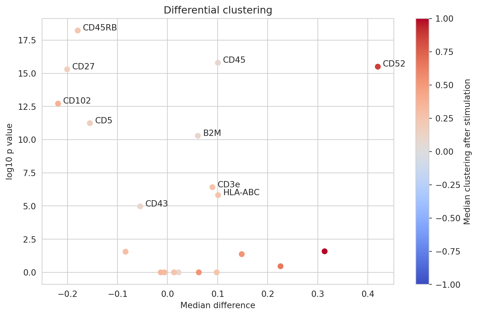
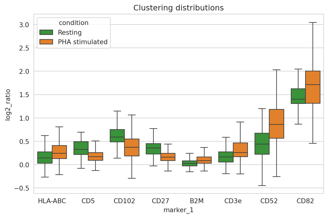
We see that CD82 and CD52 have indeed increased in clustering after PHA stimulation as well as other markers including CD3e, CD44, CD45, HLA-ABC, and B2M. We also see that CD5 and CD27 have decreased in clustering. Let us now look at the clustering distributions for these markers.
sns.boxplot(
    clustering_scores[
        clustering_scores["marker_1"].isin(["CD3e", "CD5", "CD27", "CD52", "CD82", "CD102", "HLA-ABC", "B2M"])
    ],
    x="marker_1",
    y="log2_ratio",
    hue="condition",
    hue_order=CONDITION_ORDER,
    palette=CONDITION_PALETTE,
    showfliers=False
)
plt.title("Clustering distributions")
plt.show()
Colocalization analysis
Another aspect of spatial organization of proteins is whether the colocalize with other proteins. So now, we focus on marker-pairs and their proximity scores. Here, we consider a marker-pair to be significantly colocalized if both markers are expressed in at least 50 cells together and their median proximity z-score is above 2.
colocalization_scores = proximity_scores[proximity_scores["marker_1"] != proximity_scores["marker_2"]]
sample_colocalization = (
    colocalization_scores
    .groupby(["sample", "condition", "marker_1", "marker_2"])
    .join_count_z
    .agg(
        count_of_expressing_cells= "count",
        median_z_score="median"
    )
    .reset_index()
)
colocalizatins_to_keep = (sample_colocalization["median_z_score"]>3) & (sample_colocalization["count_of_expressing_cells"]>70)
sample_colocalization[colocalizatins_to_keep].sort_values("median_z_score", ascending=False).head(10)
| sample | condition | marker_1 | marker_2 | count_of_expressing_cells | median_z_score | |
|---|---|---|---|---|---|---|
| 26973 | PNA062_PHA_PBMCs_1000cells_S04_S4 | PHA stimulated | CD81 | CD82 | 126 | 7.646492 |
| 38446 | PNA062_unstim_PBMCs_1000cells_S02_S2 | Resting | CD45RA | CD45RB | 110 | 3.936450 |
| 28486 | PNA062_PHA_PBMCs_1000cells_S04_S4 | PHA stimulated | HLA-ABC | HLA-DR | 98 | 3.217520 |
| 24835 | PNA062_PHA_PBMCs_1000cells_S04_S4 | PHA stimulated | CD52 | CD59 | 300 | 3.108329 |
| 23571 | PNA062_PHA_PBMCs_1000cells_S04_S4 | PHA stimulated | CD45 | CD45RB | 297 | 3.103666 |
We find that CD81/CD82 is by far the most signficantly colocalized PHA stimulated CD8 T cells.
Given that there can be several colocalizing marker-pairs, marker graph is one alternative for getting an overview of colocalization patterns in a sample.
significant_colocalizations = sample_colocalization[colocalizatins_to_keep]
resting_colocalizations = significant_colocalizations[significant_colocalizations["condition"] == "Resting"]
pha_colocalizations = significant_colocalizations[significant_colocalizations["condition"] == "PHA stimulated"]
fig, axes = plt.subplots(1, 2)

resting_coloc_graph = nx.from_edgelist(resting_colocalizations[["marker_1", "marker_2"]].to_numpy())
pha_coloc_graph = nx.from_edgelist(pha_colocalizations[["marker_1", "marker_2"]].to_numpy())

nx.draw_networkx(resting_coloc_graph, pos=nx.spring_layout(resting_coloc_graph, k=1.0, seed=0), ax=axes[0])
nx.draw_networkx(pha_coloc_graph, pos=nx.spring_layout(pha_coloc_graph, k=1.0, seed=0), ax=axes[1],)
axes[0].set_title("Resting")
axes[1].set_title("PHA stimulated")
axes[0].grid(False)
axes[1].grid(False)
plt.suptitle("Colocalization pairs")
plt.tight_layout(pad=0.4, w_pad=0.5, h_pad=1.0)
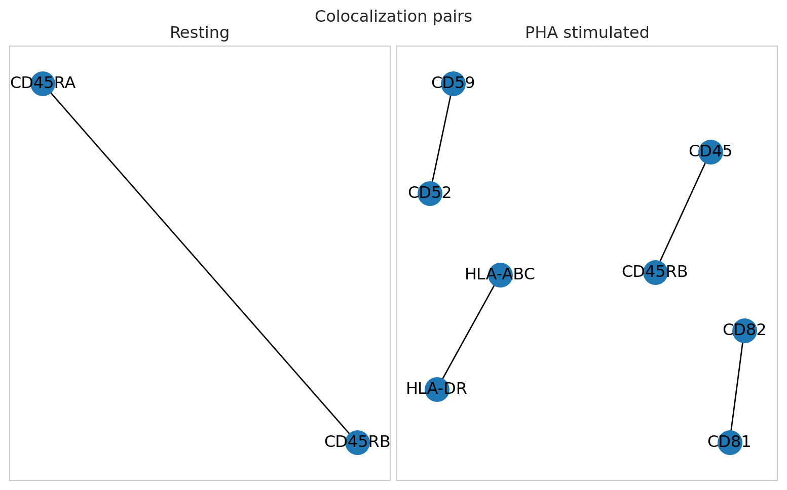
Note that the choice of removing marker pairs that are present in fewer components is likely depending on your experimental goals. If you would like to detect marker pairs that change colocalization in only a small subpopulation of cells, you might want to retain these for the downstream analysis.
Differential colocalization analysis
Let us look at the differential marker-pair colocalizations for markers that have appeared to be colocalizing in at least one sample.
differential_colocalization = calculate_differential_proximity(
    colocalization_scores,
    contrast_column="condition",
    reference="Resting",
    targets=["PHA stimulated"],
    metric="log2_ratio",
    min_n_obs=50,
)
differential_colocalization["log10_p"] = -np.log10(differential_colocalization["p_adjusted"])
sc = plt.scatter(
    differential_colocalization["median_diff"],
    differential_colocalization["log10_p"],
    c=differential_colocalization["tgt_median"],
    vmin=-1.0,
    vmax=1.0,
    cmap="coolwarm"
)
plt.colorbar(sc, label="Median colocalization after stimulation")
for _, r in differential_colocalization[differential_colocalization["log10_p"]>20].iterrows():
    plt.text(
        r["median_diff"]+0.01,
        r["log10_p"]+0.01,
        r["marker_1"] + "/" + r["marker_2"]
    )
plt.tight_layout()
plt.xlabel("Median difference")
plt.ylabel("log10 p value")
plt.title("Differential colocalization")
plt.show()


plt.show()
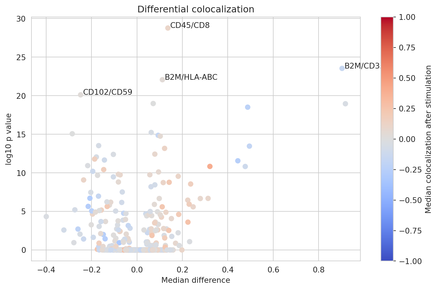
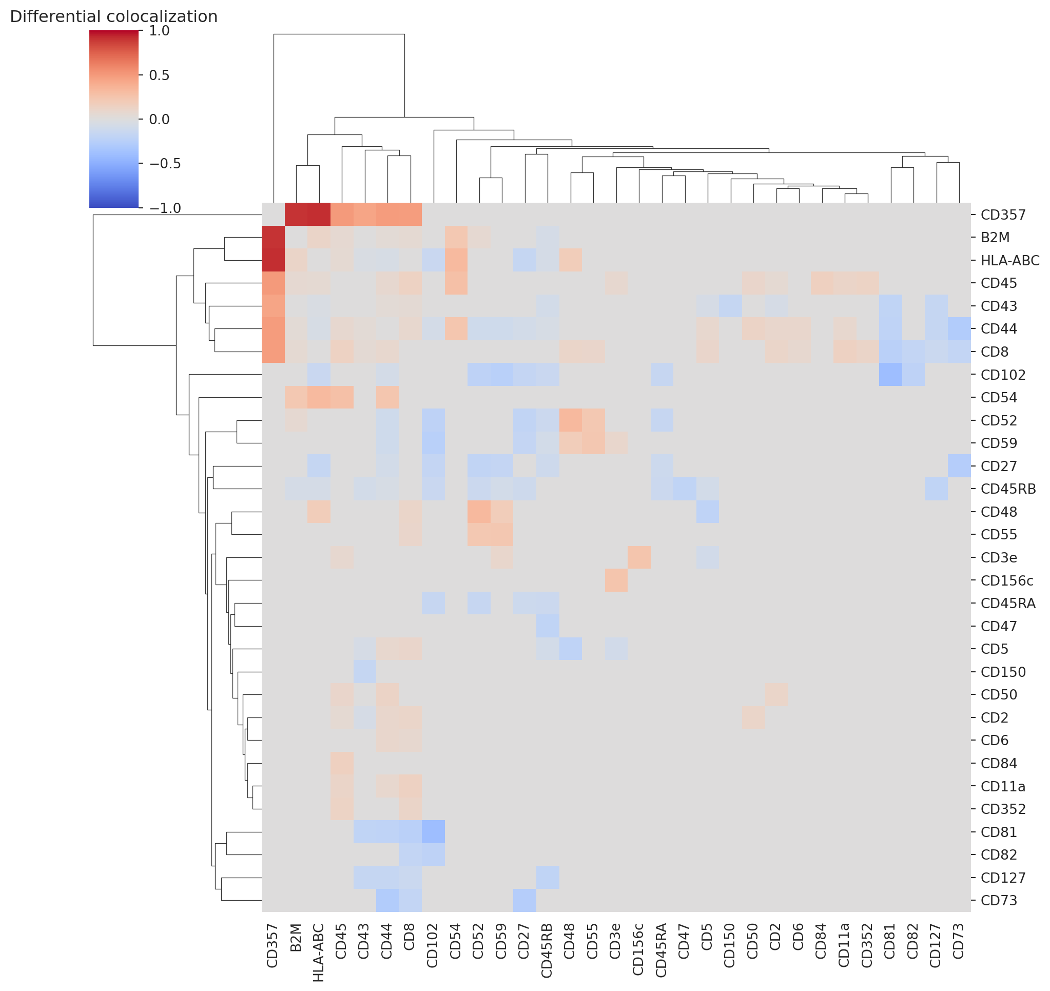
We observe several differentially colocalized pairs. Let us look at a clustered heatmap to get a better grasp of protein colocalizations.
differential_colocalization_summary = (
    differential_colocalization
    [differential_colocalization["log10_p"]>3]
    .set_index(["marker_1", "marker_2"])
    ["median_diff"]
    .unstack()
    .fillna(0)
)
differential_colocalization_summary = differential_colocalization_summary.add(differential_colocalization_summary.T, fill_value=0).fillna(0)
sns.clustermap(differential_colocalization_summary, vmin=-1, vmax=1, cmap="coolwarm")
plt.title("Differential colocalization")
plt.show()


plt.show()
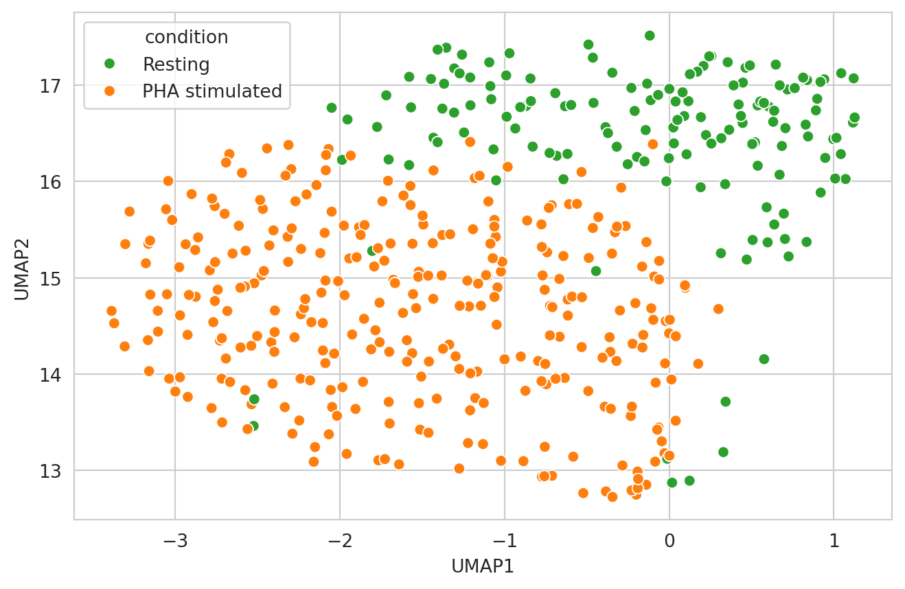
Now let’s take a holistic view of colocalization scores and make a UMAP. We will filter the proteins we want to include to only the ones that had the largest difference in colocalization score between our two samples.
# We only pick proteins which have a high estimated difference
# and that are siginficant at out adjusted p-value threshold
proteins_of_interest = pd.unique(
    differential_colocalization[
        differential_colocalization["log10_p"]>3
    ][["marker_1", "marker_2"]].values.ravel("K")
)

# We build a matrix with each colocalization with marker pairs
# in the columns, their pearson Z score as the values, and
# the components in the rows
colocalization_scores.loc[:, "pair"] = (
    colocalization_scores["marker_1"]
    +"/"
    +colocalization_scores["marker_2"]
).values
umap_df = colocalization_scores[
    colocalization_scores["marker_1"].isin(proteins_of_interest)
    & colocalization_scores["marker_2"].isin(proteins_of_interest)
].pivot(index="component", columns="pair", values="log2_ratio")
umap_df[umap_df.isna()] = 0

# Scale all marker pairs using z-scaling
scaled_data = zscore(umap_df.to_numpy(dtype="float64"), axis=0)
umap_df = pd.DataFrame(
    scaled_data,
    index=umap_df.index,
    columns=umap_df.columns,
)

# Build a UMAP, and re-attach the sample information to it
reducer = umap.UMAP()
embedding = pd.DataFrame(
    reducer.fit_transform(umap_df), index=umap_df.index, columns=["UMAP1", "UMAP2"]
)
embedding = embedding.merge(
    colocalization_scores[["component", "condition"]], how="left", on="component"
)

# Plot the UMAP
umap_plot = sns.scatterplot(
    embedding,
    x="UMAP1",
    y="UMAP2",
    hue="condition",
    hue_order=CONDITION_ORDER,
    palette=CONDITION_PALETTE,
)
plt.show()
Armed with the powerful insights gleaned from analyzing Proximity Network Assay data, we have delved into the spatial organization of proteins on the cell surface, uncovering how they cluster and interact differently under various conditions. The next tutorial in this series takes us a step further by exploring cell graph visualizations. This exciting approach will allow us to not only see, but truly feel, the dynamic nature of proteins as they cluster and colocalize, offering a deeper understanding of their roles in shaping cellular function.