Proximity Network Assay Quality Control
This tutorial details the first steps of data analysis to quality control and clean up the Proximity Network Assay data output from Pixelator.
After completing this tutorial, you should be able to:
- Use the molecule rank plot to manually set cell calling thresholds and filter low-quality cells.
- Aggregate data across samples and visualize sample-level QC metrics like number of cells.
- Check distributions of quality metrics like molecule counts and graph connectivity.
- Identify and remove cell outliers using the antibody count distribution metric Tau.
Setup
First, we will load packages necessary for downstream processing.
from pathlib import Path
from pixelator import read_pna as read
from pixelator.pna.plot import molecule_rank_plot

import numpy as np
import pandas as pd
import seaborn as sns
import matplotlib.pyplot as plt
sns.set_style("whitegrid")
DATA_DIR = Path("./pna-analysis")
from pixelator.pna.pixeldataset.download import DownloadableDatasets

DATA_DIR.mkdir(parents=True, exist_ok=True)

DownloadableDatasets.download_dataset(
  "pna062-unstim-pbmcs",
  output_path=DATA_DIR / "PNA062_unstim_PBMCs_1000cells_S02_S2.layout.pxl",
)
DownloadableDatasets.download_dataset(
  "pna062-pha-pbmcs",
  output_path=DATA_DIR / "PNA062_PHA_PBMCs_1000cells_S04_S4.layout.pxl",
)
Load data
In this tutorial we will continue where we left off after the previous tutorial Data handling and load the PXL files in a single object. As described previously, this merged object contains two samples: a resting and PHA stimulated PBMC sample.
pg_data_combined_pxl_object =  read(
    [
        DATA_DIR/"PNA062_unstim_PBMCs_1000cells_S02_S2.layout.pxl",
        DATA_DIR/"PNA062_PHA_PBMCs_1000cells_S04_S4.layout.pxl",
    ]
)

# In this tutorial we will mostly work with the AnnData object
# so we will start by selecting that from the pixel data object
pg_data_combined = pg_data_combined_pxl_object.adata()
pg_data_combined.obs["condition"] = "Resting"
pg_data_combined.obs.loc[
    pg_data_combined.obs["sample"].str.contains("PHA"),
    "condition"
] = "PHA stimulated"
pg_data_combined.obs["condition"] = pd.Categorical(
    pg_data_combined.obs["condition"],
    categories=["Resting", "PHA stimulated"],
    ordered=True,
)

CONDITION_ORDER = ["Resting", "PHA stimulated"]
CONDITION_PALETTE = {"Resting": "#2ca02c", "PHA stimulated": "#ff7f0e"}
Cell calling: Edge rank plot
Here, we use the molecule rank plot to perform an additional quality control of the called cells, to make a manual adjustment to the number of cells that were called by Pixelator. This removes cells that deviate from the component size distribution, and might not represent whole cells.
molecule_rank_df = pg_data_combined.obs[["condition", "n_umi"]].copy()
molecule_rank_df["rank"] = molecule_rank_df.groupby(["condition"])["n_umi"].rank(
    ascending=False, method="first"
)
fig, ax = molecule_rank_plot(molecule_rank_df, group_by="condition")
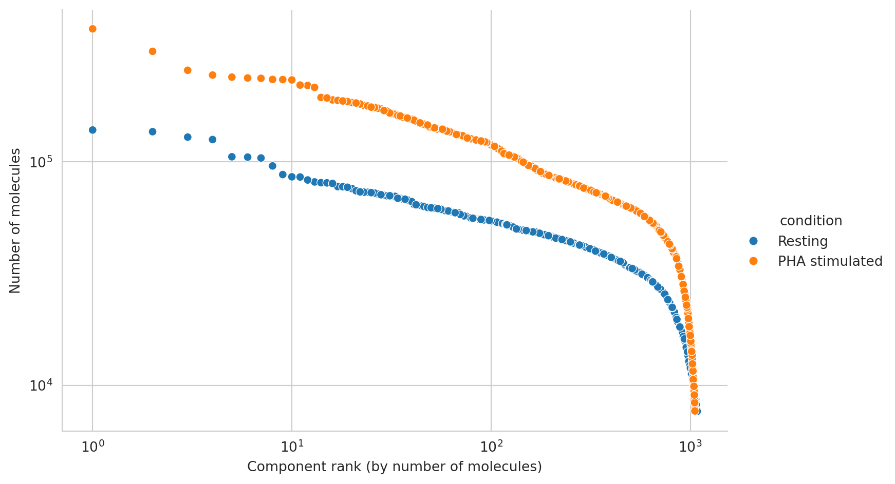
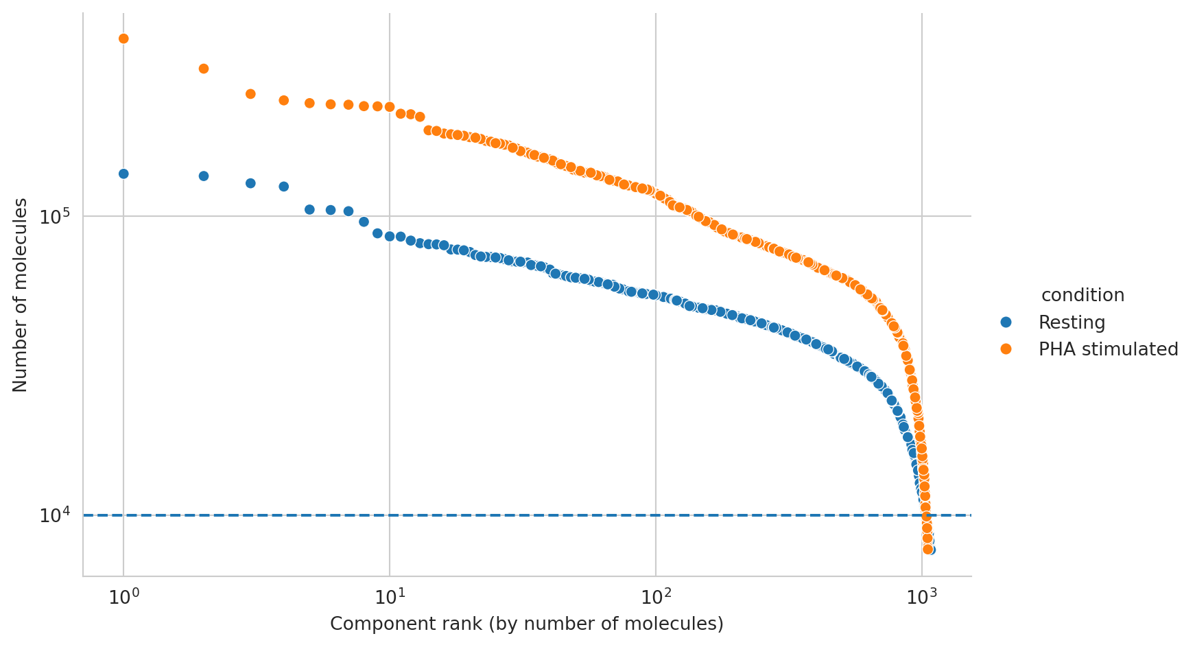
It looks like components are declining rapidly in size at around 10000 molecules, and we will thus set a manual cutoff at that point, represented by a dashed line.
fig, ax = molecule_rank_plot(molecule_rank_df, group_by="condition")
ax.axhline(10000, linestyle="--")

# Filter cells to have at least 10000 edges
pg_data_combined = pg_data_combined[pg_data_combined.obs["n_umi"] >= 10000]
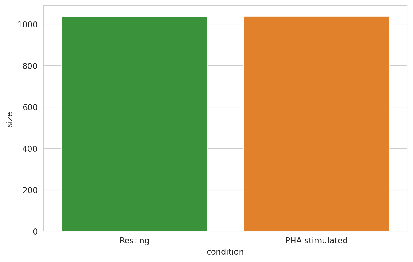
Here, we plot the number of called cells per condition.
cells_per_sample_df = (
    pg_data_combined.obs.groupby("condition").size().to_frame(name="size").reset_index()
    .sort_values("condition", ascending=False)
)

sns.barplot(
    cells_per_sample_df,
    x="condition",
    y="size",
    hue="condition",
    order=CONDITION_ORDER,
    hue_order=CONDITION_ORDER,
    palette=CONDITION_PALETTE,
)
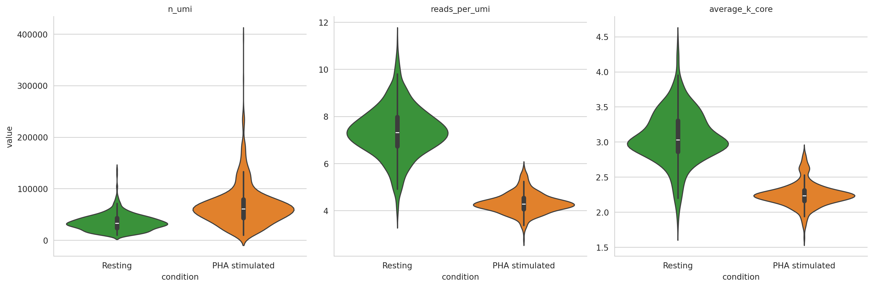
Here, we visualize the distribution of some metrics among components.
pg_data_combined.obs["reads_per_umi"] = pg_data_combined.obs["reads_in_component"]/pg_data_combined.obs["n_umi"]
metrics_per_sample_df = pg_data_combined.obs[
    ["condition", "n_umi", "reads_per_umi", "average_k_core"]
].melt(id_vars=["condition"])
metrics_plot = sns.catplot(
    data=metrics_per_sample_df,
    x="condition",
    col="variable",
    y="value",
    kind="violin",
    sharex=True,
    sharey=False,
    margin_titles=True,
    hue="condition",
    order=CONDITION_ORDER,
    hue_order=CONDITION_ORDER,
    palette=CONDITION_PALETTE,
).set_titles(col_template="{col_name}")
metrics_plot
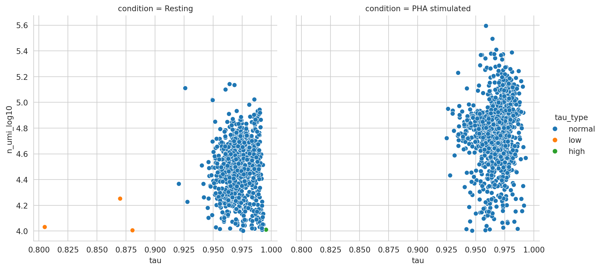
Antibody count distribution outlier removal
Here, we have plotted the base 10 log of UMI counts in each component against Tau, and colored each component by Pixelator’s classification of Tau (low, normal, or high). WARNING: THIS IS NOT TRUE FOR THE CURRENT DATA (NO HIGH TAU AND ONLY ONE LOW TAU): It looks like Pixelator has accurately picked out some outliers that might be an outlier antibody complex or a component that has low specificity, binding many more different types of antibodies than we would expect from a normal cell. As these outliers are likely a technical artefact, we will remove them from the analysis.
pg_data_combined.obs["n_umi_log10"] = np.log10(pg_data_combined.obs["n_umi"])
tau_metrics_df = pg_data_combined.obs[["condition", "tau", "n_umi_log10", "tau_type"]]

sns.relplot(tau_metrics_df, x="tau", y="n_umi_log10", col="condition", kind="scatter", hue="tau_type")
Going through the above steps we have performed critical quality control by filtering low-quality cells and identifying outliers. With a clean, high-quality Proximity Network Assay dataset in hand, we are ready to proceed to the next step, in which we will be leveraging protein abundance for the annotation of different cell populations.
If you want to pause here and save the list of filtered cells for the next tutorial, you can do so with the following code.
components_to_keep = pg_data_combined_pxl_object.adata()[
    (pg_data_combined_pxl_object.adata().obs["n_umi"] >= 10000)
    & (pg_data_combined_pxl_object.adata().obs["tau_type"] == "normal")
].obs.index

components_to_keep.to_frame().to_csv(DATA_DIR / "qc_filtered_cells.csv", index=False)