Visualizing spatial patterns
In the spatial analysis tutorial, we explored the polarity and colocalization metrics that allow us to identify protein-specific patterns of spatial organization across cell populations. Once a cell population has been defined with a large effect size of a spatial metric of interest, we can select components from that population and draw 2D or 3D layouts to show the spatial distribution of protein markers.
The polarity and colocalization metrics are summary metrics that indicate the presence of a general spatial pattern in a component, for example, whether one marker is clustered (polarity) or if two markers are colocalized (colocalization). However, these metrics do not tell us where in the component graph the polarity or colocalization event appear. For this, we can use a local spatial metric that can help us to score nodes in the graph based on how much the local marker abundance deviates from the expectation.
In this tutorial, we will learn how to use the Local G spatial metric to identify regions of MPX component graphs where a spatial pattern in marker abundance is present. In the 2D and 3D visualization tutorials, we could already see some patterns by simply coloring nodes based on marker abundance. However, for low abundant markers, such patterns can be quite challenging to pick up since the marker counts per node are sparse. The Local G spatial metric summarizes the abundance over an extended local neighborhood around each node which addresses this problem.
Setup
import pandas as pd
import numpy as np

from pathlib import Path
from pixelator.mpx import read, simple_aggregate

import plotly.graph_objects as go
import plotly.io as pio
pio.renderers.default = "plotly_mimetype+iframe_connected"

from scipy.stats import norm
import scipy as sp

import seaborn as sns
import matplotlib.pyplot as plt
Setup
DATA_DIR = Path("<path to the directory to save datasets to>")
Load data
We will continue with the stimulated T cell data that we analyzed in the previous tutorial (Karlsson et al, Nature Methods 2024). Here, we read the data files and apply the same filtering steps as in Spatial Analysis.
baseurl = "https://pixelgen-technologies-datasets.s3.eu-north-1.amazonaws.com/mpx-datasets/pixelator/next/uropod-t-cells-v1.0-immunology-I"

!curl -L -O -C - --create-dirs --output-dir {DATA_DIR} "{baseurl}/Uropod_control.layout.dataset.pxl"
!curl -L -O -C - --create-dirs --output-dir {DATA_DIR} "{baseurl}/Uropod_CD54_fixed_RANTES_stimulated.layout.dataset.pxl"
data_files = [
    DATA_DIR / "Uropod_control.layout.dataset.pxl",
    DATA_DIR / "Uropod_CD54_fixed_RANTES_stimulated.layout.dataset.pxl",
]

pg_data_combined = simple_aggregate(
    ["Control", "Stimulated"], [read(path) for path in data_files]
)

components_to_keep = pg_data_combined.adata[
    (pg_data_combined.adata.obs["molecules"] >= 8000)
    & (pg_data_combined.adata.obs["tau_type"] == "normal")
].obs.index

adata = pg_data_combined.adata
adata = adata[adata.obs.index.isin(components_to_keep), :]
Now we can select components with high colocalization for a specific marker pair to get some good example components to work with. First, we will filter our colocalization scores to keep only CD162/CD50 and then we will add the abundance data for CD162, CD37 and CD50 to the colocalization table.
colocalization_scores = pg_data_combined.colocalization

colocalization_scores = colocalization_scores[
    colocalization_scores["component"].isin(components_to_keep)
]
# Create a new columns with marker_1/marker_2 using iloc
colocalization_scores['contrast'] = colocalization_scores['marker_1'] + '/' + colocalization_scores['marker_2']
colocalization_scores = colocalization_scores[colocalization_scores['contrast'] == 'CD162/CD50']

# Fetch data from pg_data_combined and convert to a DataFrame
marker_counts = adata.X[
    :, adata.var.index.isin(["CD162", "CD37", "CD50"])
]
marker_counts = pd.DataFrame(
    marker_counts,
    columns=["CD162", "CD37", "CD50"]
)
marker_counts["component"] = adata.obs.index

# Merge the colocalization scores and marker count data dataframes on 'component'
colocalization_scores = colocalization_scores.merge(marker_counts, on='component', how='left')
Next, we will select components with high colocalization scores for CD162/CD50. In the histogram below, we see the distribution of Pearson Z scores for the CD162/CD50 colocalization. Since we want to narrow down the selection of components, we set a threshold for the Pearson Z scores. Here, we use a threshold of 35 to keep the components with the highest colocalization scores. Note that the threshold is arbitrary and should be adjusted based on the data.
# Set Pearson Z threshold
pearson_z_threshold = 35

sns.histplot(colocalization_scores['pearson_z'], bins=50)
plt.axvline(pearson_z_threshold, linestyle="--")
plt.title("Pearson Z scores [CD162/CD50]")
Text(0.5, 1.0, 'Pearson Z scores [CD162/CD50]')
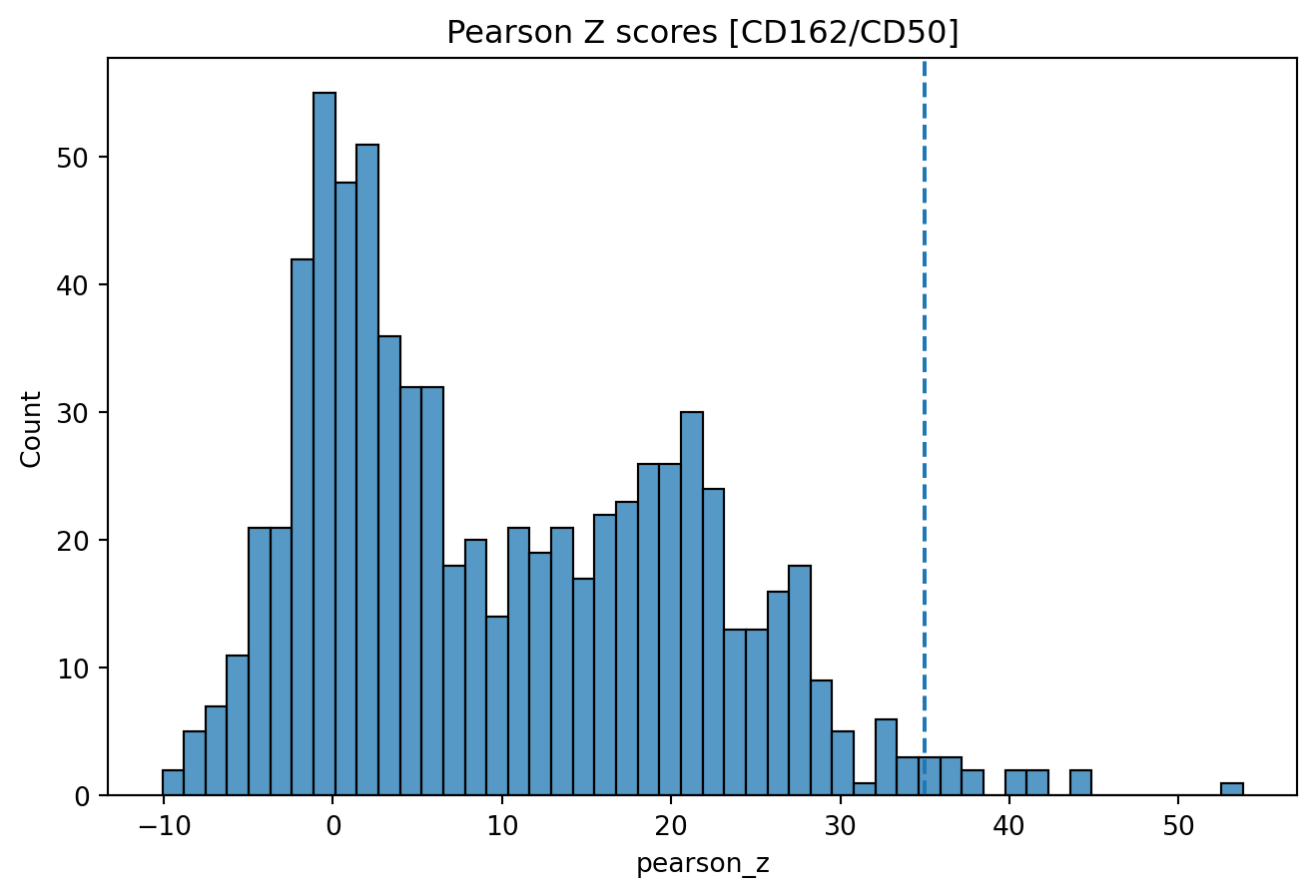
Then we apply our threshold to get a final selection of 13 components.
plot_components = colocalization_scores[
    (colocalization_scores['pearson_z'] > pearson_z_threshold) & (colocalization_scores['sample'] == 'Stimulated')
].sort_values(by='CD162', ascending=False)

plot_components = plot_components[["component", "pearson_z", "CD162", "CD50", "CD37"]]
plot_components
| component | pearson_z | CD162 | CD50 | CD37 | |
|---|---|---|---|---|---|
| 434 | 61cb84c709f41e7b_Stimulated | 41.687521 | 947 | 1222 | 631 |
| 454 | 59b284adcc91ec91_Stimulated | 44.136111 | 789 | 864 | 448 |
| 467 | 23606c9599265d9a_Stimulated | 40.091311 | 690 | 707 | 452 |
| 510 | 18278b69dc73ad16_Stimulated | 41.707346 | 486 | 736 | 249 |
| 511 | 437d692c40d6d601_Stimulated | 53.791253 | 450 | 493 | 286 |
| 569 | 50cd2ae85ea1c0e1_Stimulated | 44.591328 | 414 | 651 | 287 |
| 441 | 19ab7abc50018ac8_Stimulated | 40.458924 | 303 | 467 | 116 |
| 426 | 898664166bbd71ae_Stimulated | 35.591388 | 301 | 626 | 317 |
| 555 | d33f7aa55f7874ff_Stimulated | 36.517807 | 220 | 238 | 112 |
| 474 | 7778298975953f4f_Stimulated | 36.881728 | 216 | 420 | 138 |
| 681 | 703a192bee0b36f2_Stimulated | 37.979454 | 197 | 183 | 178 |
| 564 | f4d9b2d31012177a_Stimulated | 38.389434 | 178 | 161 | 119 |
| 461 | bd77e6c5f6e229e5_Stimulated | 36.717635 | 153 | 289 | 108 |
| 596 | 60523a26c6f19593_Stimulated | 35.865508 | 136 | 111 | 38 |
| 538 | 8a91a136efcae912_Stimulated | 35.421162 | 68 | 118 | 69 |
Local G scores
Local G is a Z score that measures how much the marker counts in a local
neighborhood deviates from the global mean. Neighborhoods are formed
around each node in the graph, where the size of the neighborhood is
determined by the k parameter. The larger k is, the larger the
neighborhood around each node becomes, which in turn increases the
spatial scale at which the score is calculated.
For instance, if we set k = 1, the local neighborhood around each node
will be the direct neighbors (1 step away). If we set k = 2, the
neighborhood will include the direct neighbors and the neighbors that
are 2 steps away.
The effect of using a higher k is that the spatial scale increases; we
are leveraging information from node that are further away in the graph,
and the local G score will be more smoothed out.
We can compute the Local G metric for a single component graph with the
local_g method. Here, we select one of the components from our
plot_components table.
example_graph = pg_data_combined.graph(
    "60523a26c6f19593_Stimulated", simplify=True, use_full_bipartite=True
)

gi_mat = example_graph.local_g(k=1, normalize_counts=False, use_weights=True)
gi_mat
| markers | ACTB | B2M | CD102 | CD11a | CD11b | CD11c | CD127 | CD137 | CD14 | CD150 | ... | CD82 | CD84 | CD86 | CD9 | HLA-ABC | HLA-DR | TCRVb5 | mIgG1 | mIgG2a | mIgG2b |
|---|---|---|---|---|---|---|---|---|---|---|---|---|---|---|---|---|---|---|---|---|---|
| node | |||||||||||||||||||||
| 476 | -0.112989 | 4.244440 | 1.324578 | -0.255276 | -0.092230 | -0.196027 | -0.184765 | -0.092230 | -0.087492 | -0.138440 | ... | 0.275866 | 3.560649 | 2.291411 | -0.092230 | 5.033729 | 4.049060 | 3.191708 | -0.184765 | -0.199366 | -0.159923 |
| 853 | -0.128300 | -0.482082 | -0.360847 | -0.031168 | -0.104727 | -0.222588 | -0.209801 | -0.104727 | -0.099348 | -0.157199 | ... | -0.212409 | -0.262182 | -0.842142 | -0.104727 | -0.655899 | -0.132802 | 0.125599 | -0.209801 | -0.226381 | -0.181593 |
| 2542 | -0.068183 | -0.057985 | -0.259402 | -0.154046 | -0.055656 | -0.118292 | -0.111496 | -0.055656 | -0.052797 | -0.083541 | ... | 0.865988 | 0.952489 | 0.168033 | -0.055656 | -0.120373 | 0.762917 | -0.158028 | -0.111496 | -0.120307 | -0.096505 |
| 2780 | -0.141421 | -1.511105 | -0.450477 | -0.141530 | -0.115438 | -0.245354 | -0.231258 | -0.115438 | -0.109509 | -0.173277 | ... | -0.636528 | -0.414664 | -1.254543 | -0.115438 | -1.329761 | -1.267388 | -0.327771 | -0.231258 | -0.249534 | -0.200165 |
| 641 | -0.071459 | 1.259288 | 1.080777 | -0.161446 | -0.058330 | -0.123974 | -0.116852 | -0.058330 | -0.055333 | -0.087555 | ... | -0.321630 | 0.801021 | 0.303520 | -0.058330 | 0.726877 | 0.824362 | -0.165619 | -0.116852 | -0.126086 | -0.101141 |
| ... | ... | ... | ... | ... | ... | ... | ... | ... | ... | ... | ... | ... | ... | ... | ... | ... | ... | ... | ... | ... | ... |
| 1167 | -0.040589 | 3.042094 | -0.154419 | -0.091702 | -0.033131 | -0.070418 | -0.066372 | -0.033131 | -0.031430 | -0.049731 | ... | 4.445383 | -0.178907 | 0.845398 | -0.033131 | 3.568833 | 3.150288 | -0.094072 | -0.066372 | -0.071618 | -0.057448 |
| 36 | -0.040589 | 0.534851 | -0.154419 | -0.091702 | -0.033131 | -0.070418 | -0.066372 | -0.033131 | -0.031430 | -0.049731 | ... | -0.182687 | -0.178907 | 0.845398 | -0.033131 | 2.952603 | 1.933318 | -0.094072 | -0.066372 | -0.071618 | -0.057448 |
| 623 | -0.040589 | -0.468046 | -0.154419 | -0.091702 | -0.033131 | -0.070418 | -0.066372 | -0.033131 | -0.031430 | -0.049731 | ... | -0.182687 | -0.178907 | -0.466948 | -0.033131 | 0.857419 | -0.094965 | -0.094072 | -0.066372 | -0.071618 | -0.057448 |
| 1024 | -0.040589 | 1.537748 | -0.154419 | -0.091702 | -0.033131 | -0.070418 | -0.066372 | -0.033131 | -0.031430 | -0.049731 | ... | -0.182687 | -0.178907 | 0.845398 | -0.033131 | 2.459618 | 0.716349 | -0.094072 | -0.066372 | -0.071618 | -0.057448 |
| 1176 | -0.040589 | 2.289921 | -0.154419 | -0.091702 | -0.033131 | -0.070418 | -0.066372 | -0.033131 | -0.031430 | -0.049731 | ... | -0.182687 | 4.765435 | 2.157744 | -0.033131 | 2.706110 | 1.933318 | -0.094072 | -0.066372 | -0.071618 | -0.057448 |
3649 rows × 79 columns
There are in fact to definitions of local G: and . The main
difference between these two variants is how they define a neighborhood
around a center node ; excludes from the neighborhood while
includes it. You can see the full definitions of the two
statistics in the algorithms section for Local
G. For visualization
purposes, the choice between and is not critical, but it
can affect the interpretation of the scores. You can select what method
to use by setting method to one of “gi” or “gstari” in the local_G
function.
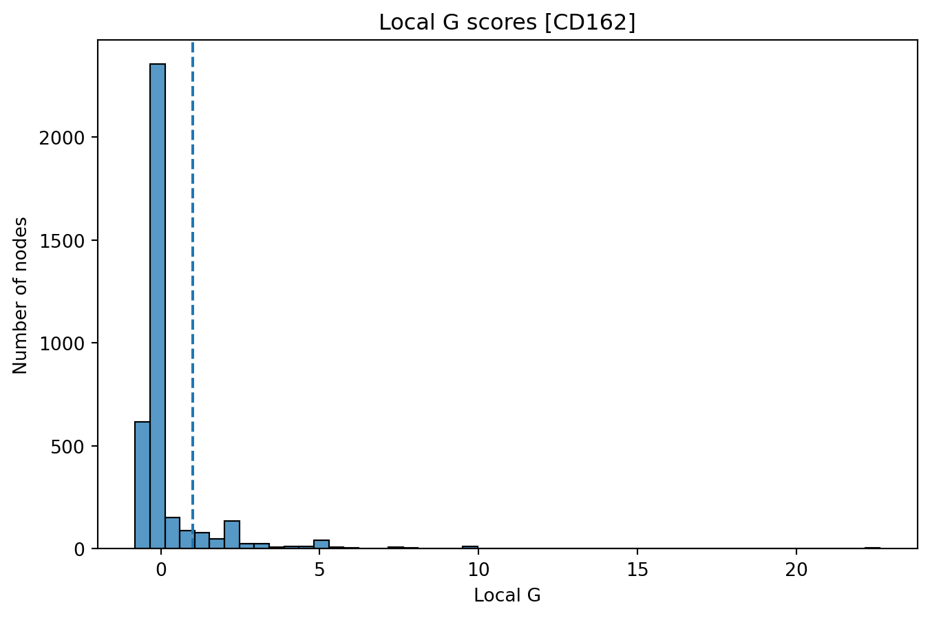
In the plot below, we show the distribution (histogram) of local G
scores for CD162 with k = 1 for our selected component. We see that a
large fraction of nodes have G scores around 0, while a smaller fraction
of the nodes (right tail) have very high scores. The latter corresponds
to nodes that are located in regions of the graph where the abundance of
CD162 is higher than expected.
sns.histplot(gi_mat["CD162"], bins=50)
plt.axvline(1, linestyle="--")
plt.title("Local G scores [CD162]")
plt.xlabel("Local G")
plt.ylabel("Number of nodes")
Text(0, 0.5, 'Number of nodes')
If we want to visualize the spatial distribution of the local G scores, we can project them back onto a 3D layout as we did in the 3D cell visualization tutorial.
First, let’s compute 3D weighted pmds layouts for our component graphs:
example_graph_layout_data = example_graph.layout_coordinates("wpmds_3d",
only_keep_a_pixels=False,
get_node_marker_matrix=True)
In the plot below, we project the local G scores for CD162 onto the
wpmds 3D layout. The color scale is centered at 0, since we are
visualizing Z scores.
vals = gi_mat["CD162"]
# Note that we need to reindex the values to match the layout data
# to ensure the nodes have the same ordering.
vals = vals.reindex(example_graph_layout_data.index)
max_abs_val = max(abs(vals))

fig = go.Figure(
    data=[
        go.Scatter3d(
            x=example_graph_layout_data["x"],
            y=example_graph_layout_data["y"],
            z=example_graph_layout_data["z"],
            mode="markers",
            marker=dict(size=3, opacity=0.4, colorscale="RdBu", cmin=-max_abs_val, cmax=max_abs_val, reversescale=True),
            marker_color=vals
        ),
    ]
)
fig.update_layout(title="Local G scores for CD162 (k = 1)")
fig.show()
Note that the Local G scores can have extreme outliers which tend to skew the color scale. To mitigate this, we can trim the values to a certain quantile range. Below, we adjust values higher than the 99th percentile.
vals[vals > vals.quantile(0.99)]=vals.quantile(0.99)

max_abs_val = max(abs(vals))

fig = go.Figure(
    data=[
        go.Scatter3d(
            x=example_graph_layout_data["x"],
            y=example_graph_layout_data["y"],
            z=example_graph_layout_data["z"],
            mode="markers",
            marker=dict(size=3, opacity=0.4, colorscale="RdBu", cmin=-max_abs_val, cmax=max_abs_val, reversescale=True),
            marker_color=vals
        ),
    ]
)
fig.update_layout(title="Local G scores for CD162 (k = 1)")
fig.show()
If we generate the same plot using raw counts, we can see that the spatial pattern is still quite clear, but less concentrated in the uropod.
fig = go.Figure(
    data=[
        go.Scatter3d(
            x=example_graph_layout_data["x"],
            y=example_graph_layout_data["y"],
            z=example_graph_layout_data["z"],
            mode="markers",
            marker=dict(size=3, opacity=0.4, colorscale="OrRd"),
            marker_color=np.log1p(example_graph_layout_data["CD162"])
        ),
    ]
)
fig.update_layout(title="Log1p counts for CD162")
fig.show()
P values
With the local_G function, we can also compute p values for each node
and marker. This allows us to identify “hot” and “cold” zones,
i.e. nodes where marker abundance is significantly different from the
global mean. The sign of the Z score can be used to determine if the
marker is over- (“hot”) or under-expressed (“cold”) in the local
neighborhood.
With an adjusted p value threshold of 0.05, we find 149 nodes in the “hot” zone and the rest are not significant (do not deviate from the global mean).
# Two-sided test
p_values = sp.stats.norm.sf(abs(gi_mat["CD162"]))*2
p_values_adj = sp.stats.false_discovery_control(p_values)

df = pd.DataFrame({
    "adj_p_val": p_values_adj,
    "Gi": gi_mat["CD162"]
})
df["zone"] = df.apply(
    lambda x: "Hot" if x["Gi"] > 0 and x["adj_p_val"] < 0.05 else "Cold" if x["Gi"] < 0 and x["adj_p_val"] < 0.05 else "Not significant",
    axis=1
)
df["node_color"] = df["zone"].apply(
    lambda x: "red" if x == "Hot" else "blue" if x == "Cold" else "grey"
)
df["zone"].value_counts()
zone
Not significant    3500
Hot                 149
Name: count, dtype: int64
If we want to visualize the “hot” and “cold” zones, we can color the nodes accordingly. Below, we color the nodes red if they are in the “hot” zone, blue if they are in the “cold” zone, and grey otherwise.
fig = go.Figure(
    data=[
        go.Scatter3d(
            x=example_graph_layout_data["x"],
            y=example_graph_layout_data["y"],
            z=example_graph_layout_data["z"],
            mode="markers",
            marker=dict(size=3, opacity=0.4, colorscale="OrRd"),
            marker_color=df["node_color"]
        ),
    ]
)
fig.update_layout(title="Hot zone CD162 (k = 1)")
fig.show()
Note that the p values are context-dependent and should be interpreted
with caution. In the computation of local G, the neighborhood size is
adjusted with the k parameter and when computing the marker abundance
within each neighborhood, each neighboring node contributes with a
certain weight that depends on its connectivity. This weighting scheme
is activated by default, but can be skipped by setting
use_weights = False. These parameters (k, use_weights, …) can be
adjusted to suit the specific needs of the analysis but will also affect
the p values.
In the plot below, we demonstrate the “smoothing” effect that we get by
increasing k to a neighborhood of 4. Now, the spatial pattern is
clearer and the “hot” zone in the Uropod is more pronounced.
gi_mat = example_graph.local_g(k=4, normalize_counts=False, use_weights=True)

vals = gi_mat["CD162"]
# Note that we need to reindex the values to match the layout data
# to ensure the nodes have the same ordering.
vals = vals.reindex(example_graph_layout_data.index)
vals[vals > vals.quantile(0.99)]=vals.quantile(0.99)

max_abs_val = max(abs(vals))

fig = go.Figure(
    data=[
        go.Scatter3d(
            x=example_graph_layout_data["x"],
            y=example_graph_layout_data["y"],
            z=example_graph_layout_data["z"],
            mode="markers",
            marker=dict(size=3, opacity=0.4, colorscale="RdBu",
                        cmin=-max_abs_val, cmax=max_abs_val,
                        reversescale=True),
            marker_color=vals
        ),
    ]
)
fig.update_layout(title="Local G scores for CD162 (k = 1)")
fig.show()
If we apply the same grouping of nodes based on the adjusted p values,
we now find many more nodes in the “hot” zone. Since we are including
more nodes in each local neighborhood (k = 4) when computing the local
G scores, there’s a higher chance that neighborhoods will include nodes
with counts for CD162, thus placing more nodes in the “hot” zone.
If we group nodes the same way as before, we now find 354 nodes in the “hot” zone.
# Two-sided test
p_values = sp.stats.norm.sf(abs(gi_mat["CD162"]))*2
p_values_adj = sp.stats.false_discovery_control(p_values)

df = pd.DataFrame({
    "adj_p_val": p_values_adj,
    "Gi": gi_mat["CD162"]
})
df["zone"] = df.apply(
    lambda x: "Hot" if x["Gi"] > 0 and x["adj_p_val"] < 0.05 else "Cold" if x["Gi"] < 0 and x["adj_p_val"] < 0.05 else "Not significant",
    axis=1
)
df["node_color"] = df["zone"].apply(
    lambda x: "red" if x == "Hot" else "blue" if x == "Cold" else "grey"
)
df["zone"].value_counts()
zone
Not significant    3369
Hot                 278
Cold                  2
Name: count, dtype: int64
fig = go.Figure(
    data=[
        go.Scatter3d(
            x=example_graph_layout_data["x"],
            y=example_graph_layout_data["y"],
            z=example_graph_layout_data["z"],
            mode="markers",
            marker=dict(size=3, opacity=0.4),
            marker_color=df["node_color"]
        ),
    ]
)
fig.update_layout(title="Hot zone CD162 (k = 4)")
fig.show()
Caveats
The Local G spatial metric is useful for visualizing spatial patterns in the data, but isolated events do not necessarily indicate biological significance. Just because a marker displays a certain spatial pattern in a single MPX cell component, this might not generalize across larger groups of MPX cell components.
Spatial patterns should be investigated across larger groups of components, for instance, by using differential polarity analysis (see our spatial analysis tutorial). Similarly, in microscopy data, observing a spatial pattern in a single cell is insufficient to establish biological significance. The pattern must be consistent across many cells to be meaningful. Once a clear pattern has been established, the local G score becomes a valuable tool for visualization and deeper analysis of MPX components displaying this spatial pattern.