Visualizing spatial patterns
In the spatial analysis tutorial, we explored the polarity and colocalization metrics that allow us to identify protein-specific patterns of spatial organization across cell populations. Once a cell population has been defined with a large effect size of a spatial metric of interest, we can select components from that population and draw 2D or 3D layouts to show the spatial distribution of protein markers.
The polarity and colocalization metrics are summary metrics that indicate the presence of a general spatial pattern in a component, for example, whether one marker is clustered (polarity) or if two markers are colocalized (colocalization). However, these metrics do not tell us where in the component graph the polarity or colocalization event appear. For this, we can use a local spatial metric that can help us to score nodes in the graph based on how much the local marker abundance deviates from the expectation.
In this tutorial, we will learn how to use the Local G spatial metric to identify regions of MPX component graphs where a spatial pattern in marker abundance is present. In the 2D and 3D visualization tutorials, we could already see some patterns by simply coloring nodes based on marker abundance. However, for low abundant markers, such patterns can be quite challenging to pick up since the marker counts per node are sparse. The Local G spatial metric summarizes the abundance over an extended local neighborhood around each node which addresses this problem.
Setup
library(dplyr)
library(tidyr)
library(here)
library(pixelatorR)
library(stringr)
library(SeuratObject)
library(ggplot2)
Load data
We will continue with the stimulated T cell data that we analyzed in the previous tutorial (Karlsson et al, Nature Methods 2024). Here, we read the data files and apply the same filtering steps as in Spatial Analysis.
We begin by downloading and loading the PXL file that is needed for this first part of the Data Handling tutorial.
DATA_DIR <- "path/to/local/folder"
Sys.setenv("DATA_DIR" = DATA_DIR)
Run the following code in the terminal to download the dataset.
BASEURL="https://pixelgen-technologies-datasets.s3.eu-north-1.amazonaws.com/mpx-datasets/pixelator/next/uropod-t-cells-v1.0-immunology-I"

curl -Ls -O -C - --create-dirs --output-dir $DATA_DIR "${BASEURL}/Uropod_control.layout.dataset.pxl"
curl -Ls -O -C - --create-dirs --output-dir $DATA_DIR "${BASEURL}/Uropod_CD54_fixed_RANTES_stimulated.layout.dataset.pxl"
And then proceed in R.
# The folders the data is located in:
data_files <-
  c(Control = file.path(DATA_DIR, "Uropod_control.layout.dataset.pxl"),
    Stimulated = file.path(DATA_DIR, "Uropod_CD54_fixed_RANTES_stimulated.layout.dataset.pxl"))


# Read .pxl files as a list of Seurat objects
pg_data <- lapply(data_files, ReadMPX_Seurat)

# Combine data to Seurat object
pg_data_combined <-
  merge(pg_data[[1]],
        y = pg_data[-1],
        add.cell.ids = names(pg_data))

# Add sample column to meta data
pg_data_combined <-
  AddMetaData(pg_data_combined,
              metadata = str_remove(colnames(pg_data_combined), "_.*"),
              col.name = "sample")
rm(pg_data)
gc()
           used  (Mb) gc trigger  (Mb) max used  (Mb)
Ncells  3819006 204.0    7184375 383.7  5723054 305.7
Vcells 28761523 219.5   64723356 493.9 64722683 493.8
# Filter cells
pg_data_combined <-
  pg_data_combined %>%
  subset(molecules >= 8000 & tau_type == "normal")
Now we can select components with high colocalization for a specific marker pair to get some good example components to work with. First, we will filter our colocalization scores to keep only CD162/CD50 and then we will add the abundance data for CD162, CD37 and CD50 to the colocalization table.
colocalization_scores <-
  ColocalizationScores(pg_data_combined, meta_data_columns = "sample") %>%
  unite(contrast, marker_1, marker_2, sep = "/") %>%
  filter(contrast == "CD162/CD50") %>%
  left_join(y = FetchData(pg_data_combined, vars = c("CD162", "CD50", "CD37"), layer = "counts") %>%
              as_tibble(rownames = "component"),
            by = "component")
Next, we will select components with high colocalization scores for CD162/CD50. In the histogram below, we see the distribution of Pearson Z scores for the CD162/CD50 colocalization. Since we want to narrow down the selection of components, we set a threshold for the Pearson Z scores. Here, we use a threshold of 35 to keep the components with the highest colocalization scores. Note that the threshold is arbitrary and should be adjusted based on the data.
# Set Pearson Z threshold
pearson_z_threshold <- 35

ggplot(colocalization_scores, aes(pearson_z)) +
  geom_histogram(bins = 50) +
  geom_vline(xintercept = pearson_z_threshold, linetype = "dashed") +
  labs(title = "Pearson Z scores [CD162/CD50]")
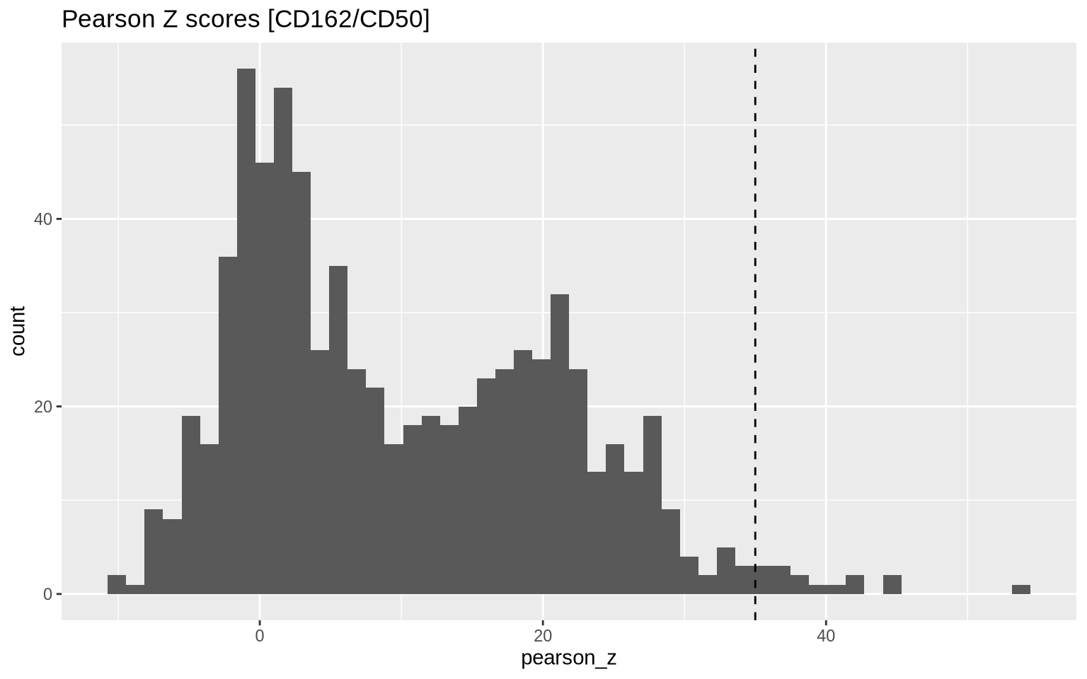
Then we apply our threshold to get a final selection of 15 components.
plot_components <-
  colocalization_scores %>%
  filter(pearson_z > pearson_z_threshold, sample == "Stimulated") %>%
  arrange(-CD162) %>%
  select(component, pearson_z, CD162, CD50, CD37)
plot_components
# A tibble: 15 × 5
   component                   pearson_z CD162  CD50  CD37
   <chr>                           <dbl> <dbl> <dbl> <dbl>
 1 Stimulated_61cb84c709f41e7b      41.7   947  1222   631
 2 Stimulated_59b284adcc91ec91      44.1   789   864   448
 3 Stimulated_23606c9599265d9a      40.1   690   707   452
 4 Stimulated_18278b69dc73ad16      41.7   486   736   249
 5 Stimulated_437d692c40d6d601      53.8   450   493   286
 6 Stimulated_50cd2ae85ea1c0e1      44.6   414   651   287
 7 Stimulated_19ab7abc50018ac8      40.5   303   467   116
 8 Stimulated_898664166bbd71ae      35.6   301   626   317
 9 Stimulated_d33f7aa55f7874ff      36.5   220   238   112
10 Stimulated_7778298975953f4f      36.9   216   420   138
11 Stimulated_703a192bee0b36f2      38.0   197   183   178
12 Stimulated_f4d9b2d31012177a      38.4   178   161   119
13 Stimulated_bd77e6c5f6e229e5      36.7   153   289   108
14 Stimulated_60523a26c6f19593      35.9   136   111    38
15 Stimulated_8a91a136efcae912      35.4    68   118    69
Local G scores
Local G is a Z score that measures how much the marker counts in a local
neighborhood deviates from the global mean. Neighborhoods are formed
around each node in the graph, where the size of the neighborhood is
determined by the k parameter. The larger k is, the larger the
neighborhood around each node becomes, which in turn increases the
spatial scale at which the score is calculated.
For instance, if we set k = 1, the local neighborhood around each node
will be the direct neighbors (1 step away). If we set k = 2, the
neighborhood will include the direct neighbors and the neighbors that
are 2 steps away.
The effect of using a higher k is that the spatial scale increases; we
are leveraging information from node that are further away in the graph,
and the local G score will be more smoothed out. You can visit our
algorithms section about Local
G if you want to learn
more about this statistic.
Before we proceed, we first need to load the component graphs of interest:
pg_data_combined <- LoadCellGraphs(pg_data_combined, cells = plot_components$component)
We can compute the Local G metric for a single component graph with the
local_G function. This function requires a graph object and a node
count matrix as input and returns a matrix where each row corresponds to
a node in the graph and each column corresponds to a marker. Here, we
select one of the components from our plot_components table.
cg <- CellGraphs(pg_data_combined)[["Stimulated_898664166bbd71ae"]]
counts <- CellGraphData(cg, "counts")
g <- CellGraphData(cg, "cellgraph")

# Compute local G
gi_mat <- local_G(g, counts, k = 1)
gi_mat[1:5, 1:5]
                                CD152       CD16       CD50      CD278
ATCGCTTCTAACTAAGTATCCGGTG-A  3.550482  0.9429896  1.5732704  1.3861821
AGCTCGTCAGATGAACCGGTAATAC-A 13.554079 -0.4391280 -0.4690609 -0.4832021
GCTTTGCTATACTGGTTCCTGAATC-A  5.759793 -0.4067368  2.0018275  3.7037100
GGGCAGGGCTGTGCATTGGTTGTAG-A 32.994167 -0.1956014 -0.2089345 -0.2152334
CATAAGCTAAAGGGCGAAGTATTCG-A  3.061348 -0.6278358 -0.5868474 -0.6025973
                                 CD337
ATCGCTTCTAACTAAGTATCCGGTG-A  3.3423569
AGCTCGTCAGATGAACCGGTAATAC-A -0.1517699
GCTTTGCTATACTGGTTCCTGAATC-A -0.1405750
GGGCAGGGCTGTGCATTGGTTGTAG-A 13.0291943
CATAAGCTAAAGGGCGAAGTATTCG-A -0.2169905
There are in fact to definitions of local G: and . The main
difference between these two variants is how they define a neighborhood
around a center node ; excludes from the neighborhood while
includes it. You can see the full definitions of the two
statistics in the algorithms section for Local
G. For visualization
purposes, the choice between and is not critical, but it
can affect the interpretation of the scores. You can select what method
to use by setting type to one of “gi” or “gstari” in the local_G
function.
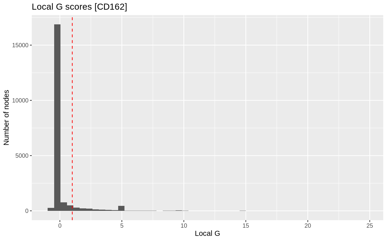
In the plot below, we show the distribution (histogram) of local G
scores for CD162 with k = 1 for our selected component. We see that a
large fraction of nodes have G scores around 0, while a smaller fraction
of the nodes (right tail) have very high scores. The latter corresponds
to nodes that are located in regions of the graph where the abundance of
CD162 is higher than expected.
gi_mat[, "CD162"] %>%
  as.data.frame() %>%
  setNames(c("CD162")) %>%
  ggplot(aes(x = CD162)) +
  geom_histogram(bins = 50) +
  geom_vline(xintercept = 1, color = "red", linetype = "dashed") +
  labs(title = "Local G scores [CD162]", x = "Local G", y = "Number of nodes")
If we want to visualize the spatial distribution of the local G scores,
we can project them back onto a 3D layout as we did in the 3D cell
visualization
tutorial. The local G scores cannot be directly visualized with
Plot3DGraph, so we will need to create the plot manually.
First, let’s compute 3D weighted pmds layouts for our loaded component graphs:
pg_data_combined <- ComputeLayout(pg_data_combined, dim = 3, pivots = 200, layout_method = "wpmds")
cg <- CellGraphs(pg_data_combined)[["Stimulated_898664166bbd71ae"]]
In the plot below, we project the local G scores for CD162 onto the
wpmds 3D layout. The color scale is centered at 0, since we are
visualizing Z scores.
layout <- CellGraphData(cg, "layout")$wpmds_3d

# Fetch local G scores for CD162
vals <- gi_mat[, "CD162"]

max_abs_val <- max(abs(vals))

plotly::plot_ly(
  layout,
  type = "scatter3d",
  mode = "markers",
  x = ~x, y = ~y, z = ~z,
  size = 1,
  marker = list(color = vals, colorscale = "RdBu", opacity = 1,
                size = scales::rescale(vals, to = c(20, 100)),
                cmin = -max_abs_val, cmax = max_abs_val, # Center color scale at 0
                line = list(width = 0))) %>%
  plotly::layout(title = "Gi scores for CD162 (k = 1)",
                 scene = list(xaxis = list(title = "", showgrid = F, nticks = 0, showticklabels = F),
                              yaxis = list(title = "", showgrid = F, nticks = 0, showticklabels = F),
                              zaxis = list(title = "", showgrid = F, nticks = 0, showticklabels = F)))
Note that the Local G scores can have extreme outliers which tend to skew the color scale. To mitigate this, we can trim the values to a certain quantile range. Below, we adjust values higher than the 99th percentile.
layout <- CellGraphData(cg, "layout")$wpmds_3d

vals[vals > quantile(vals, 0.99)] <- quantile(vals, 0.99)

max_abs_val <- max(abs(vals))

plotly::plot_ly(
  layout,
  type = "scatter3d",
  mode = "markers",
  x = ~x, y = ~y, z = ~z,
  size = 1,
  marker = list(color = vals, colorscale = "RdBu", opacity = 1,
                size = scales::rescale(vals, to = c(20, 100)),
                cmin = -max_abs_val, cmax = max_abs_val,
                line = list(width = 0))) %>%
  plotly::layout(title = "Gi scores for CD162 (k = 1)",
                 scene = list(xaxis = list(title = "", showgrid = F, nticks = 0, showticklabels = F),
                              yaxis = list(title = "", showgrid = F, nticks = 0, showticklabels = F),
                              zaxis = list(title = "", showgrid = F, nticks = 0, showticklabels = F)))
If we generate the same plot using raw counts, we can see that the spatial pattern is still quite clear, but less concentrated in the uropod.
layout <- CellGraphData(cg, "layout")$wpmds_3d

vals <- CellGraphData(cg, "counts")[, "CD162"] %>% log1p()

plotly::plot_ly(
  layout,
  type = "scatter3d",
  mode = "markers",
  x = ~x, y = ~y, z = ~z,
  size = 1,
  marker = list(color = vals, colorscale = c("lightgrey", "mistyrose", "red", "darkred"), opacity = 1,
                size = scales::rescale(vals, to = c(20, 100)),
                line = list(width = 0))) %>%
  plotly::layout(title = "log1p counts for CD162 (k = 1)",
                 scene = list(xaxis = list(title = "", showgrid = F, nticks = 0, showticklabels = F),
                              yaxis = list(title = "", showgrid = F, nticks = 0, showticklabels = F),
                              zaxis = list(title = "", showgrid = F, nticks = 0, showticklabels = F)))
P values
With the local_G function, we can also compute p values for each node
and marker. This allows us to identify “hot” and “cold” zones,
i.e. nodes where marker abundance is significantly different from the
global mean. The sign of the Z score can be used to determine if the
marker is over- (“hot”) or under-expressed (“cold”) in the local
neighborhood.
With an adjusted p value threshold of 0.05, we find 149 nodes in the “hot” zone and the rest are not significant (do not deviate from the global mean).
gi_res <- local_G(g, counts, k = 1, return_p_vals = TRUE)
df <- gi_res$gi_p_adj_mat[, "CD162"] %>%
  cbind(gi_res$gi_mat[, "CD162"]) %>%
  as.data.frame() %>%
  setNames(c("adj_p_val", "Gi")) %>%
  mutate(zone = case_when(
    Gi > 0 & adj_p_val < 0.05 ~ "Hot",
    Gi < 0 & adj_p_val < 0.05 ~ "Cold",
    TRUE ~ "Not significant"
  )) %>%
  mutate(node_color = case_when(
    zone == "Hot" ~ "red",
    zone == "Cold" ~ "blue",
    TRUE ~ "grey"
  ))
df$zone %>% table()
.
            Hot Not significant
            931           19218
If we want to visualize the “hot” and “cold” zones, we can color the nodes accordingly. Below, we color the nodes red if they are in the “hot” zone, blue if they are in the “cold” zone, and grey otherwise.
layout <- CellGraphData(cg, "layout")$wpmds_3d

layout$node_color <- factor(df$zone)

plotly::plot_ly(
  layout,
  type = "scatter3d",
  mode = "markers",
  x = ~x, y = ~y, z = ~z, color = ~node_color, colors = c("red", "blue", "grey"),
  size = 1,
  marker = list(opacity = 1,
                line = list(width = 0))) %>%
  plotly::layout(title = "Hot zone CD162 (k = 1)",
                 scene = list(xaxis = list(title = "", showgrid = F, nticks = 0, showticklabels = F),
                      yaxis = list(title = "", showgrid = F, nticks = 0, showticklabels = F),
                      zaxis = list(title = "", showgrid = F, nticks = 0, showticklabels = F)))
Note that the p values are context-dependent and should be interpreted
with caution. In the computation of local G, the neighborhood size is
adjusted with the k parameter and when computing the marker abundance
within each neighborhood, each neighboring node contributes with a
certain weight that depends on its connectivity. This weighting scheme
is activated by default, but can be skipped by setting
use_weights = FALSE. These parameters (k, use_weights, …) can be
adjusted to suit the specific needs of the analysis but will also affect
the p values.
In the plot below, we demonstrate the “smoothing” effect that we get by
increasing k to a neighborhood of 4. Now, the spatial pattern is
clearer and the “hot” zone in the Uropod is more pronounced.
layout <- CellGraphData(cg, "layout")$wpmds_3d

gi_res <- local_G(g, counts, k = 4, return_p_vals = TRUE)
vals <- gi_res$gi_mat[, "CD162"]
vals[vals > quantile(vals, 0.99)] <- quantile(vals, 0.99)
max_abs_val <- max(abs(vals))

plotly::plot_ly(
  layout,
  type = "scatter3d",
  mode = "markers",
  x = ~x, y = ~y, z = ~z,
  size = 1,
  marker = list(color = vals, colorscale = "RdBu", opacity = 1,
                size = scales::rescale(vals, to = c(20, 100)),
                cmin = -max_abs_val, cmax = max_abs_val,
                line = list(width = 0))) %>%
  plotly::layout(title = "Gi scores for CD162 (k = 4)",
                 scene = list(xaxis = list(title = "", showgrid = F, nticks = 0, showticklabels = F),
                              yaxis = list(title = "", showgrid = F, nticks = 0, showticklabels = F),
                              zaxis = list(title = "", showgrid = F, nticks = 0, showticklabels = F)))
If we apply the same grouping of nodes based on the adjusted p values,
we now find many more nodes in the “hot” zone. Since we are including
more nodes in each local neighborhood (k = 4) when computing the local
G scores, there’s a higher chance that neighborhoods will include nodes
with counts for CD162, thus placing more nodes in the “hot” zone.
If we group nodes the same way as before, we now find 304 nodes in the “hot” zone.
df <- gi_res$gi_p_adj_mat[, "CD162"] %>%
  cbind(gi_res$gi_mat[, "CD162"]) %>%
  as.data.frame() %>%
  setNames(c("adj_p_val", "Gi")) %>%
  mutate(zone = case_when(
    Gi > 0 & adj_p_val < 0.05 ~ "Hot",
    Gi < 0 & adj_p_val < 0.05 ~ "Cold",
    TRUE ~ "Not significant"
  )) %>%
  mutate(node_color = case_when(
    zone == "Hot" ~ "red",
    zone == "Cold" ~ "blue",
    TRUE ~ "grey"
  ))
df$zone %>% table()
.
            Hot Not significant
            607           19542
layout <- CellGraphData(cg, "layout")$wpmds_3d

layout$node_color <- factor(df$zone)

plotly::plot_ly(
  layout,
  type = "scatter3d",
  mode = "markers",
  x = ~x, y = ~y, z = ~z, color = ~node_color, colors = c("red", "blue", "grey"),
  size = 1,
  marker = list(opacity = 1,
                line = list(width = 0))) %>%
  plotly::layout(title = "Hot zone CD162 (k = 4)",
                 scene = list(xaxis = list(title = "", showgrid = F, nticks = 0, showticklabels = F),
                              yaxis = list(title = "", showgrid = F, nticks = 0, showticklabels = F),
                              zaxis = list(title = "", showgrid = F, nticks = 0, showticklabels = F)))
Caveats
The Local G spatial metric is useful for visualizing spatial patterns in the data, but isolated events do not necessarily indicate biological significance. Just because a marker displays a certain spatial pattern in a single MPX cell component, this might not generalize across larger groups of MPX cell components.
Spatial patterns should be investigated across larger groups of components, for instance, by using differential polarity analysis (see our spatial analysis tutorial). Similarly, in microscopy data, observing a spatial pattern in a single cell is insufficient to establish biological significance. The pattern must be consistent across many cells to be meaningful. Once a clear pattern has been established, the local G score becomes a valuable tool for visualization and deeper analysis of MPX components displaying this spatial pattern.