Cell Visualization
In this tutorial, we will make visualization of the graph components that constitute cells in MPX data.
After completing this tutorial, you will be able to:
- Select components of interest: Based on colocalization scores or other metrics, choose cells with potential uropods or other features of interest.
- Visualize individual cell graphs: Convert the bipartite graph of a component to a layout using networkx or igraph. Color nodes based on pixel type (A or B) or other attributes.
- Visualize multiple components and markers: Calculate layouts, visualize marker abundance on each node (UPIA) using color scales.
- Visualize marker detection: Color nodes based on whether specific markers were detected or not.
Setup
import matplotlib.pyplot as plt
import numpy as np
from pathlib import Path
import pandas as pd
from pixelator import read_pna as read
import seaborn as sns
import networkx as nx
import plotly.graph_objects as go
import plotly.io as pio
from plotly import subplots

pio.renderers.default = "plotly_mimetype+iframe_connected"
DATA_DIR = Path("<path to the directory to save datasets to>")
Load data
In this tutorial we will continue to focus on CD8 T cells for which we saw an increased clustering of CD82 and its colocalizaiton with CD81 after PHA stimulation.
pg_data = read([
    DATA_DIR/ "PNA062_unstim_PBMCs_1000cells_S02_S2.layout.pxl",
    DATA_DIR/ "PNA062_PHA_PBMCs_1000cells_S04_S4.layout.pxl",
])
annotations = pd.read_csv(DATA_DIR / "cell_type_annotations.csv").set_index("component")
cd8t_cells = set(annotations[annotations["cell_type"] == "CD8 T"].index)

cd8t_data = pg_data.filter(components=cd8t_cells)
proximity_scores = cd8t_data.proximity().to_df()
Component selection
Let us look at the marker count and clustering distribution to select a range for components that we would like to visualize:
proximity_scores["condition"] = "Resting"
proximity_scores.loc[proximity_scores["sample"].str.contains("PHA"), "condition"]="PHA"
sns.kdeplot(proximity_scores[(proximity_scores["marker_1"]=="CD82")&(proximity_scores["marker_2"]=="CD82")], x="marker_1_count", y="log2_ratio", hue="condition", alpha=0.8)
plt.title("CD82 clustering vs marker count")
plt.show()
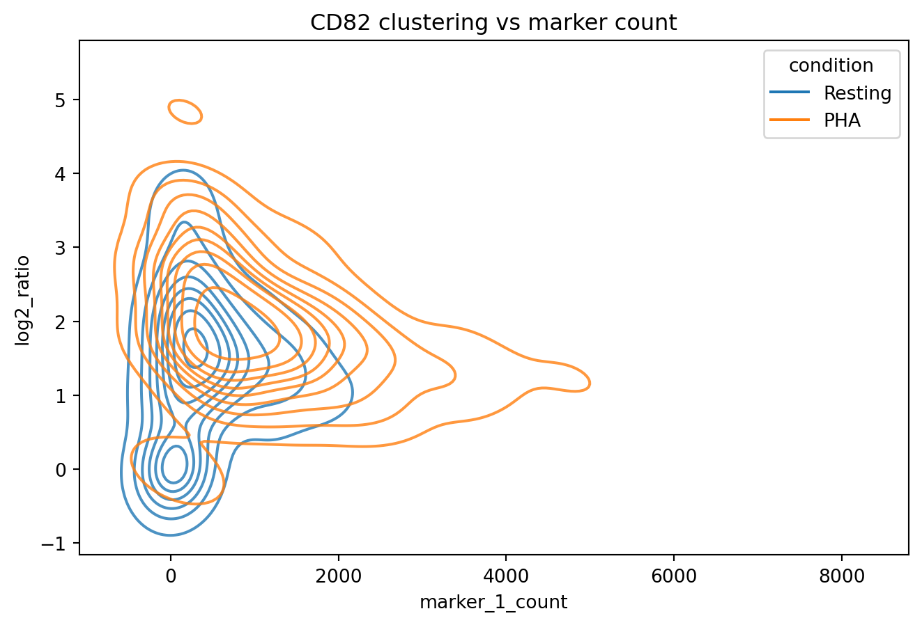
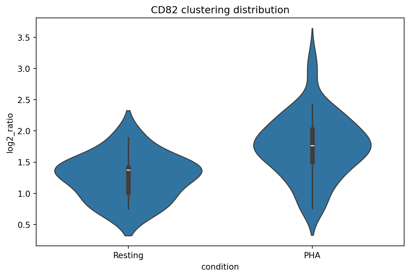
We now narrow down cells to those with CD82 counts between 1000 and 2000 where. Let us look at the CD82 clustering distributions for cells within this range.
CD82_clustering = proximity_scores[
        (proximity_scores["marker_1"]=="CD82")
        &(proximity_scores["marker_2"]=="CD82")
        &(proximity_scores["min_count"]>1000)
        &(proximity_scores["min_count"]<2000)
    ]

sns.violinplot(
    CD82_clustering,
    x="condition",
    y="log2_ratio"
)
plt.title("CD82 clustering distribution")
plt.show()
2D cell visualization
Now let us visualize two cells, one with a high log-ratio of >2.5 and another one with a lower log-ratio of <1.5. Component cells are calculated from cell graphs using a pivot multi-dimensional scaling (pmds) algorithm.
high_clustering = CD82_clustering[CD82_clustering["log2_ratio"]>2.5].sort_values("log2_ratio")["component"].iloc[2]
low_clustering = CD82_clustering[CD82_clustering["log2_ratio"]<1.5].sort_values("log2_ratio", ascending=False)["component"].iloc[0]

layouts = cd8t_data.filter(components=[high_clustering, low_clustering]).precomputed_layouts().to_df()

fig, axes = plt.subplots(1, 2)
sns.scatterplot(
    layouts[layouts["component"]==low_clustering], x="x", y="y", hue="CD82", s=5, ax=axes[0]
)
sns.scatterplot(
    layouts[layouts["component"]==high_clustering], x="x", y="y", hue="CD82", s=5, ax=axes[1]
)
axes[0].set_title("Cell with low CD82 clustering")
axes[1].set_title("Cell with high CD82 clustering")
plt.show()
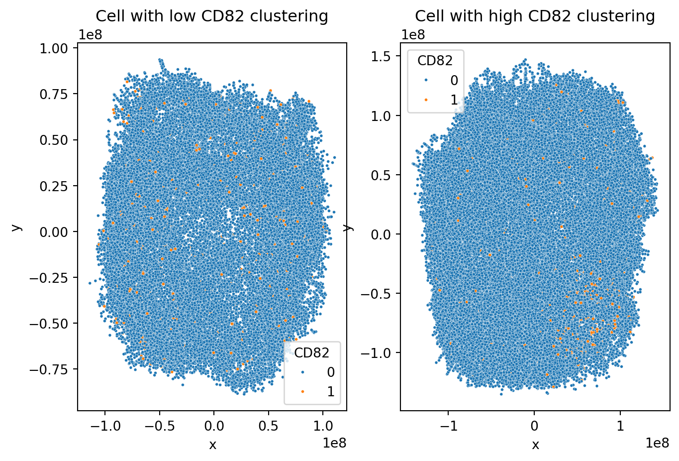
We see that in the cell with lower clustering, CD82 proteins are scattered quite uniformly across the sample while in the cell with higher CD82 clustering, there is a dense region of CD82 proteins in the top right corner.
3D cell visualization
We can also look at interactive 3D cell visualizations to get a better overview of their composition and find informative angles.
high_clustering_layout = layouts[layouts["component"]==high_clustering]
fig = go.Figure(
    data=[
        go.Scatter3d(
            x=high_clustering_layout["x"],
            y=high_clustering_layout["y"],
            z=high_clustering_layout["z"],
            mode="markers",
            marker=dict(size=1, opacity=1, colorscale=["#cccccc", "#ff4500"]),
            marker_color=high_clustering_layout["CD82"],
        ),
    ]
)
fig.update_layout(title="Cell with high CD82 clustering")
fig
low_clustering_layout = layouts[layouts["component"]==low_clustering]
fig = go.Figure(
    data=[
        go.Scatter3d(
            x=low_clustering_layout["x"],
            y=low_clustering_layout["y"],
            z=low_clustering_layout["z"],
            mode="markers",
            marker=dict(size=1, opacity=1, colorscale=["#cccccc", "#ff4500"]),
            marker_color=low_clustering_layout["CD82"],
        ),
    ]
)
fig.update_layout(title="Cell with low CD82 clustering")
fig
visualizing protein colocalizaiton
We recall from the previous tutorial that we saw CD81 and CD82 colocalizing in PHA stimulated CD8 T cells. Let us now look at one of the cells where CD81 and CD82 colocalize by synchronizing their interactive 3D plots.
marker_1 = "CD81"
marker_2 = "CD82"
high_colocalizaiton_cell = proximity_scores[
    (proximity_scores["marker_1"]=="CD81")
    &(proximity_scores["marker_2"]=="CD82")
    &(proximity_scores["min_count"]>500)
].sort_values("log2_ratio", ascending=False)["component"].iloc[0]
high_colocalizaiton_layout = cd8t_data.filter(components=[high_colocalizaiton_cell]).precomputed_layouts().to_df()
trace1 = go.Scatter3d(
    x=high_colocalizaiton_layout["x"],
    y=high_colocalizaiton_layout["y"],
    z=high_colocalizaiton_layout["z"],
    mode="markers",
    marker=dict(size=1, opacity=1, colorscale=["#cccccc", "#ff4500"], color=high_colocalizaiton_layout[marker_1]),
    scene="scene1",
)


# Create the second 3D plot trace
trace2 = go.Scatter3d(
    x=high_colocalizaiton_layout["x"],
    y=high_colocalizaiton_layout["y"],
    z=high_colocalizaiton_layout["z"],
    mode="markers",
    marker=dict(size=1, opacity=1, colorscale=["#cccccc", "#ff4500"], color=high_colocalizaiton_layout[marker_2]),
    scene="scene2",
)


f = subplots.make_subplots(rows=1, cols=2, specs=[[{'is_3d': True}, {'is_3d': True}]])

f.append_trace(trace1, 1, 1)
f.append_trace(trace2, 1, 2)

fig = go.FigureWidget(f)

def cam_change1(layout, camera):
    if fig.layout.scene2.camera == camera:
        return
    fig.layout.scene2.camera = camera

def cam_change2(layout, camera):
    if fig.layout.scene1.camera == camera:
        return
    fig.layout.scene1.camera = camera

fig.layout.scene1.on_change(cam_change1, 'camera')
fig.layout.scene2.on_change(cam_change2, 'camera')
display(fig)