Abundance Normalization
Normalizing protein abundance levels is a crucial step in single-cell PNA data analysis, as it ensures that measurements are directly comparable across all cells — a prerequisite for reliable biological interpretation. In this tutorial, we will introduce and discuss two main approaches: the centered-log-ratio transformation (CLR), our preferred method for transforming and normalizing PNA data, and the dsb algorithm, a versatile technique designed to both normalize and denoise protein abundance data in mixed cell populations.
This tutorial will first provide a concise introduction to CLR and its underlying algorithm. You will then learn how to apply this method to a PNA dataset. Finally, we will discuss important considerations and potential pitfalls when applying these or any normalization strategies.
Upon completing this tutorial, you will be able to:
- Understand the necessity for and the algorithm of CLR normalization.
- Apply CLR normalization to a PNA dataset.
- Evaluate the impact of normalization on protein abundance.
- Recognize the potential pitfalls of normalization.
Why normalize?
Raw protein abundance measurements from PNA (or other antibody-based assays) are not directly comparable across cells or samples. Normalization is the step that puts abundances on a common scale so that biological differences — such as true variation in protein expression — can be distinguished from technical and compositional artifacts. Cell-to-cell variation in total signal can arise from differences in cell size, capture efficiency, or overall staining intensity. Without normalization, a cell with higher total protein signal will tend to have higher counts for every protein than a cell with lower total signal, even when their relative protein profiles are similar. Normalization removes or reduces this global scaling difference so that we can compare relative abundance patterns across cells. In addition, many downstream steps (e.g. dimensionality reduction, clustering, and differential abundance) assume that measurements are on a comparable scale; applying them to raw counts can lead to misleading results dominated by technical variation.
The CLR algorithm
Protein abundance data are compositional: what we observe per cell is a set of relative amounts that sum (or integrate) to a total. Changing the total does not necessarily reflect a proportional change in every protein; rather, an increase in one protein often implies a relative decrease in others. Methods that assume that the data live in an unconstrained Euclidean space (e.g. standard PCA on raw counts) can be misleading for compositional data.
The centered-log-ratio (CLR) transformation is designed for compositional data. This method was originally developed for CITE-seq data (Stoeckius et al., 2017) but quickly gained traction in other antibody-based assays. For each cell, CLR takes the log of each protein’s abundance and subtracts the geometric mean of the log-abundances across all proteins in that cell. This centers the data per cell and makes abundances comparable across cells while respecting the compositional nature of the data.
In pixelator, CLR is available as clr_transformation (see Setup
below). The implementation follows the same logic as in Seurat: for each
cell, the log1p of each protein’s count is divided by the geometric mean
of the log1p counts in that cell.
As a result, CLR helps to:
- Reduce the influence of a few highly abundant proteins that would otherwise dominate the variance.
- Put all proteins on a similar scale so that low- and high-abundance markers can contribute more equally to downstream analysis.
- Provide a stable, interpretable scale for visualization and modeling (e.g. in UMAP, clustering, or differential abundance).
Thus, CLR is a good choice when the goal is to normalize PNA protein data for comparative analysis without requiring empty droplets or isotype-based noise models.
The dsb algorithm
Antibody-based assays, including PNA, can be affected by variable non-specific antibody binding. In leukocytes, for example, this can occur due to antibodies binding to Fc-receptors on the cell surface. This non-specific binding introduces background signal, or “noise,” which can vary significantly between samples and even individual cells. Factors such as sample type and quality, preprocessing conditions, and antibody isotype can influence noise levels. Ultimately, this noise can obscure the identification of cell subpopulations that are truly positive or negative for a specific protein, thereby complicating cell type annotation and differential abundance analysis. The dsb method explicitly models and removes this kind of background; CLR, in contrast, focuses on making relative abundances comparable and is most useful when background is less of a concern or when dsb is not applicable (e.g. pure or FACS-sorted populations).
The dsb method was initially developed for denoising and normalizing antibody data from droplet-based single-cell platforms like CITE-seq. It leverages the detection of background protein levels in “empty” droplets, which ideally contain reagents but no cell. While PNA does not involve cell compartmentalization and thus does not generate empty droplets in the same way, it has been demonstrated that the background abundance of a protein can be inferred from its distribution across all cells within a mixed population sample (see dsb paper).
dsb adapts this concept by first estimating the background signal for each protein based on the overall cellular abundance distribution. The mean abundance of this inferred background population for each protein is then subtracted from the protein’s abundance in each cell, effectively centering the background at zero. Subsequently, the signals from isotype control proteins and a cell-specific background mean are integrated into a “noise component.” The first principal component of this noise matrix is then regressed out of the background-corrected data to further reduce noise.
In summary, the dsb algorithm involves the following steps:
- Apply a log1p transformation to the raw count data.
- For each protein, fit a two-component finite Gaussian mixture model to its abundance across all cells. As a background correction step, subtract the mean of the first (typically lower abundance) component from the logged data. Note: If a two-component fit is not possible, this background correction is skipped for that protein.
- For each cell, fit a two-component finite Gaussian mixture model across all proteins. The mean of the first component represents the cell-wise background mean. This value is combined with the background-corrected counts of the isotype controls to create a “noise matrix.” Regress out the first principal component of this noise matrix.
- The resulting residuals are returned as the normalized and denoised protein abundance values.
Setup
To follow this tutorial, you will need to load the following Python packages and functions:
import numpy as np
import pandas as pd
import scanpy as sc
from pathlib import Path
from pixelator import read_pna as read
from pixelator.common.statistics import clr_transformation, dsb_normalize
import seaborn as sns
import matplotlib.pyplot as plt
sns.set_style("whitegrid")
DATA_DIR = Path("./pna-analysis")
from pixelator.pna.pixeldataset.download import DownloadableDatasets

DATA_DIR.mkdir(parents=True, exist_ok=True)

DownloadableDatasets.download_dataset(
  "pna062-unstim-pbmcs",
  output_path=DATA_DIR / "PNA062_unstim_PBMCs_1000cells_S02_S2.layout.pxl",
)

DownloadableDatasets.download_dataset(
  "pna062-pha-pbmcs",
  output_path=DATA_DIR / "PNA062_PHA_PBMCs_1000cells_S04_S4.layout.pxl",
)
Load Data
To illustrate the normalization procedure we continue with the quality checked and filtered object we created in the previous tutorial. As described there, this merged object contains two samples: a resting and PHA stimulated PBMC sample.
# Load the object from the previous tutorial (PXL files + filtered cell list). If you saved a combined filtered PXL, you can load that instead.
pg_data_combined_pxl_object = read([
    DATA_DIR / "PNA062_unstim_PBMCs_1000cells_S02_S2.layout.pxl",
    DATA_DIR / "PNA062_PHA_PBMCs_1000cells_S04_S4.layout.pxl",
])
qc_filtered_path = DATA_DIR / "qc_filtered_cells.csv"
if qc_filtered_path.exists():
    filtered_cells = list(pd.read_csv(qc_filtered_path)["component"])
    pg_data_combined_pxl_object = pg_data_combined_pxl_object.filter(components=filtered_cells)
# We will mostly work with the AnnData object
pg_data_combined = pg_data_combined_pxl_object.adata()
Normalizations
To apply the CLR algorithm we use pixelator’s clr_transformation.
The dsb procedure is available as dsb_normalize. Since dsb uses
the antibody isotype controls to perform the normalization, we need to
specify these with the isotype_controls parameter in dsb_normalize.
We add CLR, dsb, and log1p-transformed data as layers so we can
compare them and use CLR as the default for downstream steps.
# Perform the standard CLR normalization and store in a layer
pg_data_combined.layers["clr"] = clr_transformation(
    pg_data_combined.to_df(), axis=0, non_negative=True
)

# Perform the dsb normalization (optional); specify the isotype controls in the panel
isotype_controls = ["mIgG1", "mIgG2a", "mIgG2b"]
pg_data_combined.layers["dsb"] = dsb_normalize(
    pg_data_combined.to_df(),
    isotype_controls=isotype_controls,
)

# Create a log1p layer for later comparisons
pg_data_combined.layers["log1p"] = np.log1p(pg_data_combined.to_df())
Evaluate normalization
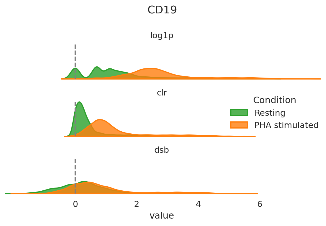
After having run the normalization step it can be helpful to visualize the overall distribution of some proteins of interest with different normalization strategies. This will allow you to assess in more detail how this procedure has modified the abundance levels of proteins. Let’s have a look at CD19 as an example.
# Ensure condition is defined
if "condition" not in pg_data_combined.obs.columns:
    pg_data_combined.obs["condition"] = "Resting"
    pg_data_combined.obs.loc[
        pg_data_combined.obs["sample"].astype(str).str.contains("PHA", na=False),
        "condition",
    ] = "PHA stimulated"

pg_data_combined.obs["condition"] = pd.Categorical(
    pg_data_combined.obs["condition"],
    categories=["Resting", "PHA stimulated"],
    ordered=True,
)

CONDITION_ORDER = ["Resting", "PHA stimulated"]
CONDITION_PALETTE = {"Resting": "#2ca02c", "PHA stimulated": "#ff7f0e"}

# Build long-format data for ridge plot (log1p, clr, dsb) by condition
def get_norm_long(adata, marker="CD19"):
    log1p_vals = adata.to_df("log1p")[marker]
    clr_vals = adata.to_df("clr")[marker]
    dsb_vals = adata.to_df("dsb")[marker]
    condition = adata.obs["condition"].values
    return pd.DataFrame({
        "condition": np.tile(condition, 3),
        "value": np.concatenate([log1p_vals, clr_vals, dsb_vals]),
        "name": np.repeat(["log1p", "clr", "dsb"], len(condition)),
    })

norm_obj = get_norm_long(pg_data_combined, "CD19")

sns.set_theme(style="white", rc={"axes.facecolor": (0, 0, 0, 0), "axes.linewidth": 2})
g = sns.FacetGrid(
    norm_obj,
    row="name",
    hue="condition",
    hue_order=CONDITION_ORDER,
    aspect=3,
    height=1.4,
    palette=CONDITION_PALETTE,
)
g.map(sns.kdeplot, "value", bw_adjust=0.5, clip_on=False, fill=True, alpha=0.8, linewidth=1.5)
for ax in g.axes.flat:
    ax.axvline(0, color="gray", linestyle="--")
# Row labels: which normalization is which (log1p, clr, dsb)
g.set_titles(row_template="{row_name}", size=11)
g.set(ylabel="", yticks=[])
g.despine(bottom=True, left=True)
for ax in g.axes.flat:
    ax.set_xlim(norm_obj["value"].min(), norm_obj["value"].max())
# Legend: which color is which condition (Resting, PHA stimulated)
g.add_legend(title="Condition")
plt.suptitle("CD19")
plt.tight_layout()
plt.show()
Before we continue, let’s remove the additional layers from the object to keep the object clean.
# Remove the dsb and log1p layers; we will use CLR for downstream steps
del pg_data_combined.layers["dsb"]
del pg_data_combined.layers["log1p"]
CD19 is a B cell-specific protein marker. The population of B cells in these samples should be quite small and the majority of cells should be negative for CD19. With CLR, this negative population indeed has values close to zero and the positive population has values above 1, while dsb centers the negative population at 0, and the positive population has values above 2. These normalizations make it fairly straightforward to separate the B cells from the negative population. With log1p, both the negative and positive populations have high values for CD8 and could be falsely interpreted as two positive populations.
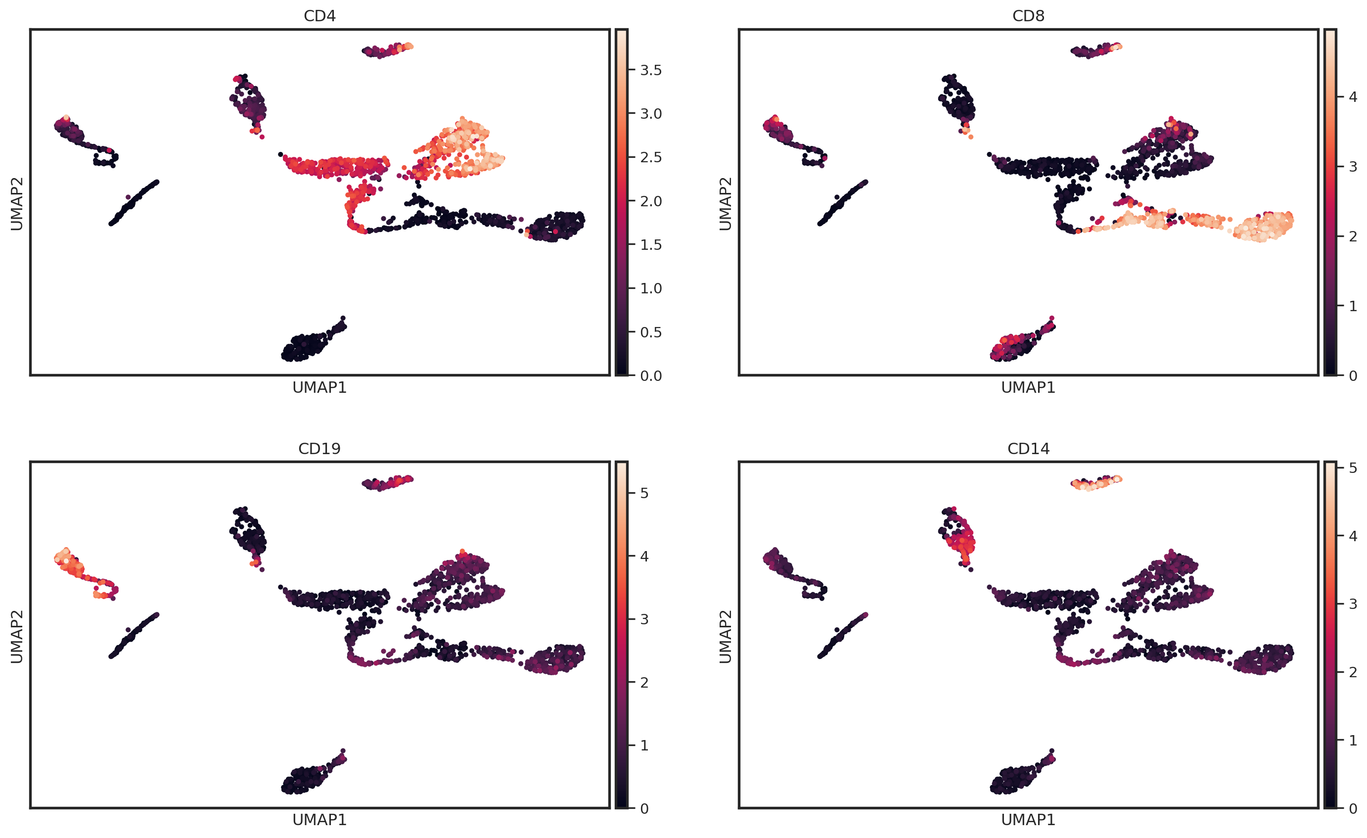
Another useful way to visualize the normalization is to create a UMAP of the protein abundance levels. We can overlay the UMAP with the normalized abundance levels of common cell type markers to see how the normalization has affected the protein expression.
sc.pp.highly_variable_genes(
    pg_data_combined, flavor="seurat_v3", n_top_genes=50
)
pg_data_combined.obsm["pca"] = sc.tl.pca(
    pg_data_combined.layers["clr"], random_state=42
)
sc.pp.neighbors(
    pg_data_combined,
    n_neighbors=30,
    n_pcs=10,
    use_rep="pca",
    metric="cosine",
)
sc.tl.umap(
    pg_data_combined,
    min_dist=0.3,
)
markers_of_interest = ["CD4", "CD8", "CD19", "CD14"]

sc.pl.umap(pg_data_combined, color=markers_of_interest, ncols=2, layer = "clr")
Note that for later tutorials, we will continue with CLR as the default normalization method.
Remarks
As any other normalization method, CLR and dsb have limitations. However, most limitations can typically be circumvented with a good experimental design and analysis plan. Below is a list of a few recommendations, remarks and good practices:
-
The dsb normalization method works optimally for proteins that have a clearly defined positive and a negative population in the experimental setup; i.e. in datasets consisting of different cell populations (such as PBMCs). This increases the chance that the GMM fitting will reliably detect the negative background population. Consequently, proteins such as HLA-ABC that have a relatively consistent high expression across all cell types might display some unexpected behaviour (i.e. these can show a low dsb value despite being highly expressed in all cells). If your dataset mainly consists of very similar cells, such as for example pure cell lines, it might be prudent to choose log- or CLR-normalization.
-
Do not apply normalization blindly and always be aware of the effect of a transformation when using normalized protein counts for downstream analysis. A good practice is to visualize the abundance values for proteins you deem important in your analysis before and after normalization with, for example, violin plots. Does this correspond to what you expect and if not, ask yourself why could this be the case?
Make sure the normalized values produced by dsb and/or CLR are
suitable for the test you would like to perform! Some downstream
differential abundance tests demand strictly positive values as input.
For example, the rank_genes_group function from Scanpy requires that
the data provided to it is strictly non-negative and does not provide
Log Fold Changes for proteins that are on average negative in one or
more groups. If you would like to use this function as part of your
downstream analysis, we suggest to shift the abundance of markers with
negative values to strictly positive (e.g. subtract the minimum per
marker so the minimum becomes 0). This leaves the relative differences
between groups unaffected and allows you to proceed with the testing
procedure. This procedure has been described in the following Scanpy
issue.
# Example of code to add a layer of shifted normalized values to the adata object
# Calculate minimum value per marker
mins = pg_data_combined.to_df("clr").min()
# If minimum value is positive, set to zero
mins[mins > 0] = 0
# Add layer to use in Differential Abundance test
pg_data_combined.layers["shifted_clr"] = pg_data_combined.to_df("clr").sub(mins)