Cell segmentation
This tutorial will introduce cell segmentation, a methodology enabling various cell-level analyses. Cell segmentation is a technique designed to identify localized regions, or “compartments”, with distinct protein compositions. Depending on the biological context, these compartments can signify diverse entities such as cell types (in multiplets), cell:cell interface, fragments of cells (trogocytosis) or cellular debris.
For instance, cell segmentation holds significant relevance in co-culture experiments where cell-cell interactions are prominent. Cell segmentation aids in separating these interacting cells, thereby providing valuable insights into their interplay. Core aspects of cell segmentation involve quantifying compartments and examining their protein composition.
After completing this tutorial, you will be able to:
-
Understand the prerequisites for cell segmentation.
-
Identify cell type identity weights for cell segmentation.
-
Run cell segmentation.
-
Examine the protein composition of segmented compartments.
Cell segmentation is an experimental feature in pixelatorR and might
change in the near future. Use it with caution and please provide
feedback to the developers if you encounter any issues or have
suggestions for improvements.
Setup
library(pixelatorR)
library(SeuratObject)
library(dplyr)
library(tidyr)
library(stringr)
library(ggplot2)
library(here)
library(patchwork)
library(harmony)
library(tidygraph)
library(tibble)
library(Seurat)
plot_colors <-
c(
"#866CCD", "#4A73C0", "#4AAF9D", "#5EA857",
"#CB73A9", "#DB5D61", "#D07B5B", "#E6BB43",
"#A28EDB", "#6D92D1", "#75C5B5"
)
BASEURL <- "https://pixelgen-technologies-datasets.s3.eu-north-1.amazonaws.com/pna-datasets/v1"
files_to_download <-
c("PNA065_CARTcells_Raji_24hrs_1to1_S05_S5.layout.pxl", "PNA065_CARTcells_S01_S1.layout.pxl",
"PNA065_Raji_S04_S4.analysis.pxl", "PNA065_Raji_S04_S4.layout.pxl",
"PNA066_CARTcells_Raji_24hrs_1to1_S05_S5.layout.pxl", "PNA066_CARTcells_S01_S1.layout.pxl",
"PNA066_Raji_S04_S4.analysis.pxl", "PNA066_Raji_S04_S4.layout.pxl")
for (f in files_to_download) {
if (!file.exists(file.path(DATA_DIR, f))) {
download.file(paste0(BASEURL, "/", f), destfile = file.path(DATA_DIR, f), method = "curl")
}
}
Load data
In this tutorial we will use a dataset containing chimeric antigen receptor (CAR) T-cells co-cultured for 24 hours with a cancerous B-cell line (Raji) and additionally two control datasets with pure CAR T-cells and Raji populations that were not co-cultured.
These particular CAR T-cells are engineered to express a chimeric antigen receptor targeting the CD19 antigen on Raji cells which allows the T-cells to recognize and eliminate the malignant Raji cells. This type of engineered immune cells have emerged as a transformative approach to cancer immunotherapy but are still in a relatively early stage of development. Challenges such as antigen escape, T cell exhaustion and limited efficacy in solid tumors remain and highlight the need for a deeper understanding of the mechanisms of action of CAR T-cells. It is however becoming increasingly clear that the spatial organization of the membrane-bound proteins and their ability to form clusters and complexes on the surface of the engineered T-cells are key factors in their activation, function and persistence.
Besides the spatial organization of the membrane-bound proteins, which we will not explore in this tutorial, this dataset is also a prime example of how to use PNA data to study a process called trogocytosis. Trogocytosis is a form of cell-to-cell interaction where one cell transfer fragments (or “patches”) of its cell membrane to another cell. In the CAR T-cell context this means that the CAR T-cells incorporate fragments of the Raji cell membrane into their own cell membrane. This can have important functional consequences for the CAR T-cells, such as tumor escape due to reduced antigen density on the target cell, increased T-cell exhaustion and even fratricide among the CAR T-cells. Until now there has not been a technology to study this process at scale and looking at this many targets simultaneously. To start exploring the CAR T-cell dataset begin by downloading and loading the data as described below.
DATA_DIR <- "path/to/local/folder"
Sys.setenv("DATA_DIR" = DATA_DIR)
# The folders the data is located in:
data_files <- c(
coculture1 = file.path(DATA_DIR, "PNA065_CARTcells_Raji_24hrs_1to1_S05_S5.layout.pxl"),
coculture2 = file.path(DATA_DIR, "PNA066_CARTcells_Raji_24hrs_1to1_S05_S5.layout.pxl"),
cart1 = file.path(DATA_DIR, "PNA065_CARTcells_S01_S1.layout.pxl"),
cart2 = file.path(DATA_DIR, "PNA066_CARTcells_S01_S1.layout.pxl"),
raji1 = file.path(DATA_DIR, "PNA065_Raji_S04_S4.layout.pxl"),
raji2 = file.path(DATA_DIR, "PNA066_Raji_S04_S4.layout.pxl")
)
# Read PXL files as a list of Seurat objects
obj_list <- lapply(data_files, ReadPNA_Seurat, load_proximity_scores = FALSE)
# Combine files into a single Seurat object
pg_data_combined <- merge(obj_list[[1]], y = obj_list[-1], add.cell.ids = names(obj_list))
# Add meta data describing the sample and donor origin
pg_data_combined <- AddMetaData(
pg_data_combined,
metadata = data.frame(id = colnames(pg_data_combined)) %>%
mutate(condition = str_remove(id, "[1|2]_.*"),
rep = str_extract(id, "[1|2]") %>% as.integer()) %>%
column_to_rownames("id")
)
pg_data_combined
An object of class Seurat
159 features across 2948 samples within 1 assay
Active assay: PNA (159 features, 159 variable features)
6 layers present: counts.1, counts.2, counts.3, counts.4, counts.5, counts.6
Filter data
To ensure high data quality prior to cell segmentation, it’s essential to filter out low-quality cells. Our quality control criteria will include the number of UMIs and isotype fraction. Detailed information regarding these quality control steps can be found in previous tutorials.
pg_data_combined <- pg_data_combined %>%
subset(isotype_fraction < 0.001) %>%
subset(n_umi >= 1e4)
Data-driven clustering
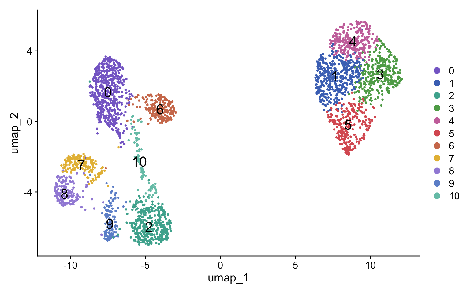
Dealing with co-culture data often means facing mixed cell abundance profiles across different conditions. To address this and simplify cell annotation, we’ll start by integrating our dataset using Harmony. Following integration, we will proceed with clustering and annotating the cells (refer to previous tutorials for a detailed guide on these initial steps if needed).
pg_data_combined <- pg_data_combined %>%
Normalize(method = "clr") %>%
ScaleData() %>%
RunPCA() %>%
RunHarmony(group.by.vars = "condition") %>%
RunUMAP(dims = 1:10, reduction = "harmony") %>%
FindNeighbors(dims = 1:10, reduction = "harmony") %>%
FindClusters(verbose = FALSE)
Initializing centroids
DimPlot(pg_data_combined, label = TRUE, label.size = 6, cols = plot_colors)
Annotation
Next, we run a differential test to identify cluster-specific protein markers. These markers will guide the annotation step. Here we simply classify clusters as “CD8T” if CD8 is differentially up-regulated, “CD4T” if CD4 is differentially up-regulated and “Raji” if CD21/CD19/CD22 are differentially up-regulated. Cell type annotations are saved to a new column called “celltype”.
Finally, we create a column combining the celltype annotation and condition.
de_markers <- FindAllMarkers(pg_data_combined, only.pos = TRUE, fc.name = "difference", mean.fxn = rowMeans)
de_markers %>%
group_by(cluster) %>%
arrange(-difference) %>%
slice_head(n = 10)
# A tibble: 110 × 7
# Groups: cluster [11]
p_val difference pct.1 pct.2 p_val_adj cluster gene
<dbl> <dbl> <dbl> <dbl> <dbl> <fct> <chr>
1 4.09e-244 4.20 0.989 0.586 6.51e-242 0 CD8
2 2.74e-215 3.28 1 0.529 4.35e-213 0 CD162
3 1.88e- 94 3.14 1 0.653 3.00e- 92 0 CD44
4 3.73e- 96 2.73 1 0.639 5.92e- 94 0 CD3e
5 9.69e-120 2.70 1 0.54 1.54e-117 0 CD6
6 6.52e-163 2.69 1 0.652 1.04e-160 0 CD26
7 1.42e-179 2.65 1 0.496 2.27e-177 0 CD50
8 5.58e-106 2.63 1 0.648 8.87e-104 0 CD2
9 1.72e- 87 2.47 1 0.58 2.74e- 85 0 CD5
10 1.42e- 84 2.20 1 0.487 2.25e- 82 0 CD226
# ℹ 100 more rows
ann <- c(
"0" = "CD8T",
"1" = "Raji",
"2" = "CD8T",
"3" = "Raji",
"4" = "Raji",
"5" = "Raji",
"6" = "CD8T",
"7" = "CD4T",
"8" = "CD4T",
"9" = "CD4T",
"10" = "CD8T"
)
pg_data_combined$celltype <- ann[as.character(pg_data_combined$seurat_clusters)] %>% unname()
pg_data_combined$celltype_condition <-
paste(
pg_data_combined$celltype,
ifelse(
pg_data_combined$condition %in% c("cart", "raji"),
"alone",
"coculture"
),
sep = "_"
) %>% unname()
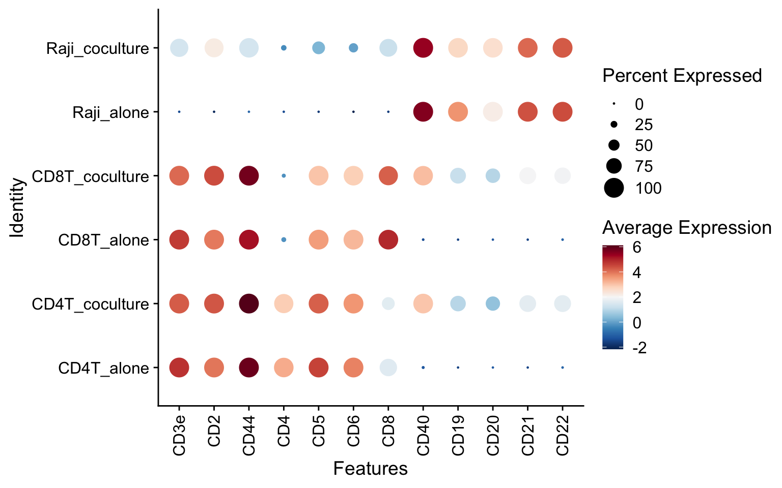
As a sanity check, we can visualize the abundance levels of selected T cell and Raji markers. As expected, the T cells from the co-culture experiment display elevated levels of Raji markers, indicating the presence of Raji patches on these cells. In the isolated conditions, the T cell populations are free of Raji markers and the Raji cells are free of T cell markers.
DotPlot(pg_data_combined, scale = FALSE,
features = c("CD3e", "CD2", "CD44", "CD4", "CD5", "CD6", "CD8", "CD40", "CD19", "CD20", "CD21", "CD22"),
group.by = "celltype_condition") &
theme(axis.text.x = element_text(angle = 90, hjust = 1, vjust = 0.5)) &
scale_color_gradientn(colours = RColorBrewer::brewer.pal(n = 11, name = "RdBu") %>% rev())
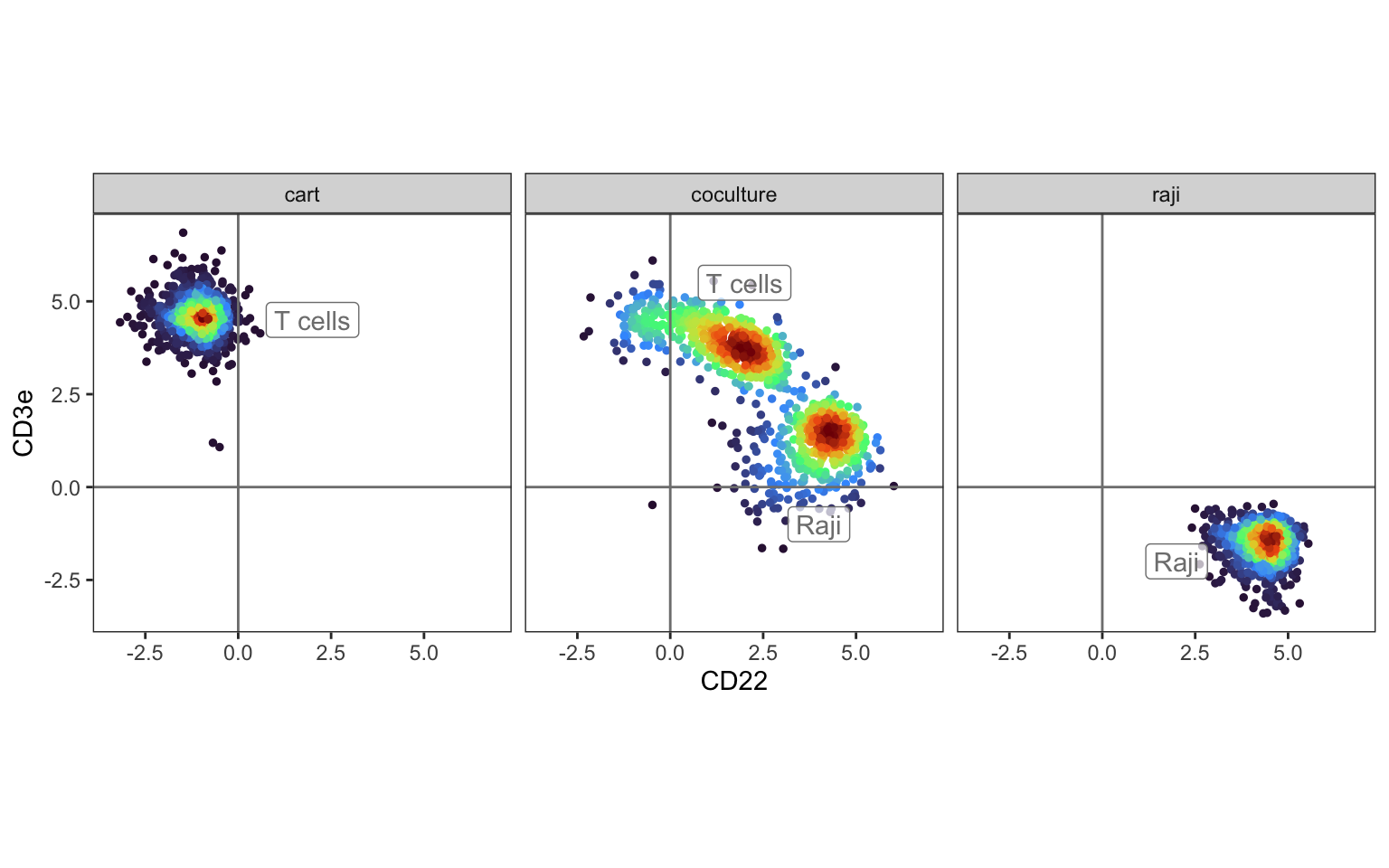
We can also plot a density scatter plot of a T cell (CD3e) and a Raji (CD22) marker protein to compare co-cultured cells with the isolated populations. Here, we clearly see that the T cell population gains CD22 in the co-culture condition. We also expect to see some bleedover from the T cells to the Raji cells, as evident by the increase in CD3e in the Raji co-culture population.
DensityScatterPlot(pg_data_combined, marker1 = "CD22", marker2 = "CD3e", facet_vars = "condition") &
geom_label(data = tibble(
marker1 = c(2, 2, 4, 2),
marker2 = c(4.5, 5.5, -1, -2),
label = c("T cells", "T cells", "Raji", "Raji"),
condition = c("cart", "coculture", "coculture", "raji"),
dens = NA_real_
), aes(marker1, marker2, label = label), alpha = 0.7) &
facet_grid(~condition) &
guides(color = "none")
Patched cells detected by proximity scores
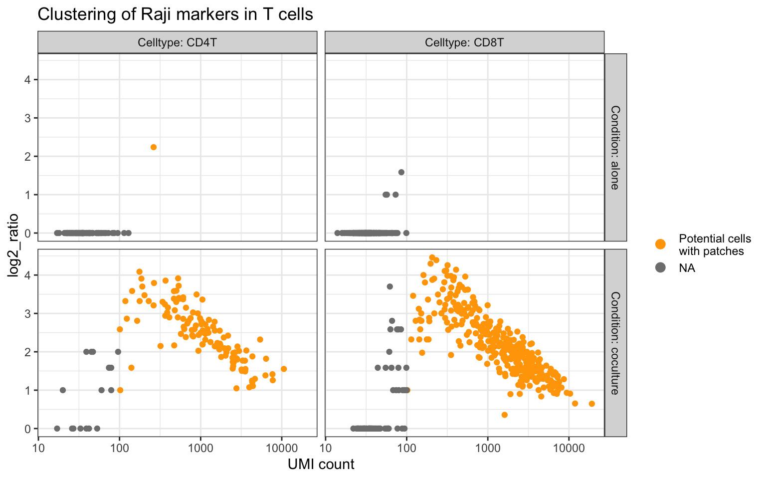
If the Raji patches on the T cells are large enough, it’s reasonable to expect elevated abundance levels for Raji protein markers on these T cells. We can also expect to see elevated proximity scores for these Raji markers since they should be aggregated in confined regions of the T cell graphs, thereby forming more connections with each other more than expected by random chance.
In the dot plot above, we saw that CD40, CD19, CD20, CD21 and CD22 are specific to Raji cells. We can compute a joint proximity score (log2_ratio) for these markers in the T cell populations to see if this expectation holds true.
The plot below shows the log2_ratio vs the total UMI count for the Raji markers in the T cells split by condition. As expected, virtually all T cells from the co-culture experiment have high log2_ratio values for the Raji markers, whereas the isolated T cell populations only display background levels.
This analysis is a good sanity check before proceeding to the cell segmentation step. Now we have support both from the abundance and proximity data that the T cells from the co-culture experiment are indeed patched with Raji cells.
raji_markers <- c("CD40", "CD19", "CD20", "CD21", "CD22")
counts <- FetchData(pg_data_combined, vars = raji_markers, layer = "counts")
counts <- tibble(component = rownames(counts), count = rowSums(counts))
# Compute joint log2_ratio for raji markers
prox_raji_markers <-
ProximityScores(pg_data_combined, lazy = TRUE, meta_data_columns = "celltype_condition") %>%
filter(
celltype_condition %in% c(
"CD8T_alone",
"CD4T_alone",
"CD4T_coculture",
"CD8T_coculture"
)
) %>%
filter(marker_1 %in% raji_markers & marker_2 %in% raji_markers) %>%
group_by(celltype_condition, component) %>%
summarize(
join_count = sum(join_count),
join_count_expected_mean = sum(join_count_expected_mean),
.groups = "drop"
) %>%
collect() %>%
mutate(log2_ratio = log2(pmax(join_count, 1) / pmax(join_count_expected_mean, 1))) %>%
left_join(counts, by = c("component")) %>%
separate(celltype_condition,
into = c("celltype", "condition"),
sep = "_") %>%
mutate(label = case_when(
log2_ratio > 0.3 & count > 100 ~ "Potential cells\nwith patches",
TRUE ~ NA_character_
))
# Plot results
prox_raji_markers %>%
ggplot(aes(count, log2_ratio, color = label)) +
geom_point() +
scale_x_log10() +
theme_bw() +
facet_grid(paste0("Condition: ", condition) ~ paste0("Celltype: ", celltype)) +
labs(color = "") +
scale_color_manual(values = c("Potential cells\nwith patches" = "orange")) +
guides(color = guide_legend(override.aes = list(size = 3))) +
labs(x = "UMI count", title = "Clustering of Raji markers in T cells")
Cell segmentation
We will illustrate cell segmentation using the CD8 T-cell population from our co-culture experiment, where we anticipate finding Raji patches. A key prerequisite for cell segmentation is that we can only consider two cell types at a time. In this example, our first population consists of CD8 T-cells, and the second population is the Raji cells. Note that we cannot segment more than two cell types simultaneously. As previously observed, most CD8 T-cells in the co-culture experiment exhibit elevated levels of Raji markers, strongly suggesting they are patched with Raji cells. Crucially, the presence of the Raji population within the dataset is essential for identifying the specific protein markers that differentiate these two populations.
Before proceeding, we need to build a cell type weight matrix. For cell
segmentation, we only want to use proteins that are highly cell-type
specific and preferably abundant. pixelatorR offers the
cc_protein_weights function to build this matrix.
To get these weights, we need the pure CD8 T cell and Raji populations. Preferably, we should use isolated cells (not cocultured) to minimize background, but if we don’t have access to such data we could also use the CD8 T-cell and Raji populations from the coculture experiments as long as they are relatively pure (no CD8 T cell:Raji doublets).
cc_protein_weights needs to know what column keeps the cell type
labels and what cell type populations should be used to build the weight
matrix.
set.seed(123)
w <- cc_protein_weights(
pg_data_combined,
group_by = "celltype_condition",
population_1 = "CD8T_alone",
population_2 = "Raji_alone"
)
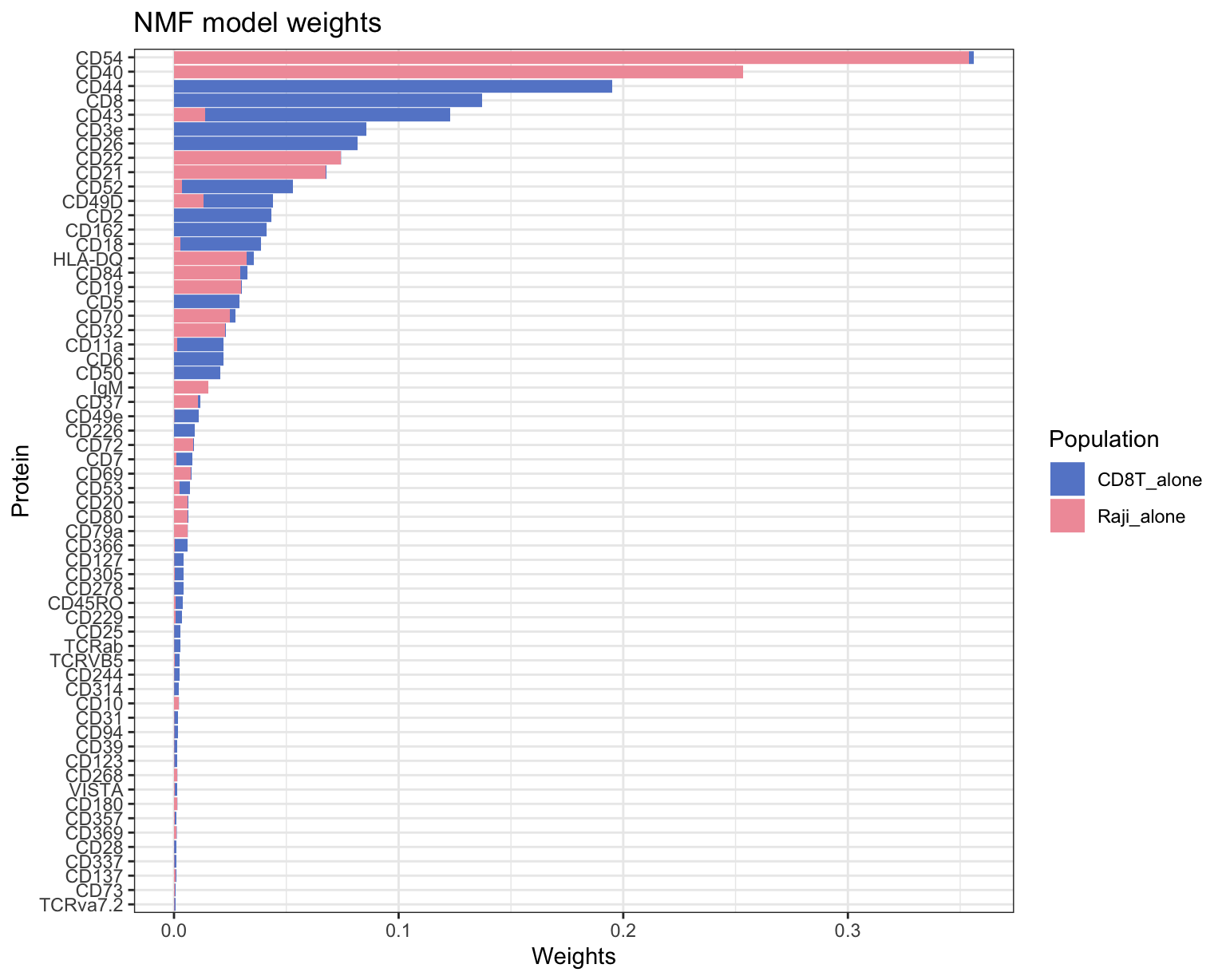
The function returns a matrix with proteins (rows) and cell type labels (columns), and it also draws a bar plot for a quick evaluation. Only the proteins passing certain filtering criteria are kept. It is also possible to mask certain proteins if you suspect that these could interfere with the cell segmentation.
The plot shows the cell type-specific proteins for the two populatiuons (cell types). As mentioned earlier, the best proteins should be both specific and abundant. This places CD54, CD40, CD22 and CD21 as the top markers for Raji cells and CD44, CD8, CD43, CD26 and CD3e as the top markers for CD8 T cells.
Proteins that have high weights for both cell types difficult to use for segmentation, which is why generic surface proteins such as HLA-ABC and CD45 are excluded. As a rule of thumb, we want to have at least a few proteins with weights > 0.1 for both populations.
Note that the cell segmentation tool is designed for segmentation of cell types with distinct phenotypes. This means that it is not possible to segment e.g. CD4 T cells and CD8 T cells.
Run cell segmentation
Now we are ready to proceed with the cell segmentation step. The method operates on the PNA cell graph, meaning that we first need to load these into our Seurat object. For this step, we will only need the CD8T cells from the co-culture experiment. The PNA cell graphs are large data structures and when loaded, they can consume a lot of memory. Although we only have 415 CD8 T cells from the co-culture experiment, they use up close to 8GB of memory. For larger datasets, it is generally a good idea to process smaller batches of cells.
# Select CD8T cell component IDs
cd8t_cells <- pg_data_combined[[]] %>%
filter(celltype_condition == "CD8T_coculture") %>% rownames()
# Load cell graphs
pg_data_combined <- LoadCellGraphs(pg_data_combined, cells = cd8t_cells)
# Pull out loaded cell graphs (just for convenience in later steps)
cg_list <- CellGraphs(pg_data_combined)[cd8t_cells]
# Now we can remove the cell graphs from the Seurat object
pg_data_combined <- RemoveCellGraphs(pg_data_combined)
We have the graphs loaded and we have a weight matrix (w). Now we can
proceed with the cell segmentation.
You can find more information about the cell segmentation algorithm in
the function documentation (?segment_cell). The algorithm operates on
the PNA graphs and aggregates protein composition information in local
neighborhoods around each node. These local abundance profiles are then
scored using the weight matrix. Finally, the scores are thresholded to
assign cell type labels for each node. This is a computationally
intensive step, so it may take a while to run.
Note that we also have an option to detect the interface between the two
cell type compartments, corresponding to nodes touching an edge spanning
between two distinct cell type labels. For this analysis, we will skip
interface detection (detect_interface = FALSE). We also set
keep_largest_comp = FALSE to make sure that we can detect multiple
“patches”, otherwise only the largest component will be considered.
Finally, we set a component size threshold (min_comp_size = 50) to
ignore small patches.
# Run patch detection
cg_list <- pbapply::pblapply(cg_list, function(cg) {
cg <- pixelatorR::segment_cell(
cg,
w,
detect_interface = FALSE,
keep_largest_comp = FALSE,
min_comp_size = 50,
verbose = FALSE
)
}, cl = NULL)
Inspect results
Let’s inspect the results in a single CellGraph object from cg_list.
Each CellGraph contains a tidy graph (visit
tidygraph for more information)
with a node table and an edge table. After running cell segmentation,
the node table will contain a compartment column cell type labels.
cg <- cg_list[[2]]
# Inspect the node table
CellGraphData(cg, "cellgraph") %N>%
as_tibble()
# A tibble: 94,892 × 3
name node_type compartment
<chr> <chr> <chr>
1 71905342332125-umi1 umi1 CD8T_alone
2 22437986569621294-umi2 umi2 CD8T_alone
3 116896337584537-umi1 umi1 CD8T_alone
4 41362921692680373-umi2 umi2 CD8T_alone
5 300756512162453-umi1 umi1 CD8T_alone
6 57488365265918230-umi2 umi2 CD8T_alone
7 376227976534695-umi1 umi1 CD8T_alone
8 54716076737357242-umi2 umi2 CD8T_alone
9 394167817161303-umi1 umi1 CD8T_alone
10 56628804997723423-umi2 umi2 CD8T_alone
# ℹ 94,882 more rows
# Count patch sizes
patch_sizes <- CellGraphData(cg, "cellgraph") %N>%
filter(compartment == "Raji_alone") %>%
igraph::components()
cd8t_size <- length(CellGraphData(cg, "cellgraph")) - sum(patch_sizes$csize)
glue::glue("CD8 T cell subgraph size: {cd8t_size} nodes")
CD8 T cell subgraph size: 85206 nodes
glue::glue("Raji patch sizes: {patch_sizes$csize %>% sort(decreasing = TRUE) %>% paste(collapse = ', ')}")
Raji patch sizes: 7985, 281, 211, 185, 147, 141, 111, 109, 89, 74, 68, 61, 59, 57, 54, 54
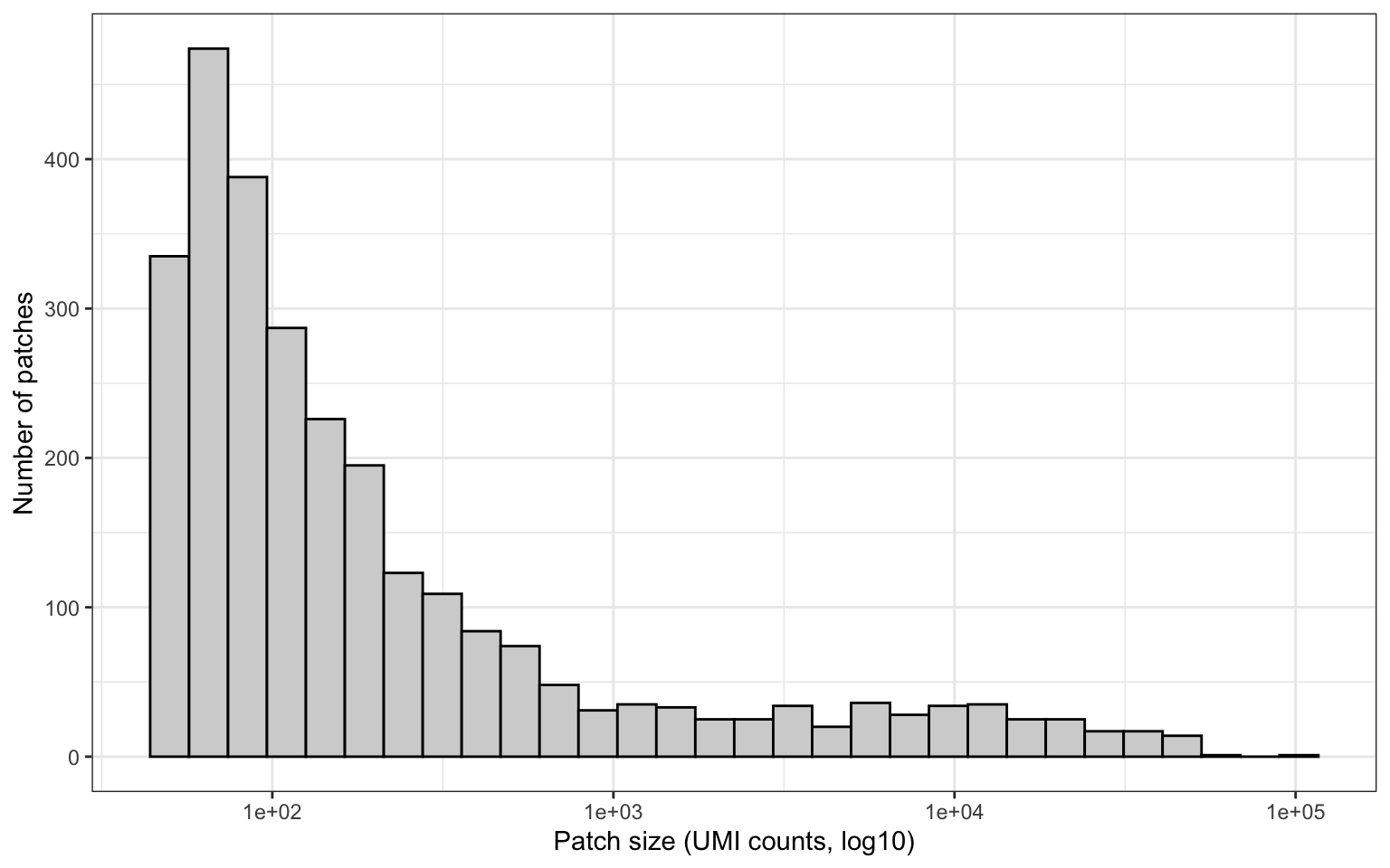
Calculate patch sizes
From our list of CellGraphs, we can now calculate the patch sizes and
visualize the size distribution. We will also label patches as “large”
if they make up at least 1% of the total PNA graph size, “small”
otherwise.
patch_sizes <- lapply(names(cg_list), function(nm) {
cg <- cg_list[[nm]]
patch_sizes <- CellGraphData(cg, "cellgraph") %N>%
filter(compartment == "Raji_alone") %>%
igraph::components()
tibble(count = sort(patch_sizes$csize), patch = seq_along(patch_sizes$csize), component = nm)
}) %>% bind_rows()
patch_sizes <- patch_sizes %>%
left_join(pg_data_combined[[]] %>% rownames_to_column("component") %>% select(component, n_umi), by = "component") %>%
mutate(p = count / n_umi)
patch_sizes %>%
ggplot(aes(count)) +
geom_histogram(bins = 30, color = "black", fill = "lightgrey", position = "dodge") +
scale_x_log10() +
theme_bw() +
labs(x = "Patch size (UMI counts, log10)", y = "Number of patches")
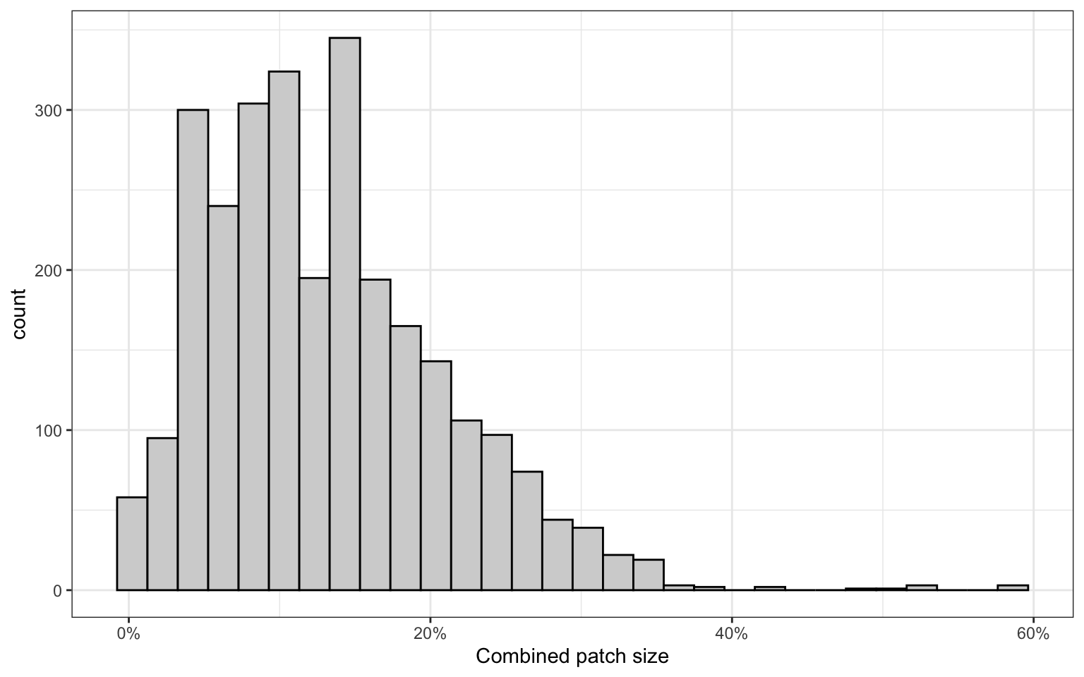
We can also visualize the proportion of nodes in the CD8T cell graphs that are labelled as patches. Roughly ~5-30% of nodes in CD8T cell graphs are found in the detected Raji patches.
patch_sizes %>%
group_by(component) %>%
mutate(p = sum(p)) %>%
ggplot(aes(p)) +
geom_histogram(bins = 30, color = "black", fill = "lightgrey", position = "dodge") +
theme_bw() +
scale_x_continuous(labels = scales::percent) +
labs(x = "Combined patch size")
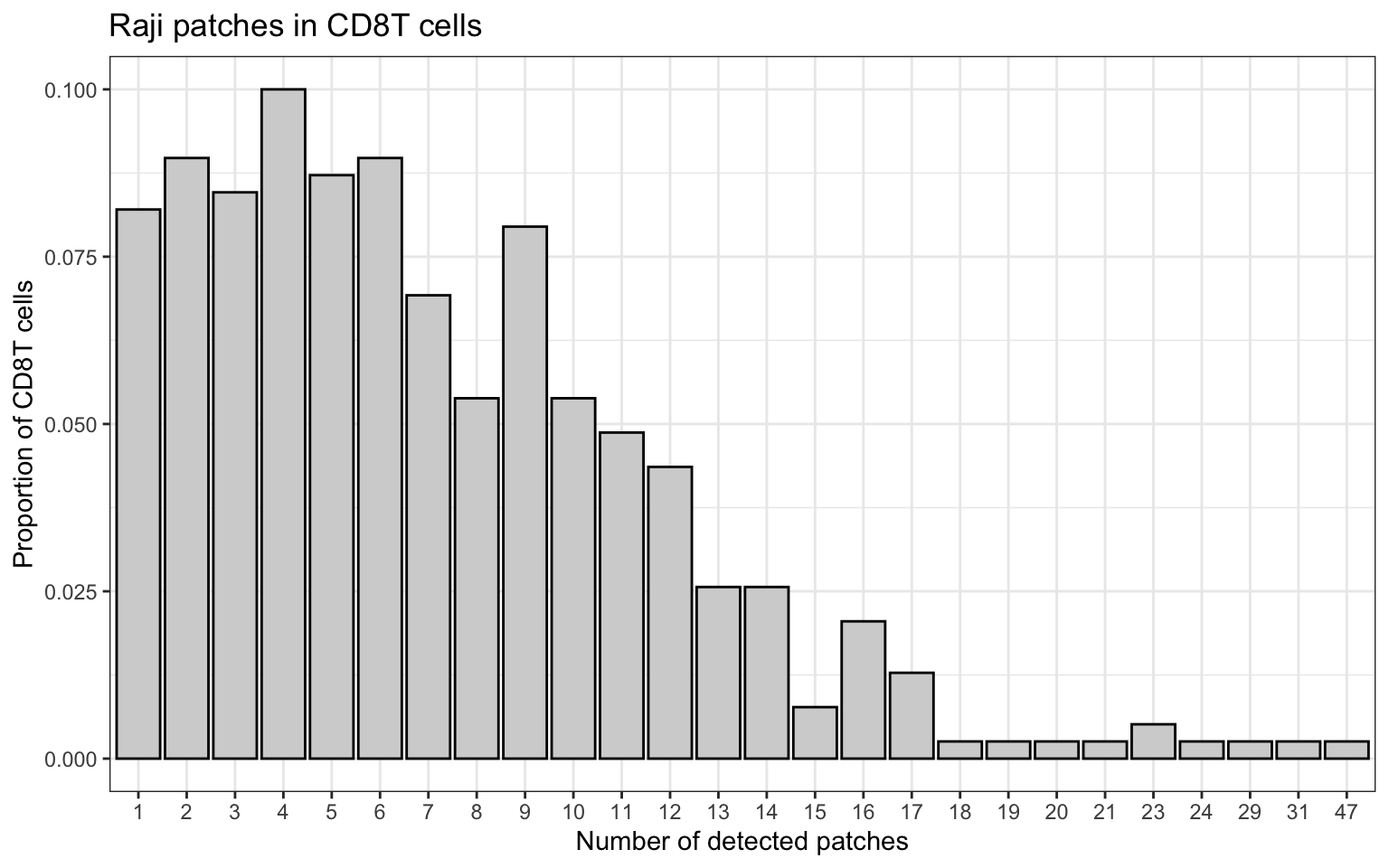
Finally, let’s count the number of patches. Here, we see that most CD8T cells have 0-3 large patches and often several smaller patches.
patch_sizes_summarized <- patch_sizes %>%
group_by(component) %>%
count()
patch_sizes_summarized %>%
group_by(n) %>%
count(name = "count") %>%
ungroup() %>%
complete(n, fill = list(count = 0)) %>%
mutate(count = count / sum(count)) %>%
mutate(n = factor(n)) %>%
ggplot(aes(n, count)) +
geom_col(color = "black", fill = "lightgrey") +
theme_bw() +
labs(y = "Proportion of CD8T cells",
x = "Number of detected patches",
title = "Raji patches in CD8T cells")
Compartment protein composition
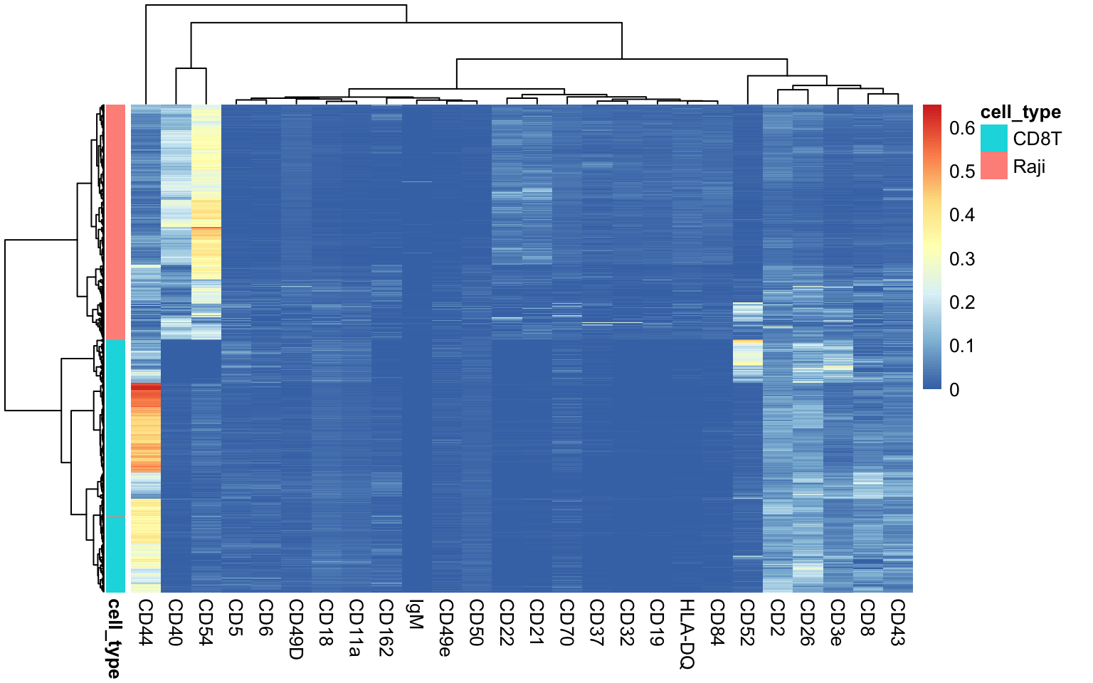
Now the question is, how reliable are these results? To answer this, we can look at the protein composition of the patches. We anticipate that Raji patches (compartments) will be enriched for Raji protein markers and CD8T compartments should be enriched for CD8T cell protein markers. We will collapse the counts matrices from the graphs to compartment level and then visualize their protein composition.
As the heatmap below demonstrates, our expectations are confirmed. The segmented CD8T and Raji compartments cluster almost perfectly. Nevertheless, it’s crucial to acknowledge the inherent complexity of cell segmentation, which can lead to a certain degree of “bleedover” or signal contamination between the segmented compartments. The cell segmentation relies on smoothing data over local neighborhoods, meaning that there’s always some level of uncertainty, especially at the boundaries between compartments.
collapsed_counts <- pbapply::pblapply(names(cg_list), function(nm) {
cg <- cg_list[[nm]]
compartment_counts <- partition_counts(cg, partition_column = "compartment")
compartment_counts <- compartment_counts[intersect(c("CD8T_alone", "Raji_alone"), rownames(compartment_counts)), , drop = FALSE] %>%
t()
colnames(compartment_counts) <- paste0(nm, "_", colnames(compartment_counts))
return(compartment_counts)
})
collapsed_counts <- Seurat::RowMergeSparseMatrices(collapsed_counts[[1]], collapsed_counts[-1])
ann <- data.frame(
cell_type = if_else(stringr::str_detect(colnames(collapsed_counts), "Raji"), "Raji", "CD8T"),
row.names = colnames(collapsed_counts)
)
markers_keep <- intersect(rownames(w[apply(w, 1, function(x) any(x > 0.01)), ]), rownames(collapsed_counts))
collapsed_counts[markers_keep, ] %>%
as.matrix() %>%
t() %>%
prop.table(margin = 1) %>%
pheatmap::pheatmap(annotation_row = ann, show_rownames = FALSE, clustering_method = "ward.D2")
Re-analysis of segmented data
With our new count matrix representing segmented CD8T and Raji patches, we can now create a Seurat object to plug into a data-driven analysis workflow. Let’s create this object and add some relevant meta data. We can also examine the size (UMI count) distribution to compare the sizes of the segmented compartments.
pg_data_segmented <- CreateSeuratObject(counts = collapsed_counts, assay = "segmented")
pg_data_segmented$n_umi <- Matrix::colSums(LayerData(pg_data_segmented, layer = "counts"))
pg_data_segmented$cell_type <- ann$cell_type
pg_data_segmented$original_component <- stringr::str_remove(colnames(pg_data_segmented), "_Raji_alone|_CD8T_alone")
MoleculeRankPlot(pg_data_segmented, group_by = "cell_type", n_umi_min_threshold = 2e3)
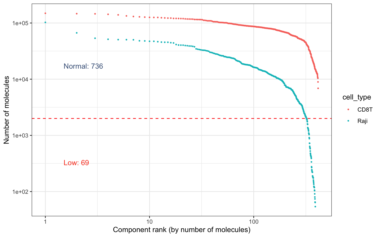
As we already know, a large fraction of the detected patches are very small. For the re-analysis, we will only keep patches that have at least 2000 UMI counts to ensure that we have sufficient data per graph component to work with.
# Subset data to include graphs with more than 2000 UMI counts
pg_data_segmented <- pg_data_segmented %>% subset(n_umi >= 2e3)
VariableFeatures(pg_data_segmented) <- rownames(pg_data_segmented)
pg_data_segmented <- pg_data_segmented %>%
Normalize(method = "clr") %>%
ScaleData() %>%
RunPCA() %>%
RunUMAP(dims = 1:6, reduction = "pca") %>%
FindNeighbors(dims = 1:6, reduction = "pca") %>%
FindClusters(resolution = 0.2, verbose = FALSE)
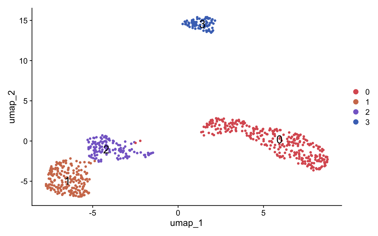
DimPlot(pg_data_segmented, label = TRUE, label.size = 6, cols = plot_colors[c(6:7, 1:3)])
Compare segmented cells with original CD8T cells
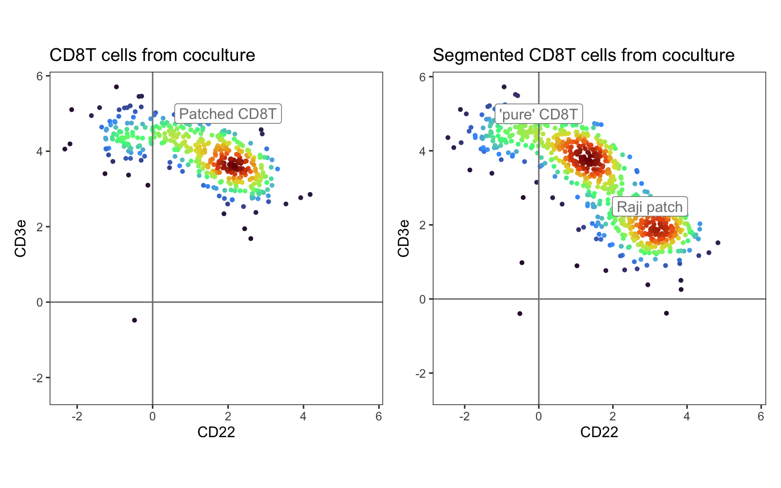
Let’s compare our segmented data with the original CD8T cells from the co-culture. In the left panel, we see the original CD8T cell population enriched for the Raji protein marker CD22. After segmenting this population, the patched CD8T cells are split into roughly two populations: “pure” CD8T cells and Raji patches.
p1 <- DensityScatterPlot(pg_data_combined %>% subset(condition == "coculture") %>% subset(celltype == "CD8T"),
marker1 = "CD22", marker2 = "CD3e", margin_density = FALSE) &
geom_label(data = tibble(
marker1 = 2,
marker2 = 5,
label = "Patched CD8T",
dens = NA_real_
), aes(marker1, marker2, label = label)) &
ggtitle("CD8T cells from coculture") &
guides(color = "none")
p2 <- DensityScatterPlot(pg_data_segmented, marker1 = "CD22", marker2 = "CD3e", margin_density = FALSE) &
geom_label(data = tibble(
marker1 = c(0, 3),
marker2 = c(5, 2.5),
label = c("'pure' CD8T", "Raji patch"),
dens = NA_real_
), aes(marker1, marker2, label = label)) &
ggtitle("Segmented CD8T cells from coculture") &
guides(color = "none")
p1 + p2
Profile and annotate segmented data
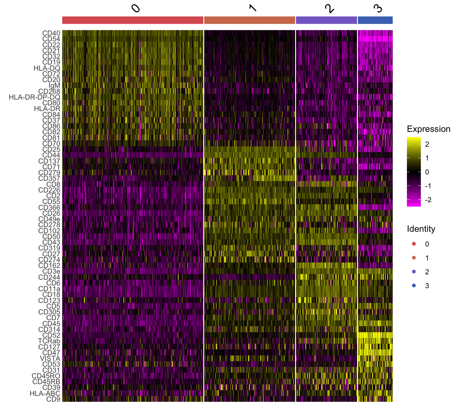
Now we can go ahead and identify and visualize marker proteins for each cluster. We find one Raji patch population (clusters 0) and three CD8T populations (clusters 1, 2 and 3).
de_markers <- FindAllMarkers(pg_data_segmented %>% JoinLayers(), fc.name = "difference", mean.fxn = Matrix::rowMeans, only.pos = TRUE)
sel_markers <- de_markers %>%
filter(pmax(pct.1, pct.2) > 0.2 & p_val_adj < 0.01) %>%
group_by(cluster) %>%
arrange(-difference) %>%
slice_head(n = 20) %>%
pull(gene) %>%
unique()
pg_data_segmented$seurat_clusters <- pg_data_segmented$seurat_clusters %>% factor(levels = c("0", "1", "2", "3")) %>% unname()
pg_data_segmented <- SetIdent(pg_data_segmented, value = "seurat_clusters")
DoHeatmap(pg_data_segmented, features = sel_markers, group.colors = plot_colors[c(6:7, 1:3)])
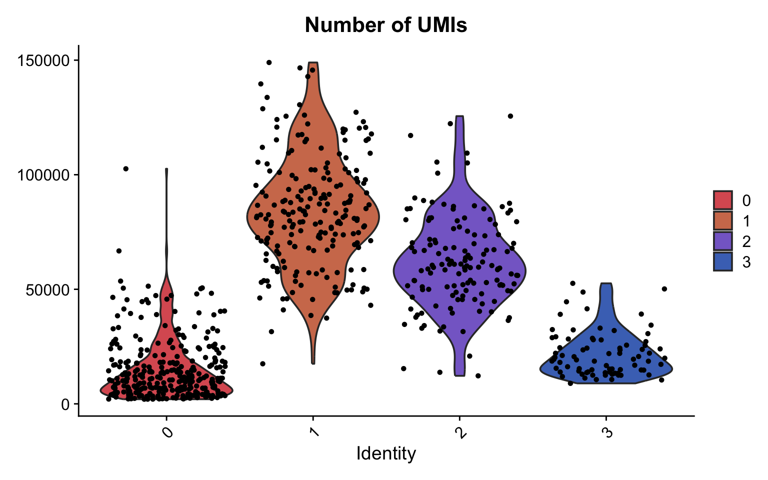
If we plot the number of molecules per cluser, we see that the Raji patches are quite small compared to the CD8 T cell clusters, as expected. However, there are a few big outliers. Let’s take a closer look at these later.
VlnPlot(pg_data_segmented, feature = "n_umi", cols = plot_colors[c(6:7, 1:3)]) &
ggtitle("Number of UMIs")
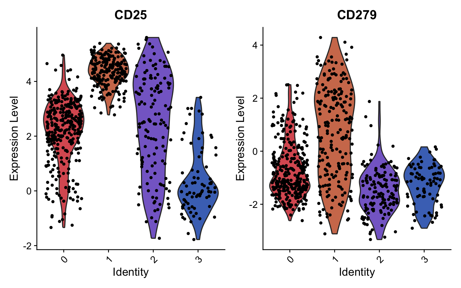
The CD8T cell populations can be classified into three different activation states based on the abundance of CD25 and CD279:
-
non-activated: CD25-/CD279-
-
activated: CD25+/CD279-
-
exhausted: CD25+/CD279+
VlnPlot(pg_data_segmented, features = c("CD25", "CD279"), cols = plot_colors[c(6:7, 1:3)])
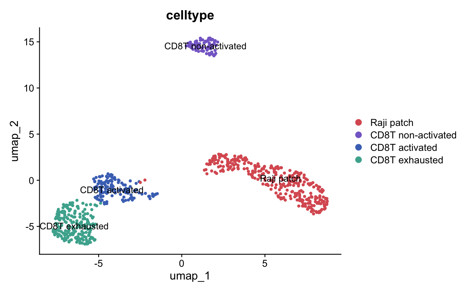
Now we can annotate the clusters accordingly:
ann <- c(
"0" = "Raji patch",
"1" = "CD8T exhausted",
"2" = "CD8T activated",
"3" = "CD8T non-activated"
)
pg_data_segmented$celltype <- ann[as.character(pg_data_segmented$seurat_clusters)] %>% unname() %>%
factor(levels = c("Raji patch",
"CD8T non-activated",
"CD8T activated",
"CD8T exhausted"))
cols <- c("Raji patch" = plot_colors[6],
"CD8T non-activated" = plot_colors[1],
"CD8T activated" = plot_colors[2],
"CD8T exhausted" = plot_colors[3])
DimPlot(pg_data_segmented, label = TRUE, label.size = 4, group.by = "celltype", cols = cols)
T cell states and patches
Due to the relative homogeneity of the Raji population, there’s currently no data indicating an association between distinct Raji phenotypes and the three CD8T cell states. Nevertheless, it’s possible to examine the connection between CD8T cell states and two key parameters: the count of Raji patches and their aggregate size. To begin, we will subset our segmented CD8T cells and add data on patch quantity.
pg_data_cd8t <- pg_data_segmented %>%
subset(celltype %in% c("CD8T non-activated", "CD8T activated", "CD8T exhausted"))
pg_data_cd8t$n_patches <- pg_data_cd8t[[]] %>%
left_join(patch_sizes_summarized, by = c("original_component" = "component")) %>%
mutate(n = if_else(is.na(n), 0, n)) %>%
pull(n)
patch_p_summarized <- patch_sizes %>%
group_by(component) %>%
summarize(p = sum(p), .groups = "drop")
pg_data_cd8t$pct_patches <- pg_data_cd8t[[]] %>%
left_join(patch_p_summarized, by = c("original_component" = "component")) %>%
mutate(p = if_else(is.na(p), 0, p)) %>%
pull(p)
cd8t_patch_data <- FetchData(pg_data_cd8t, vars = c("pct_patches", "n_patches", "celltype"))
p1 <- cd8t_patch_data %>%
ggplot(aes(celltype, n_patches, fill = celltype)) +
geom_violin(draw_quantiles = 0.5, scale = "width") +
labs(x = "", y = "Number of detected Raji patches")
p2 <- cd8t_patch_data %>%
ggplot(aes(celltype, pct_patches, fill = celltype)) +
geom_violin(draw_quantiles = 0.5, scale = "width") +
scale_y_continuous(labels = scales::percent) +
labs(x = "", y = "Percent of graph covered by Raji patches")
p1 + p2 & theme_bw() &
scale_fill_manual(values = cols) &
theme(axis.text.x = element_text(angle = 45, hjust = 1),
legend.position = "none")
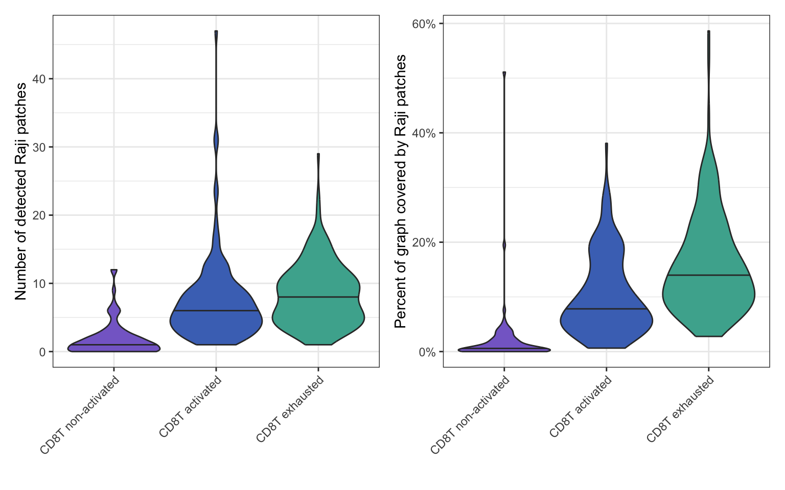
These plots show that activated CD8 T cells form more Raji patches and exhibit greater Raji patch coverage than non-activated cells. Exhausted CD8 T cells display even higher numbers of patches and more extensive Raji patch coverage compared to activated cells.
The increased patch formation on activated CD8 T cells compared to non-activated ones reflects normal immune engagement. It’s expected that activated CD8 T cells would interact more extensively with Raji cells than non-activated (naïve or resting memory) T cells. Activation primes CD8 T cells to recognize and engage with target cells, so an increased number of patches and patch coverage reflect this functional engagement.
The further increase in patch formation and coverage on exhausted CD8 T cells, when linked with the knowledge that chronic antigen exposure drives exhaustion, suggests that these exhausted cells have a history of, or are potentially trapped in, a state of persistent interaction with the antigen-presenting Raji cells. This extensive physical contact, which initially was part of an active immune response, becomes a contributing factor to their eventual exhaustion when sustained over time. The patch data provides a potential correlate for the intense and prolonged stimulation that defines the pathway to T cell exhaustion.
Visualize patched cells
Visualizing patches on CD8T cell graphs can be difficult. The primary issue is that patches vary widely in size and can adopt irregular shapes within the graph layouts, making straightforward visualization challenging. Furthermore, layouts containing patches are frequently more distorted than those without, and the 3D nature of these layouts makes it even harder to view every patch simultaneously. Remember that the PNA graph layouts are abstract representations of the cells and are influenced by a number of factors, in particular the local connectivity which is expected to vary more in patched cells. With this in mind, you will probably need to manually inspect multiple layouts to find good examples for visualization.
We’ll use our patch count table to find cells with different numbers of patches. We’ve chosen two specific cells from the table below: one with a single large patch and another with two large patches.
# Use table of patch sizes to filter for
# cells with a desired number of patches
patch_sizes_summarized %>%
group_by(component) %>%
summarize(n = sum(n))
# A tibble: 390 × 2
component n
<chr> <int>
1 coculture1_01aa1d5b53369b6a 1
2 coculture1_022a17d9821b0dc0 8
3 coculture1_024b268fc621415c 6
4 coculture1_02e7aba0141f3781 5
5 coculture1_07594a52dfe38946 20
6 coculture1_0795eec3516219ae 11
7 coculture1_07fc35489bef2d9a 13
8 coculture1_09882e9df98138fc 5
9 coculture1_09b06d367f016e2d 2
10 coculture1_0a3038709b0efce2 16
# ℹ 380 more rows
plot_patches <- function(cg, title) {
xyz <- layout_with_spectral(cg@cellgraph) %>% as_tibble(.name_repair = ~c("x", "y", "z"))
xyz$compartment <- cg@cellgraph %N>% pull(compartment)
xyz %>%
filter(compartment != "other") %>%
plotly::plot_ly(
x = ~x, y = ~y, z = ~z, color = ~compartment,
colors = c("CD8T_alone" = "lightgrey", "Raji_alone" = "#A53335"),
type = "scatter3d", mode = "markers",
marker = list(size = 2)
) %>%
plotly::layout(title = title) %>%
print()
}
cg1 <- cg_list[["coculture1_2a77aaf817b6376e"]]
cg2 <- cg_list[["coculture2_441ef31c0ee76b09"]]
plot_patches(cg1, "One patch")
plot_patches(cg2, "Two patches")
Doublets
Co-cultured Raji and CD8+ T cells capture various stages of cell-cell interaction. Here, we focus primarily on CD8+ T cells bearing acquired Raji proteins—a outcome of trogocytosis that typically reflects late-stage interaction or target lysis. However, during early contact or non-lytic signaling (such as APC–T cell interactions), cells exist as intact cell-cell doublets.
In our dataset, certain segmented T cells displayed Raji signals exceeding 40% of the total PNA graph. While computationally distinguishing a heavily trogocytosed T cell from a true T:Raji doublet is challenging, examining these boundary cases is essential. Depending on whether your experiment focuses on cell killing or stable immune synapses, you can tailor this workflow to target either trogocytosed single cells or intact conjugates.
Below, we showcase an example of a T:Raji doublet to explore how its
signal profiles and cell boundaries appear in the visual output. We’ll
rerun the segmentation step, but this time we set
detect_interface = TRUE to auto-detect the boundary between the two
cells.
candidate_doublets <- patch_sizes %>%
group_by(component) %>%
summarize(p = sum(p)) %>%
filter(p > 0.3)
cg <- cg_list[["coculture2_1fd610a2a105a2d4"]]
# Rerun segmentation with interface detection
cg <- pixelatorR::segment_cell(cg, w, detect_interface = TRUE)
# coarsened pmds is slower than spectral (used earlier) but typically better at creating layouts for doublets
xyz <- layout_with_coarsened_pmds(cg@cellgraph) %>% as_tibble(.name_repair = ~c("x", "y", "z"))
xyz$compartment <- cg@cellgraph %N>% pull(compartment)
plotly::plot_ly(
xyz,
x = ~x, y = ~y, z = ~z, color = ~compartment,
colors = c("CD8T_alone" = "lightgrey", "Raji_alone" = "#A53335", "interface" = "black"),
type = "scatter3d", mode = "markers",
marker = list(size = 2)
)
Next, we summarize and visualize protein abundance across the three spatial compartments: Raji, CD8+ T cell, and the contact interface. We expect distinct cell-type markers within the individual cell bodies and an overlapping signature at the interface region.
# summarize UMI counts and exclude "other" label
compartment_counts_doublet <- partition_counts(cg, partition_column = "compartment")[c("Raji_alone", "interface", "CD8T_alone"), ]
# Convert abundance levels to proportions (simple normalization)
compartment_counts_doublet <- compartment_counts_doublet %>%
as.matrix() %>%
prop.table(margin = 1)
# Filter out low abundant proteins
compartment_counts_doublet <- compartment_counts_doublet[, apply(compartment_counts_doublet, 2, function(x) any(x > 0.01))]
compartment_counts_doublet %>%
pheatmap::pheatmap(cluster_rows = FALSE, clustering_method = "ward.D2")
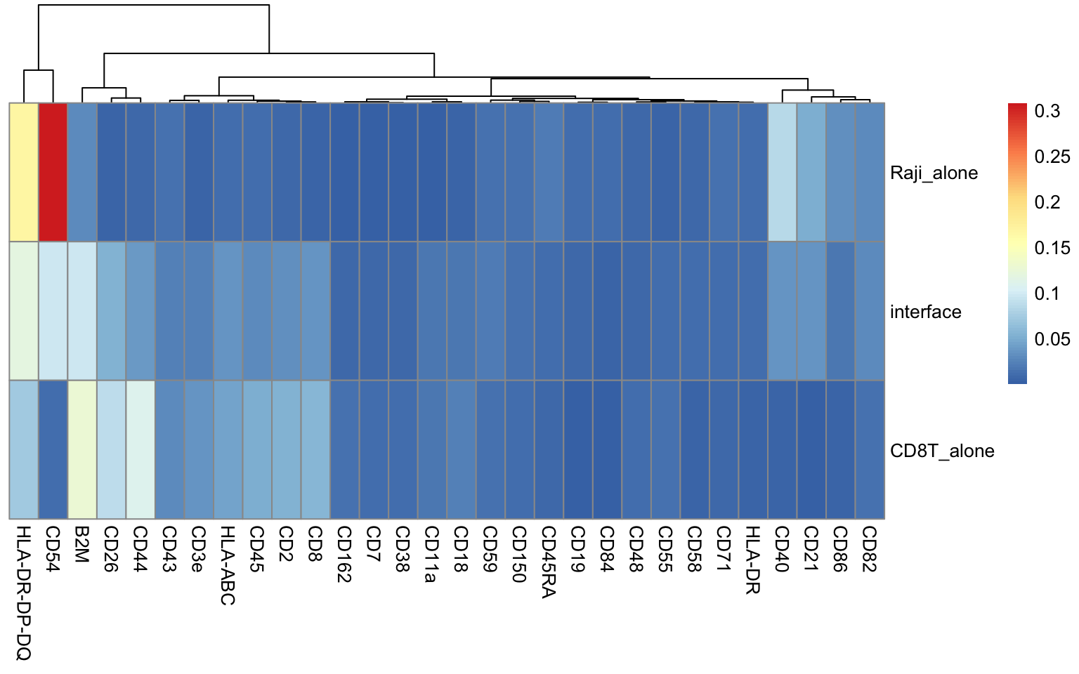
To profile protein dynamics across the contact zone, we can measure
graph distances relative to the interface using
distance_from_node_set. By supplying the interface node IDs (name
attribute), the function appends a new column to the CellGraph object
containing absolute graph distances. We can then convert these into
signed values — using negative distances for Raji and positive distances
for CD8+ T cells — to construct a continuous spatial axis spanning both
cells.
cg <- distance_from_node_set(
cg,
seed_nodes = cg@cellgraph %N>% filter(compartment == "interface") %>% pull(name)
)
cg@cellgraph %>%
as_tibble() %>%
mutate(distance_from_interface = if_else(
compartment == "Raji_alone",
-distance_from_seed,
distance_from_seed
)) %>%
ggplot(aes(distance_from_interface)) +
geom_histogram(color = "black", fill = "lightgrey", binwidth = 1) +
geom_vline(xintercept = 0, linetype = "dashed") +
theme_bw() +
labs(x = "Raji <---- interface ----> CD8 T", y = "Number of nodes") +
geom_vline(xintercept = -9, linetype = "dashed", color = "red") +
geom_vline(xintercept = 10, linetype = "dashed", color = "red")
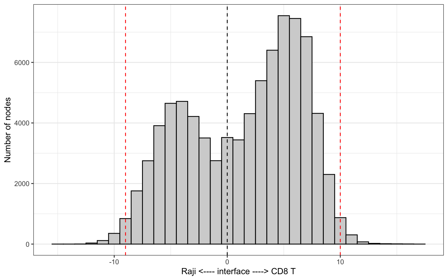
The histogram above displays the node count per distance band, where the bimodal distribution reflects the two distinct cell bodies in the graph. Because distance bands with low node counts yield less statistical certainty, filtering out extreme values is recommended. Here, we restrict our working range to [-9, 10].
Next, we apply this distance filter, aggregate protein counts across each band, and normalize abundance values into relative proportions. Based on our earlier heatmap, we select three representative markers to plot along this spatial axis: CD40 (Raji cell) and CD44 (CD8+ T cell).
abundance_cd8t_raji <- cg@cellgraph %>%
as_tibble() %>%
bind_cols(as.matrix(cg@counts)) %>%
mutate(distance_from_interface = if_else(
compartment == "Raji_alone",
-distance_from_seed,
distance_from_seed
)) %>%
# Limit the range to ignore nodes that are "far away" from the interface
filter(between(distance_from_interface, -9, 10)) %>%
group_by(distance_from_interface) %>%
summarize(across(all_of(colnames(cg@counts)), ~sum(.x))) %>%
pivot_longer(all_of(colnames(cg@counts))) %>%
group_by(distance_from_interface) %>%
mutate(pct = value / sum(value))
selected_markers <- c("CD40", "CD44")
ggplot(abundance_cd8t_raji %>% filter(name %in% selected_markers), aes(distance_from_interface, pct, color = name)) +
geom_line() +
geom_point() +
geom_vline(xintercept = 0, linetype = "dashed") +
theme_bw() +
labs(x = "Raji <---- interface ----> CD8 T", y = "Percent of UMI counts") +
scale_y_continuous(labels = scales::percent)
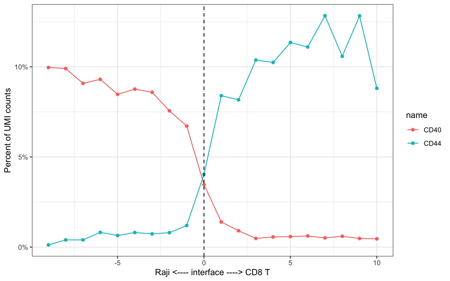
By calculating graph distances from the interface, we can profile protein expression dynamics along a continuous cell–cell axis. While a single doublet offers limited statistical power, scaling this workflow across multiple doublets enables systematic discovery of recurring spatial trends.
In this tutorial, we gained a comprehensive understanding of patch analysis in PNA data. We learned how to:
-
Understand patches as connected subgraphs enriched for specific protein markers, representing entities like cell fragments or interacting cells.
-
Perform quality control, data integration (using Harmony for co-culture data), and initial cell type annotation.
-
Utilize pixelatorR’s specialized function to unmix abundance data and define cell type weights for robust cell segmentation.
-
Apply the cell segmentation algorithm on PNA cell graphs.
-
Calculate and visualize patch sizes, proportions of cell graph coverage, and the number of patches per cell.
-
Verify the purity of detected patches by analyzing their protein composition.
-
Create a new Seurat object from segmented graphs, allowing for independent clustering and annotation of these distinct cellular components.
-
Explore the relationship between CD8 T cell activation states and the quantity/coverage of Raji patches, revealing potential biological insights into cell-cell interactions and T cell exhaustion.
-
Understand the challenges and strategies for visually representing patches within 3D cell graph layouts.
-
Measure graph distances relative to the cell contact interface to profile protein gradients along interaction axes.
This tutorial has equipped you with the foundational knowledge and practical skills to perform cell segmentation, moving beyond protein abundance to explore the spatial organization interacting cells.